Themes In Forms
Component Themes Now Applied to Forms
Released: December 9, 2025
What's New
Component themes can now be applied to Forms, creating consistency across Tables, Lists, and Forms throughout your app.
Unified Theming System
Apply the same theme across multiple elements:
- Tables: Data tables with themed styling
- Lists: List views matching your theme
- Forms: Forms that match your component themes
- Consistency: Unified appearance across all components
Theme Preview
Preview themes before applying:
- Access theme preview in Design → Themes
- See how themes look on forms
- Compare different theme options
- Choose the best fit for your app
Why It Matters
- Professional Appearance: Consistent design language throughout your app
- Easier Branding: Apply your brand theme to all interface elements
- Better UX: Users see a cohesive, unified interface
- Time Savings: Theme once, apply everywhere
- Simplified Maintenance: Update themes globally instead of per element
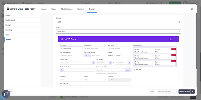
How to Apply Themes to Forms
- Navigate to Design → Themes in your builder
- Choose a component theme
- Preview how it looks on forms
- Apply the theme to your forms
- Forms will automatically match your component styling
Customization Options
While themes provide consistency, you can still customize:
- Override theme colors for specific forms
- Adjust spacing and layout
- Customize individual form elements
- Maintain theme consistency while adding unique touches
Pro Tip
Choose a theme that works well across both data display (tables, lists) and data entry (forms). Preview it on forms before applying to ensure input fields are readable and buttons are clearly visible.
Universal Component Themes
This feature is part of the broader Universal Component theming system introduced in late 2025:
- Approximately 5 themes per component
- All fully customizable
- Consistent across all component types
- Professional, modern designs
We'd love to hear your feedback.