We've added several API and security enhancements focused on improving visibility, security, and overall API usability.
New API Endpoints
Added endpoints for Workflow Logs, Active Sessions (including session termination), and File Logs (including file deletion).
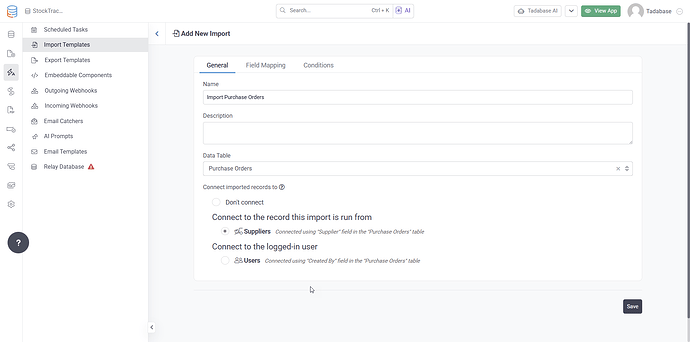
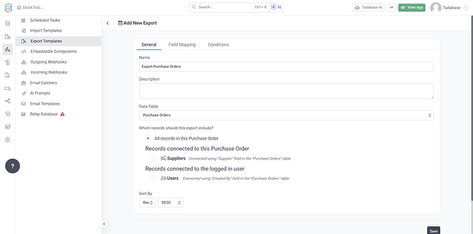
Import and Export Security
Import and Export operations now fully respect Row Level Security policies. If a user's policy does not permit access, the API will automatically block the request.
Simplified API Endpoints
We've added shorter aliases for connected and related record endpoints while maintaining compatibility with existing API paths.