Table Style 2
The following example is how to customize any table you wish into the table style seen here by adding "table-style-2" to your table's class selector.
Step 1
Add the following code to the header section of your app.
<style>
    /* table style two  */

    .table-style-2 h3 {
        color: #181C32;
        font-weight: 400;
        padding-left: 7px;
        padding-bottom: 10px;
        margin: 0;
    }

    .table-style-2 .table-wrap>.table tr {
        color: #3F4254;
        background-color: #fff;
    }

    .table-style-2 table>tbody>tr {
        border-top: 1px solid #EBEDF3;
    }

    .table-style-2 table,
    .table-style-2 table>thead>tr>th,
    .table-style-2 table>tbody>tr>th,
    .table-style-2 table>tfoot>tr>th,
    .table-style-2 table>thead>tr>td,
    .table-style-2 table>tbody>tr>td,
    .table-style-2 table>tfoot>tr>td {
        border: none;
        padding-top: 1.5rem;
        padding-bottom: 1.5rem;
    }

    .table-style-2 {
        padding: 4rem;
        background: #F2F3F7;
    }

    .table-style-2 table>tbody>tr>td {
        color: #3F4254;
        font-weight: 600;
    }

    .table-style-2 .table-responsive {
        /*border: 1px solid;*/
        border-radius: 1rem;
        background-color: white;
        padding: 1rem;
    }

    .table-style-2 a.td-link.td-data-link {
        background: #f3f6f9;
        padding: 8px;
        border-radius: 0.4rem;
    }

    .table-style-2 table>thead>tr>th {
        font-weight: 600;
        color: #B5B5C3 !important;
        font-size: 13px;
        text-transform: uppercase;
        letter-spacing: 2px;
        vertical-align: middle;
    }

    .table-style-2 .td-data-link i.fa {
        color: #3699FF;
    }

    .table-style-2 .td-data-link:hover {
        background: #3699FF !important;
        color: #fff;
    }

    .table-style-2 .td-data-link:hover i {
        color: white;
    }

    .table-style-2 table a:not(.btn) {
        text-decoration: none;
    }

    .table-style-2 .table-actions {
        border: none;
        background: none;
    }


    /* Check box css */

    .table-style-2 input[type='checkbox'] {
        margin-top: -30px;
    }

    .table-style-2 input[type='checkbox'] {
        -webkit-font-smoothing: antialiased;
        text-rendering: optimizeSpeed;
        width: 24px;
        height: 24px;
        margin: 0;
        margin-right: 1px;
        display: block;
        float: left;
        position: relative;
        cursor: pointer;
    }

    .table-style-2 input[type='checkbox']:after {
        content: "";
        vertical-align: middle;
        text-align: center;
        line-height: 24px;
        position: absolute;
        cursor: pointer;
        height: 24px;
        width: 24px;
        left: 0;
        top: 0;
        font-size: 12px;
        -moz-box-shadow: inset 0 1px 1px #3699FF, 0 1px 0 #3699FF;
        background: #EBEDF3;
    }

    .table-style-2 input[type='checkbox']:hover:after,
    input[type='checkbox']:checked:hover:after {
        background: #EBEDF3;
        content: '\2714';
        color: #fff;
    }

    .table-style-2 input[type='checkbox']:checked:after {
        background: #3699FF;
        content: '\2714';
        color: #fff;
    }
</style>
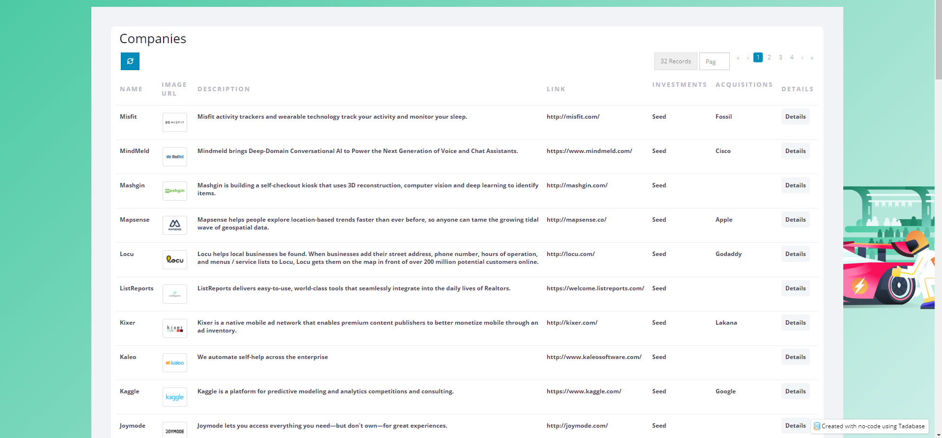
Step 2
Now, it will apply this design when I add a CSS Class of "table-style-2" to a table.

Original Community Post:
UI/UX CSS works - Community Discussions / Getting Started - Tadabase Community
We'd love to hear your feedback.