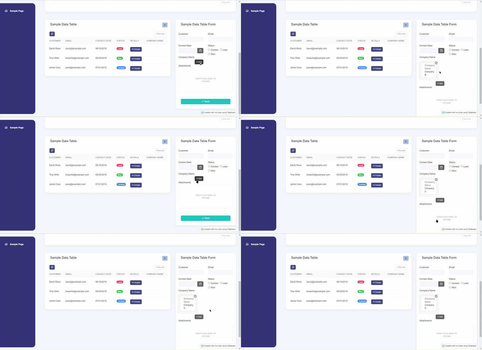
CSS Option for Connection Fields in a Form Component.
Please note that this is now available as a plugin for easier installation. While you can use this document as a reference, the recommended method to add this functionality is through the plugin installation wizard. Learn more about plugins here.
If you would like a CSS customization to change the display of a connected field in the format of a list drop-down follow the steps below.
Step 1
Within your form component, ensure your connected field is set to display as a dropdown list, as seen below.
Step 2
Add the following code to your CSS tab.
.record-selector.drop-down-list {
    left: 50%;
    top: 0;
    right: 0;
    position: absolute;
    z-index: 10;
}

.view-record {
    float: left;
    width: calc(50% - 80px);
}

.add-record {
    float: right;
}
Our new themes may need some tweaking to the code.
For this theme, I made the following changes to each class selector:
.record-selector.drop-downlist
I removed the 50% value on the left.
.view-record
I removed the width calculation and replaced it with 75%.
Feel free to edit these values until you get the display you want on your form.
.record-selector.drop-down-list {
  left: 0;
  top: 0;
  right: 0;
  position: absolute;
  z-index: 10;
}

.view-record {
    float: left;
    width: 75%;
}

.add-record {
    float: right;
}


We'd love to hear your feedback.