Mobile Menu Logo - When Menu is Closed
Please note that this is now available as a plugin for easier installation. While you can use this document as a reference, the recommended method to add this functionality is through the plugin installation wizard. Learn more about plugins here.
Adding customization to a menu logo can significantly help the user experience for mobile users. Here is how to get this done.
Step 1
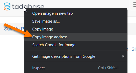
Get the Image Address or “URL.”
If viewing an image on a webpage, you can copy it by right-clicking and selecting the “Copy image address” option.
If you do not have the image uploaded, you can always upload it to an Image Component or anywhere else on the internet.
Step 2
Add the following to the JavaScript tab of the Layout where the menu is located.
var imageUrl = '//res.cloudinary.com/tadabase/image/upload/v1592348737/client/tutorials/logo_twohh9.png';
var image = $('<img class="custom-menu-image" src="' + imageUrl + '">');
$('.navbar.navbar-default').prepend(image);
Change the imageUrl to your Image URL
Step 3
Add the following code to the CSS tab of your Layout.
.custom-menu-image {
    width: 150px;
    position: relative;
    margin-right: 15px;
    padding: 9px 10px;
    margin-top: 8px;
    margin-bottom: 8px;
}

@media (max-width: 768px) {
    .menu-item-img {
        display: none;
    }
}

@media (min-width: 768px) {
    .custom-menu-image {
        display: none;
    }
}
Original Community Post:
https://community.tadabase.io/t/mobile-menu-logo-when-the-menu-is-closed/1349
We'd love to hear your feedback.