Pages
What is a page?
Pages enable you display data on your live app with custom security permissions and formatting settings. You can add pages to your app to display groups of components on each page.
Pages are one of the three design elements you can use in the Page Builder, along with layouts and components, to design how users will add, view, and interact with your data on the live app.
Default Pages
At the top of your app's list of layouts and pages, there are three pinned pages which are default pages that are automatically included with each new app.
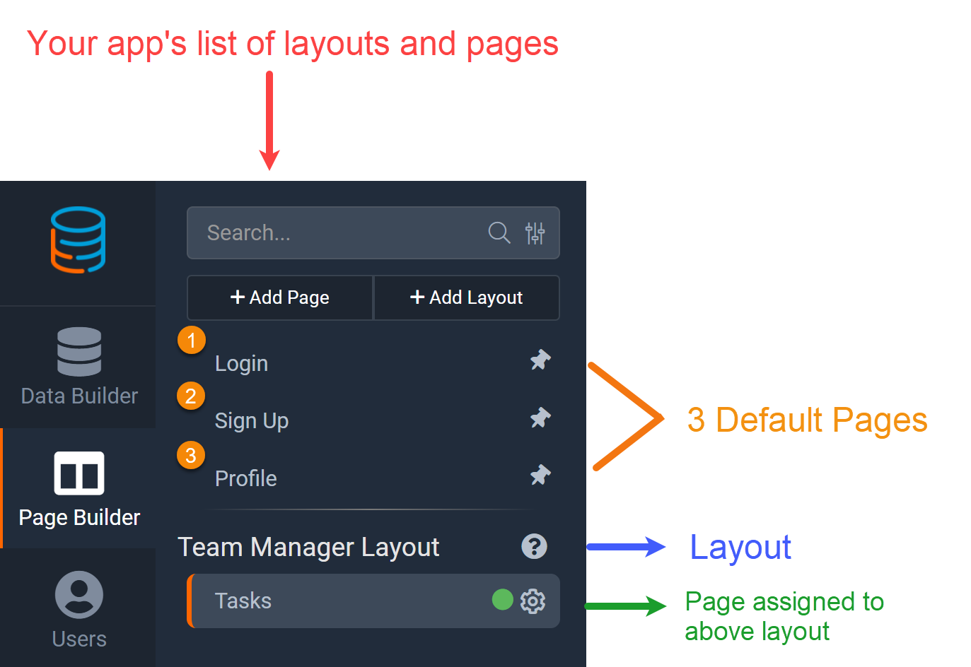
The three default pages built-in to each app for your convenience are:
- Login Page
- Sign Up Page
- Profile Page
These default pages are similar to regular pages except that they were built-in to each app for your convenience to save you the time of having to create these basic pages from scratch.
These default pages can not be deleted, however they can be edited and customized to your specific needs. Additionally, you can create new login, sign up, and profile pages by adding login, sign up, and profile system components to any page.
Please Note: If a User Menu system component has been added to a page or layout, when users clicks on their name within the user menu they will be routed to the default profile page. The default profile page is secured by default and there is no way to remove the permissions from this page.
The default sample page
Every new app comes with an included sample page which serves as a preview page to assist new users with creating their first apps. This sample page is for onboarding purposes only and can be deleted at any time or customized to meet your page needs.

Adding pages
To add a new page, click on the +Add Page button at the top of your app's list of layouts and pages in the Page Builder.

A new window will pop up prompting you to name your new page and optionally define other page settings as well.

- Name- Name your page. Page names do not have to be unique. It is required to name your page.
Assuming you would like this new page to be active, you do not have to define any other pages settings other than the name at this time if you so choose. As the Layout, Page Structure, and Menu settings are optional and can be defined at a later point, and the Status is active at default, you can simply name your new page and click Save. Once you save your new page, it will be added to your app's list of layouts and pages with your selected name. To add content to this new page, select the page from the list of layouts and pages and the page's content will appear. - Layout- Select a layout this page should be assigned to and use when displayed on the live app. This setting is optional and you can assign or change the layout at a later point within the Settings tab of each page's navigation menu. Click here to learn more about layouts.
- Add Page to Current Menu- Choose to add this page to one of your existing menus. This setting is optional and you can add this page to display on a particular menu at a later point. Click here to learn more about the menu system component.
4. Select component- Allows you to select one of 3 components before you ever hit save.
Once you have defined your new page's name and other settings, click Save and your new page will be added to your app's list of layouts and pages. To add content to your new page, click on the page's name from your app's list of layouts and pages and the page content will appear.
Page Content
You can view and add content to a page within the Content tab of a selected page's navigation menu. You can access a page's content by selecting the page from your app's list of layouts and pages in the Page Builder.
Within the Page Content you can add rows, add columns within the rows, and add Data Components and System Components within the columns to design your page structure.
Adding content to a page
When you create a new page, a row with one column will automatically be added to the page and you will be prompted to add your first data or system component within that column.

Additionally, you can add components to columns via the Add Component menu located towards the top of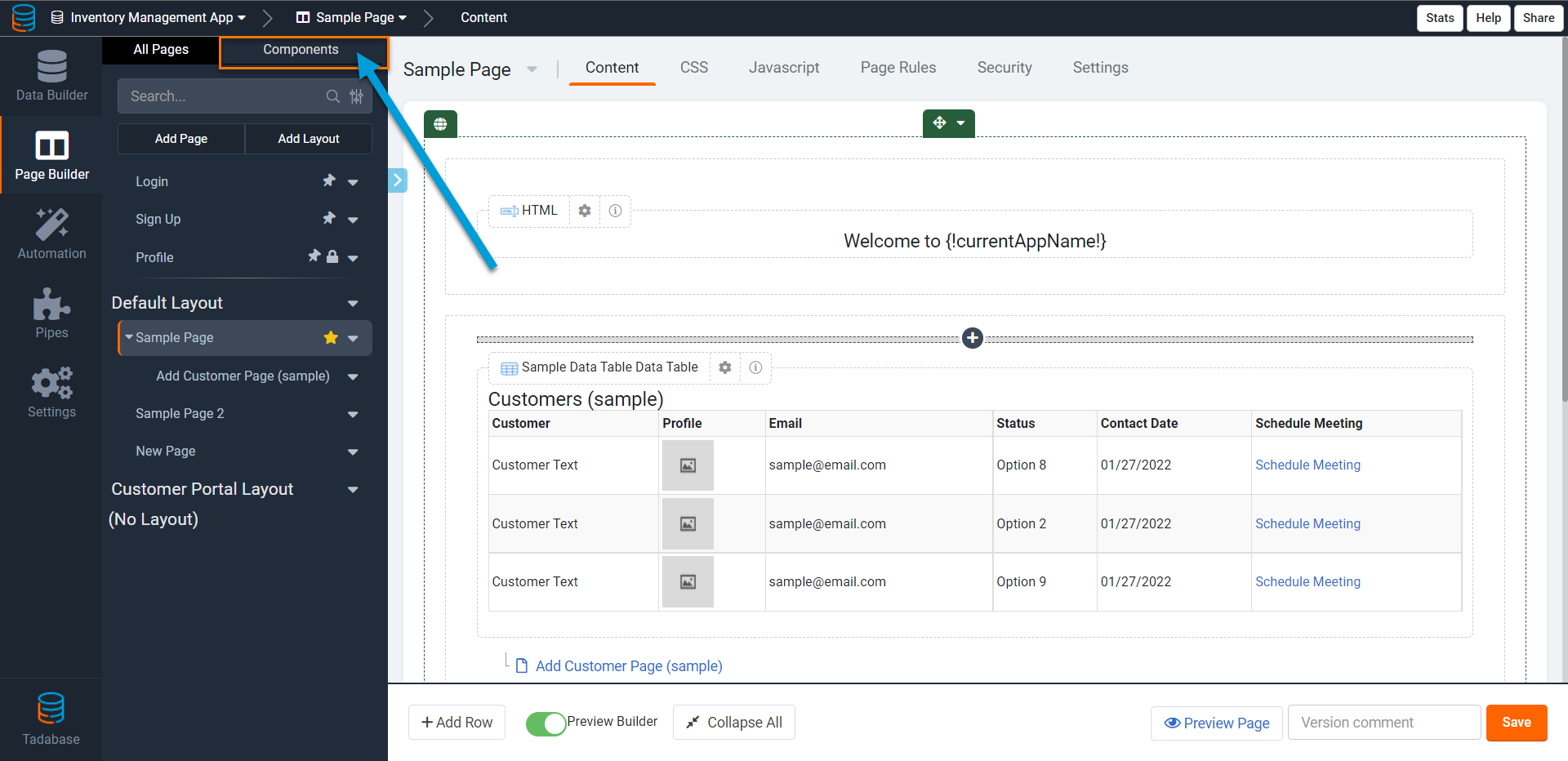 the page's content section.
Learn more about the various data components and system components you can add to your pages.
Learn more about adding additional rows and columns to your page structure.
Hiding the help window
When working with pages, you can choose to hide the help text window located on the right side of your browser window in order to expand the page content section. To hide the help text window and expand your page content section, click on the X above the help bar. 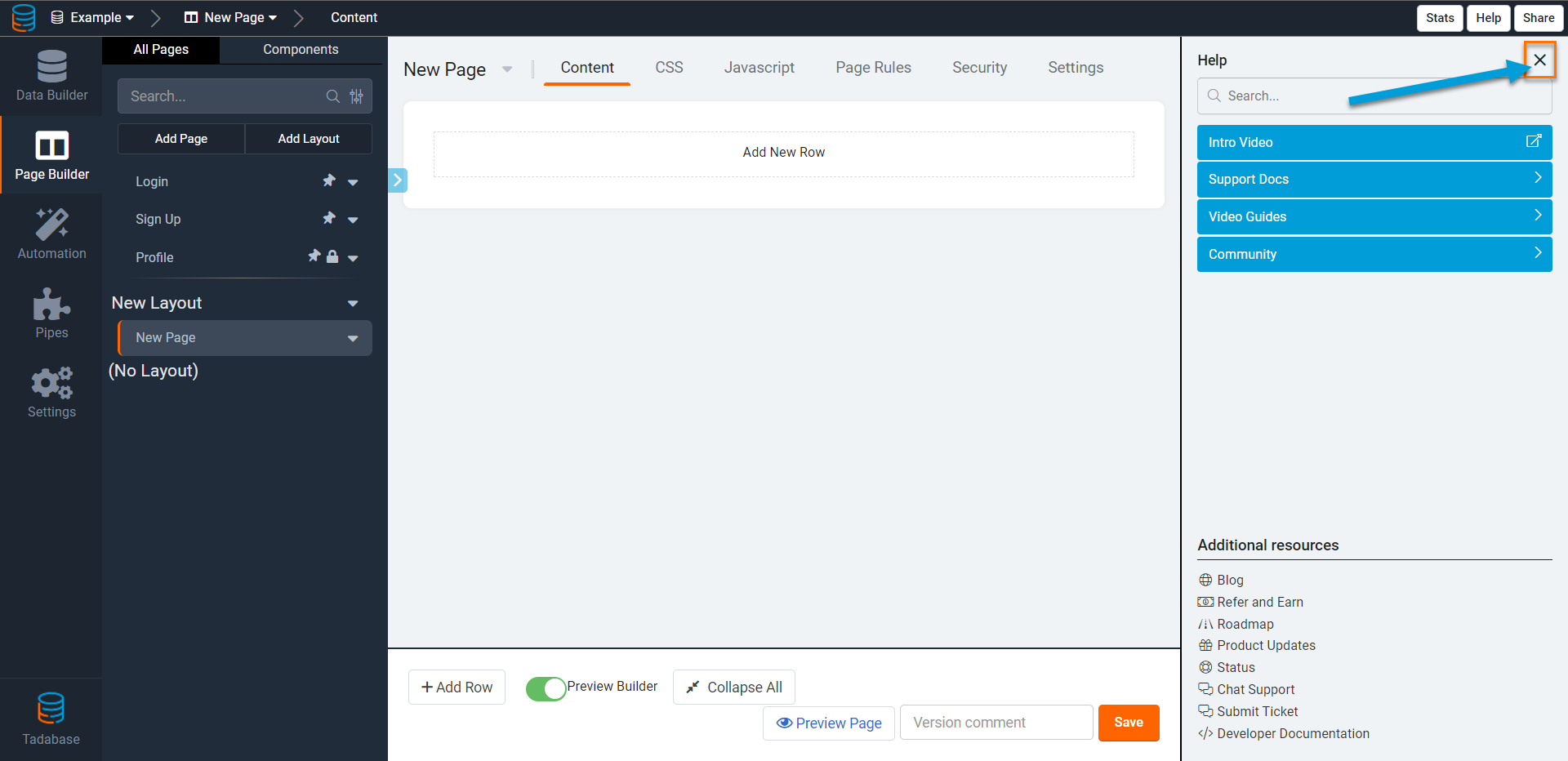
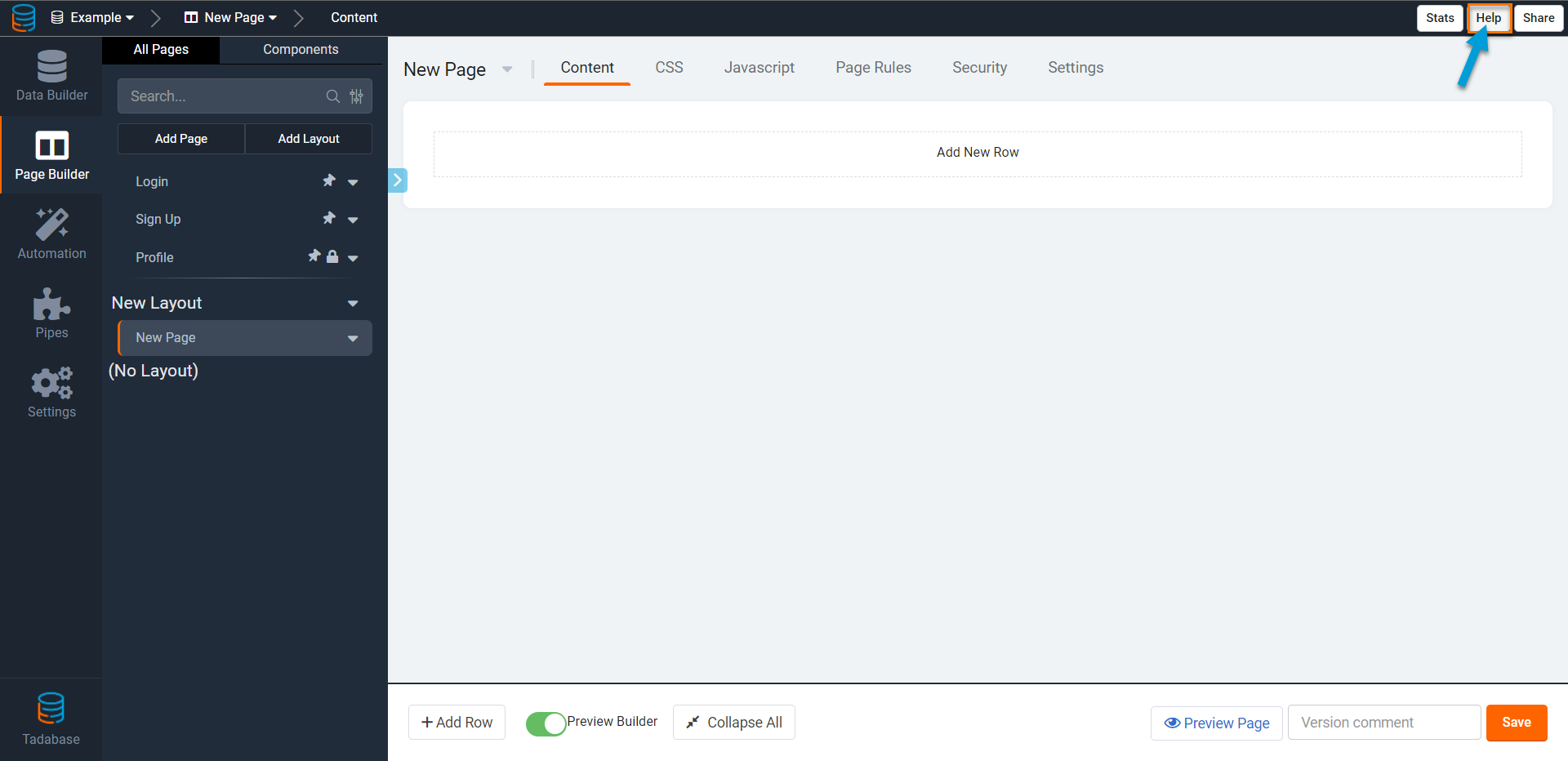
As you can see in the image below, once you enable hiding the help text window the page content section of the selected page expands to give you more room to work with. To get the help section back, click on the help button at the top pf the page.
Previewing pages on the live app
When you add rows, columns, and components to a page, you can preview how the page will display to users on the live app by clicking on the preview button.
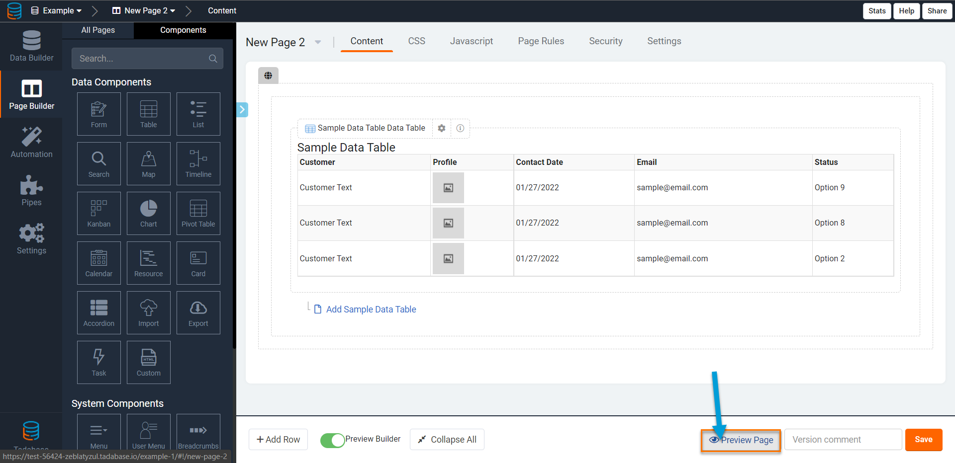
For instance, say you have a Tasks page and you add a row with one column and a table component within the column to track your tasks on the live app. If you wanted to preview how this page will appear on the live app, you can click the button located in the image above.
The image below illustrates the preview of how the above page in the Page Builder will appear on the live app.

Customizing pages
You can customize your pages within the Settings Tab of each selected page's navigation menu.

- Name- this is where you can view the name of this page and rename the page if you wish.
Note: When working with auto-generated child pages, the name is auto-generated. It can be helpful to modify this name in the page settings after it is created. - Slug- this is the text that will appear in the URL when viewing this page.
- Layout- Choose to assign this page to a layout.
- Home Page- Select whether this page should be the app's home page. Each app can have a home page which is the default page that users will automatically be directed to when they visit your domain or sub-domain.
To assign a particular page as your app's home page, enable this Home Page setting to Yes. If you set a particular page as the app's home page, that page will display with a yellow star icon on your app's list of layouts and pages in the Page Builder.

- Status- Select whether this page should be active or inactive. The default status for each page is Active and pages will remain active unless you change their status to "Inactive" within their page settings.
Pages that are active will display with a green dot icon on your app's list of layouts and pages.
- Page Title- define a name for your page to display on the browser tab
- Page CSS Class-


Securing pages
Within the Settings tab of a selected page's navigation menu, you can use the Page Security section to secure that particular page with custom security permissions, including restricting the visibility of that page to only specific user roles.
There are three options for page security:
- Anyone, no login required- Using this default setting, the page will be visible to anyone.
- Only Logged In Users- When this security option is enabled, only users who are logged in to your app will be able view this page. Any logged in users will be able to view this page, regardless of their user roles.
- Only Users In Specific Roles- With this security option you can secure this page by specific user roles.

When you select this security option, you will be prompted to select a role or multiple roles, securing this page to be accessed only by users assigned to your selected role(s). A user that matches any of the roles you select will have access to this page.

When any permission restrictions are configured on a page, the page will display with a lock icon on your app's list of layouts and pages.

Additionally, when any permission restrictions are configured on a page, you will have the ability to create custom error messages to display when users attempt to access a secured page.

Page rules
Within the Settings tab of a selected page's navigation menu, you can create page rules to perform specific actions upon custom-defined conditions when a page loads.
Page rules enable you to run additional checks prior to a page loading and determine if a particular action should be taken if/when your defined condition(s) is met.
For instance, you can create a page rule stipulating that when a page loads, check if the user's phone number is blank, and if it is blank then auto-direct the user to the profile page to update his/her phone number.
When creating a page rule, you can choose one of the following three actions to occur if your conditions are met when the page loads:
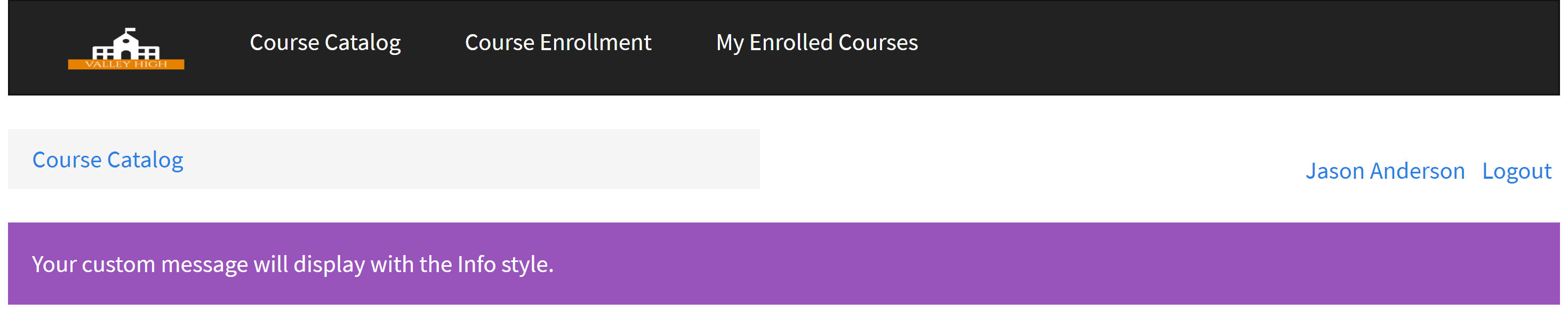
Show a message
You can create a page rule to show a custom message when your custom-defined condition(s) is met. Showing a message will override the default page content and instead only show your custom-defined message. The message can be shown with any HTML content as well as with a pre-defined alert style. The alert style will display your message with a pre-defined style type.

You can show your custom message using one of the five alert styles:
- Danger/Error

- Warning

- Info

- Success

- No Style


You can then enter your custom message as well as define your condition(s) upon which you would like your message to show.

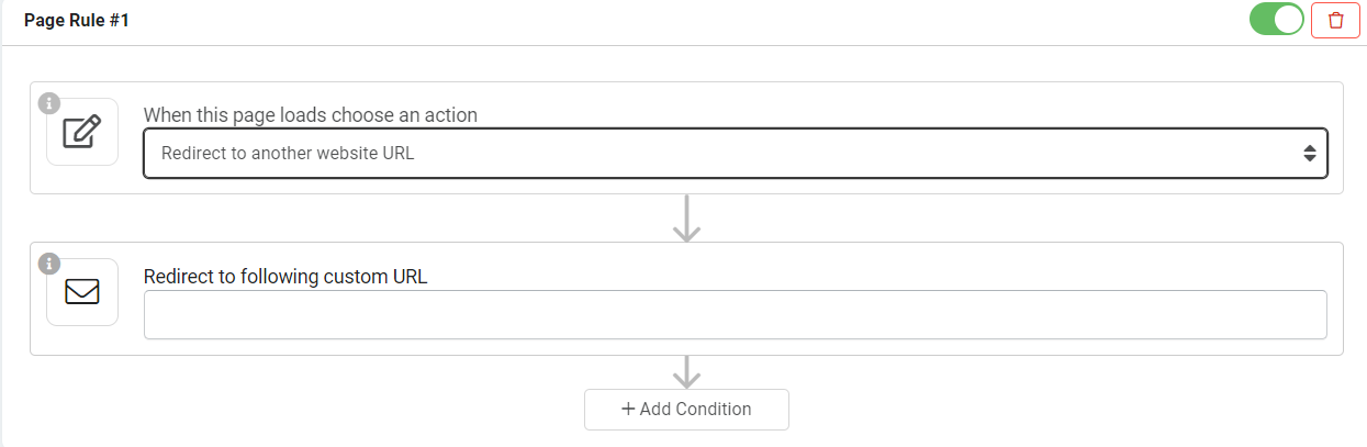
Redirect to another page
You can also choose to redirect the user to any parent page in your app if/when your defined condition(s) is met.

Redirect to a URL
You can also choose to redirect users to a specific URL if/when your defined condition(s) is met. You can auto-direct users to a URL within your app or any external website you choose.
When adding page rules to a parent page, you can define conditions based on the logged-in user's field values, such as based on the logged-in user's name, role, status, etc.
When adding page rules to a child page, you can define conditions based on the logged-in user's field values as well as based on field values from the child page's data table.
Parent and Child Pages
There are two types of pages that can be added to your app:
-
Parent page
-
Child page
Parent page
A parent page is a page you manually created by adding a new page.
Child page
A child page is a page that is directly connected to a component in the page one level above it. When adding certain links to a component, a child page will automatically be created.
For instance, if you add a Details link to a table component, a child page will be created.

As you can see in the image below, adding the Details link to the above Employees table component automatically added a new child page with each employee's details. As you can see, the automatically created Employee Details child page was added directly under its parent Employees Page on the app's list of layouts and pages.

You can click on each child page to customize it just as you would any other page. For instance, you can customize the employee details page to appear as such:

As you can see in the image below, child pages are nested below the page they are directly connected to via a component.

Deleting a child page will not delete the link in the parent component, however deleting the link that created the child page will in fact remove the child page.
Page load process
When a page is requested by a user, the server goes through a process to determine what to show the user. Below is a diagram of that process.

Deleting pages
You can delete a page by clicking on the gear icon to the right of the selected page within your app's list of layouts and pages and selecting the Delete option.
We'd love to hear your feedback.