Card Component
What are cards?
Cards enable you to add static or dynamic single points of data on a component that looks a bit like a card.

When should I use cards?
Cards are mostly used on dashboard or any page where you want to add a summary in a clean design with custom title, icons and footers.
Adding Cards
To add a card choose the card component and then choose the data table to be used for this card
Inside the calendar component you'll see have some standard options available in other components, as well as unique settings only available in the calendar component.
- Data Source
- Calculations
- Design
Data Source
For this component the data source is unlike the other components and only shows the table being used for display of component.
Calculations
Here you can choose what to display as the primary content on the card. You can choose from the following options:
- Static or Formula
Static
Static will simply display a static (non dynamic) value that you enter here.
Formula
With formula you can choose to summarize values from the table you chose when adding this component.
You can choose from 5 formulas:
- Count
- Minimum
- Maximum
- Average
- Sum
You can also add conditions to determine which records should be used int he calculation.
For example, Count all the Jobs where Job Status is Job Scheduled
When working with other formulas that require another parameter, like SUM which we must also decide which field to sum, you'll have another option to choose that number field.
You can also enable Auto Refresh which will refresh this component every 30 seconds. This is useful when displaying statistics on a TV monitor so you don't need to constantly refresh.
Finally, you can choose to add a thousands delimiter to the output:

Design
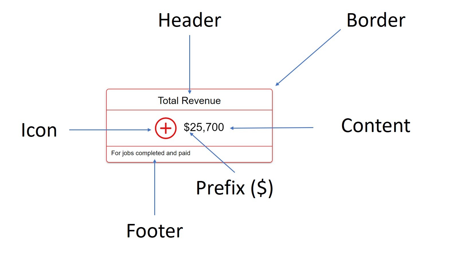
In the design tab you can customize much of how the card is displayed including:
Here are all the sections
Header
Header can be customized with custom text, size, alignment and color.
Footer
Content
Content can be customized with size, color, alignment as well as a prefix or suffix to be added next to the value outputted. For example, you can add a currency symbol as a prefix or a % sign as the suffix. This can be anything you wish.
Border
Border can be customized with which sides should have a border, the width, color and radius.
Icon
Choose a default icon and its position and color,
Icon can be customized with display rules that will modify the icon based on the values. For example,
- If revenue is above $25,000 show a green smiley face.
- If revenue is lower than $20,000 show a red frown
- Otherwise, show a blue 'meh'


We'd love to hear your feedback.