Layouts
What is a layout?
Layouts are one of the three design elements you can use in the Page Builder, along with pages and components, to design how users will add, view, and interact with your data on the live app.
Layouts enable you to build a page structure that will be consistent across multiple pages of your app. You can create multiple layouts to run across multiple sets of pages.
For instance, if you would like specific pages to display with a header including your logo and a specific menu, you can create a unique layout including this page structure and apply it to those specific pages. If you would like another set of pages to display with a different menu, you can create another unique layout and apply it to those specific pages. You can create as many layouts as you need to create unique page structure displays for multiple sets of pages.
You can use Layouts to customize the user interfaces and experiences of specific user groups when they visit your app.
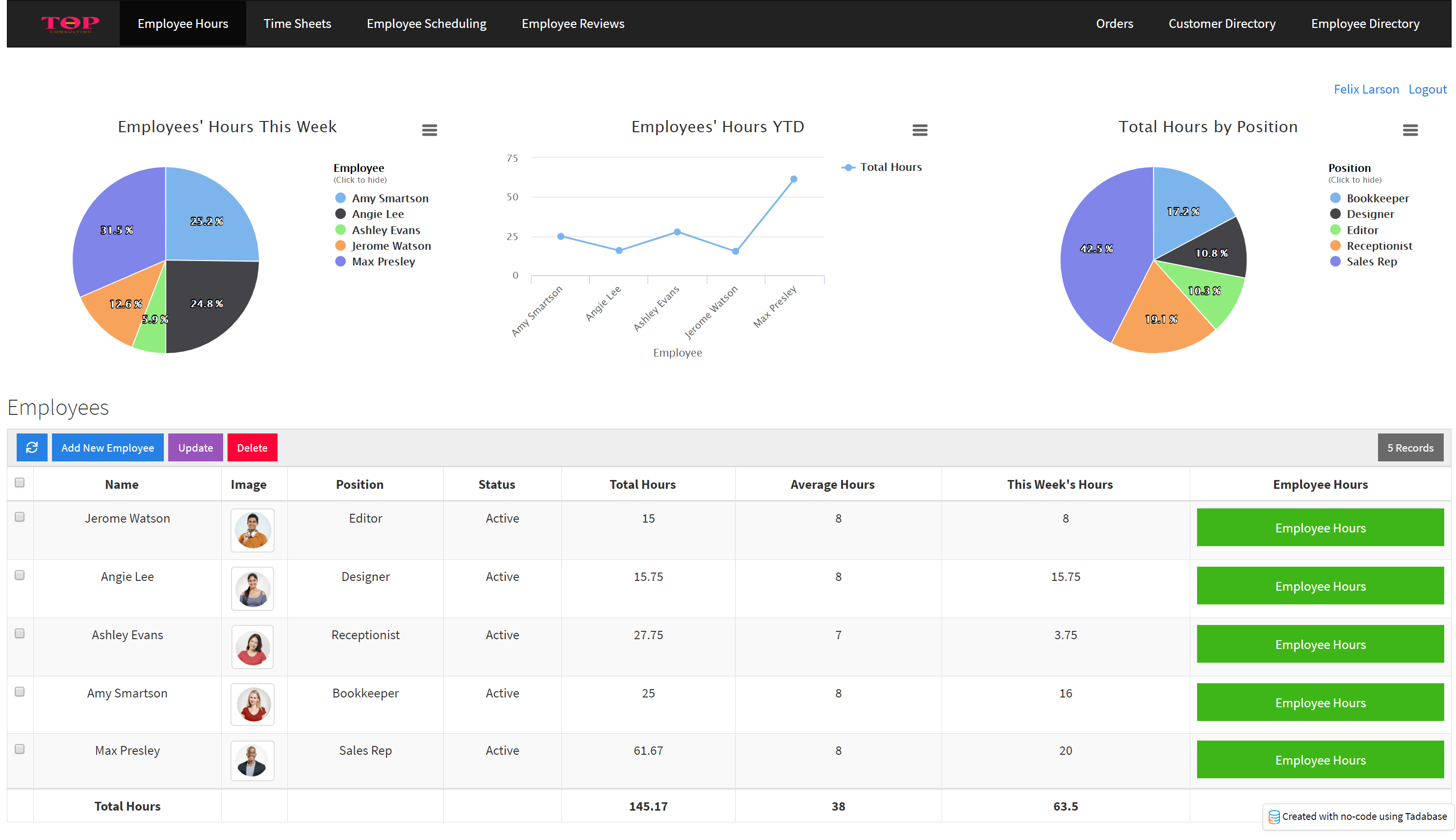
For instance, say you have a Time Sheet Application for employees to clock in and out and track their hours and for HR members to track all employees' hours. When employees login to your app to clock in/out and track their hours, you will likely want them to experience an entirely different app interface than what you present to HR members who login to your app. With layouts, you can create unique page structures including custom menus, headers, login pages, profile pages, etc. to create an Employee Portal exclusively for users assigned to an employee role. You can create an additional layout to customize an entirely different interface and app experience for users assigned to an HR role.
For instance, when employees login to your app they may see pages using the following layout:
And when HR members login to your app they may see pages using an entirely different layout:
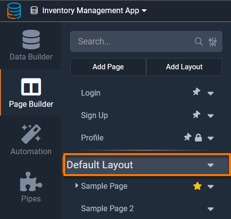
Within the Tadabase Page Builder, you can view all your app's Layouts as well as all the Pages assigned to each layout within your app's list of Layouts and Pages. Within this list, all pages assigned to a particular layout will be nested underneath that layout. Click on a layout to view or customize that layout's content.

The default layout
Each new app comes with a default layout that nests a default sample page. This default layout is the layout that applies to the sample page. Both the default layout and default sample page are included in each new app as samples to assist new beginners with getting started building their first apps, and both can be deleted at any time.
You can either delete the default layout or change its name as needed within the Settings tab of the default layout's navigation menu.

Adding new layouts
To add a new layout, click on the +Add Layout button at the top of your app's list of Layouts and Pages in the Page Builder.

A new window will pop up prompting you to name your new layout. Once you name the layout and click Save, the layout will be saved and added to your app's list of layouts and pages. To add content to this new layout, select the layout from the list of layouts and pages and the layout's content will appear.
Layout Content
You can view and add content to a layout within the Content tab of a selected layout's navigation menu. You can access a layout's content by selecting the layout from your app's list of layouts and pages in the Page Builder.

Within the Layout Content you can add rows, add columns within the rows, and add System Components within the columns to design your layout structure. Within a layout you can only add system components, such as menus, login components, sign up components, etc. but you can not add data components (forms, reports, charts, etc.).
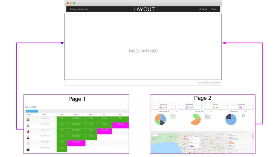
Each layout must contain a Page Container.
Page container
The page container is a required, built-in section of the layout that is designated for page(s) to be loaded into. The page container can not be removed but can be reordered on a page to appear above or below other rows within the layout.
When a user visits a page on your live app, the page will be loaded into the Page Container section of the assigned layout. If no layout is chosen, the page will be loaded on its own, independent of the layout.
For instance, the image below illustrates one layout which includes a page container and two pages which will each load within the page container of the layout. Additionally, you can see that the layout also includes a menu at the top which will be visible on all pages that use this layout.
Adding content to a layout
When you create a new layout, the layout content will appear with the following default content pre-populated on the layout page:

As you can see in the image above, each new layout comes with an included, irremovable default page container and underneath is an included default row with one column for you to add your first system component.
If you add a system component to the column below the page container, the system component will appear below the page container where the page(s) assigned to this layout will load into on the live app. Meaning, if you add a system component to the column below the page container in the Page Builder, the system component will display on the live app underneath the page container towards the bottom of the page.
For instance, if you would like to add a footer menu to the page(s) assigned to this layout, you could add a menu system component to the column below the page container. The pages assigned to this layout will load within the page container located above the menu system component, resulting in the menu displaying towards the bottom of the page(s) as a footer menu.
Alternatively, if you would like to add a header menu to display on the top of the page(s) assigned to this layout, you would add the menu system component within a column located above the page container.
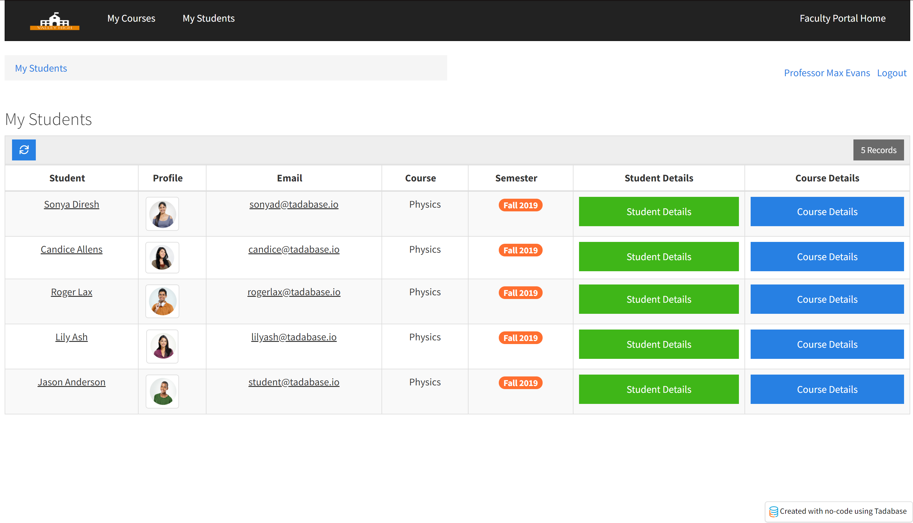
For instance, the Instructor Layout illustrated in the image below shows three system components added above the page container. The top row has one column with a menu system component and the row underneath has two columns- one with a breadcrumbs system component and the other with a user menu system component. Underneath those three system components is the page container.

Let's see how this Instructor Layout will display on the live app. As you can see in the image below, pages assigned to this layout will load within the page container with our three components displayed above the page. As you can see, at the very top is the menu system component, followed by the two columns with the breadcrumbs and user menu system components, followed by the page container which contains the actual page using this layout.
Alternatively, the following Student Layout illustrated in the image below shows four system components. This Student Layout is similar to the above Instructor Layout, except that it has an additional menu system component added within a column underneath the page container.
As you can see in the image below, pages assigned to this Student Layout will display on the live app with a menu at the very top, followed by breadcrumbs and user menu system components side-by-side underneath, followed by the page loaded into the page container, and then followed by the additional menu displaying underneath the page container as a footer menu.

Click here to learn more about adding rows, columns, and components.
Click here to learn more about system components.
Renaming Layouts
You can rename a layout within the Settings tab of the selected layout's navigation menu.
Deleting layouts
You can delete a layout by clicking on the layout within your app's list of layouts and pages, clicking on the settings icon to the right of the layout, and selecting the Delete option.
We'd love to hear your feedback.