Table Component
What is the table component?
The Table Component is a data component that you can add to pages within your app for users to track, update, and automate your data at a glance.

Adding table components
Like all other data components, table components can be added to a page within your app, specifically within a column on the page.
To add a table component to a page, go to the Page Builder and select the page onto which you wish to add the table component. Within that page's Content tab, click on the blue + icon within the column you wish to add the table and select the table component from the selector on the left.
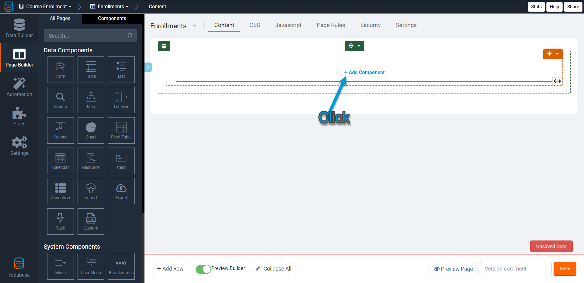
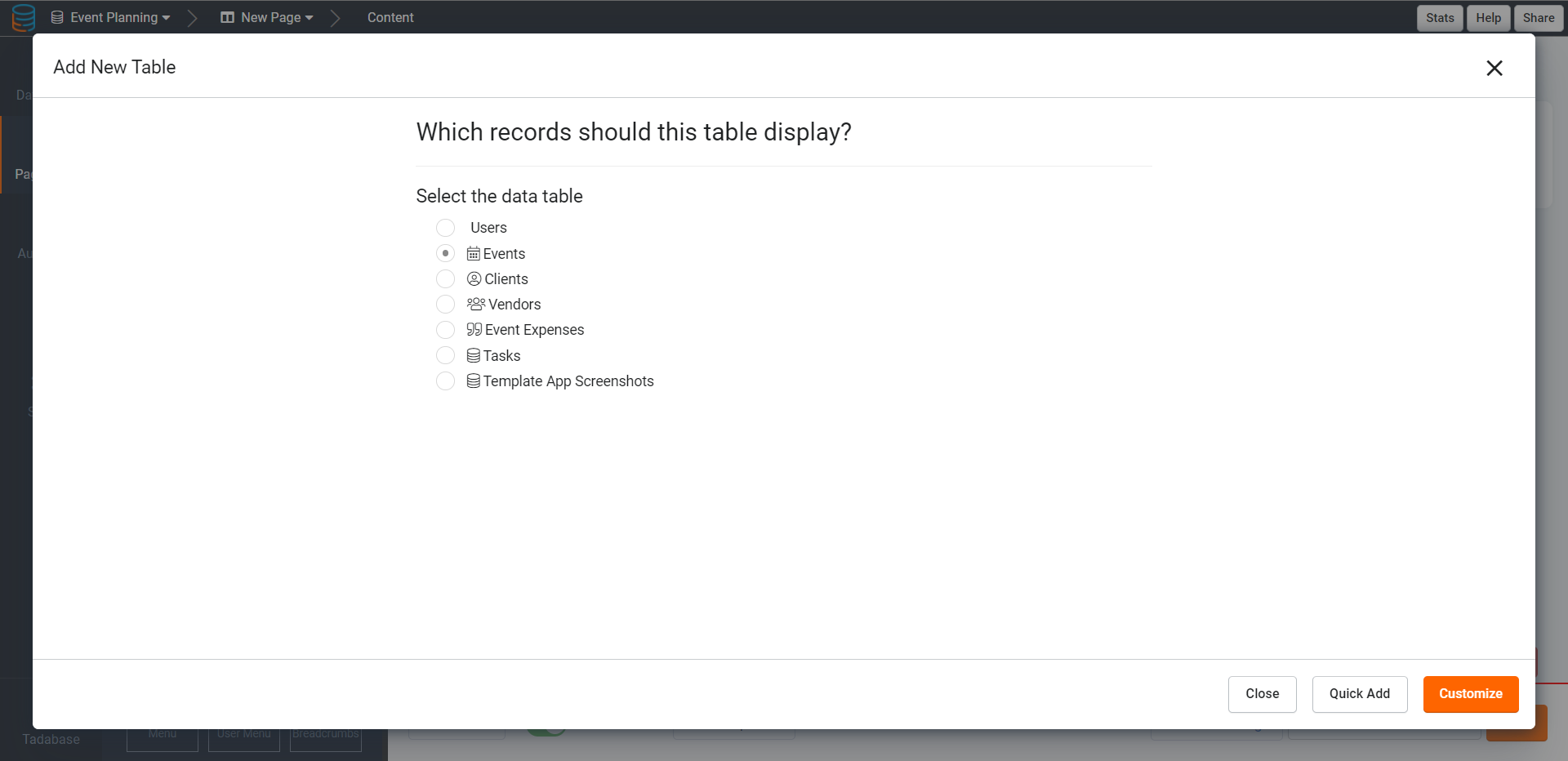
Once you click on the table component to add it to the page, you will be prompted to select the data table from which you want this table to display records.
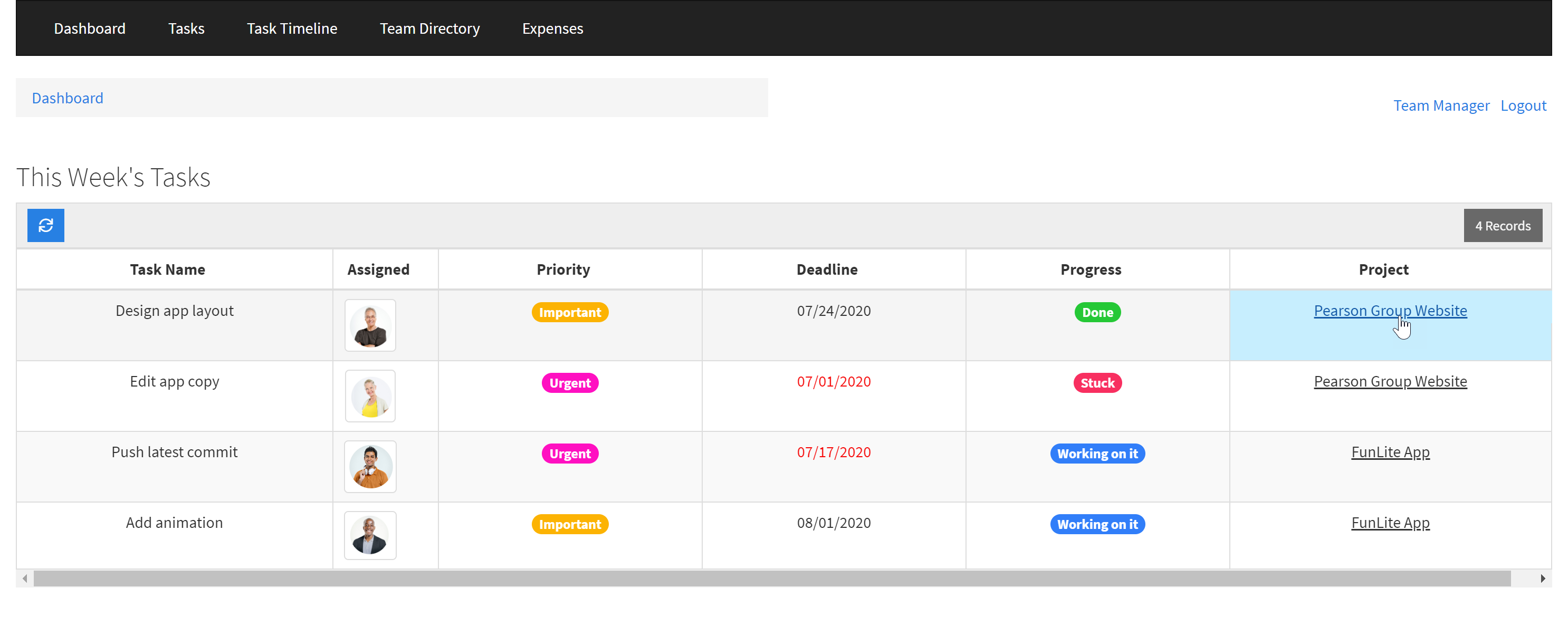
For instance, if you have an Event Management App and would like to add a table component to view records from the Events data table, select the Events data table and configure this table component using either the Quick Add or Customize option.
If you choose to configure this table component using Quick Add, you will have the option to select expedited table component settings, including adding a form to this table component to add new events and adding a link to this table component to view more details about each event. Items that you select to quick-add will be included within your new table component upon its configuration so that you do not have to manually add these items to the table at a later point. You can choose any or all quick-add options that meet your needs for this table component.

Using Quick-Add will also automatically add all fields within the selected data table to your new table component.

Alternatively, if you choose to configure this table component using the Customize option, you will not have the option to quick-add any items to the table component, rather you will be directed straight within the table component to manually select the fields you wish to add to the table.

To learn more about adding data components, selecting data tables, and configuring component settings with either Quick Add or Customize, please see the Data Component Overview article.
Adding fields
You can add fields to a table component by clicking on the selected fields within the Fields tab located on the left-side menu of the table component. When you click on a field from the Fields tab, it will be added to the table as a new column.

As you can see in the image below, columns listed within the table component preview in the Builder will display exactly so within the table component on the live app.
If you hover over a column, you will see a move icon which you can use to drag that column to the right or left to its new location within the table component. Moving a column to a new location will change its location on the live app as well.

Adding connected field values
Connected fields are fields from a data table that is connected to the current table component's data table. You can add Connected Fields to a table component to enable users to view those connected values within the table.
Connected fields are read-only, and while their values will be dynamically updated within a table component, they can not be directly updated or edited by users within the table component.
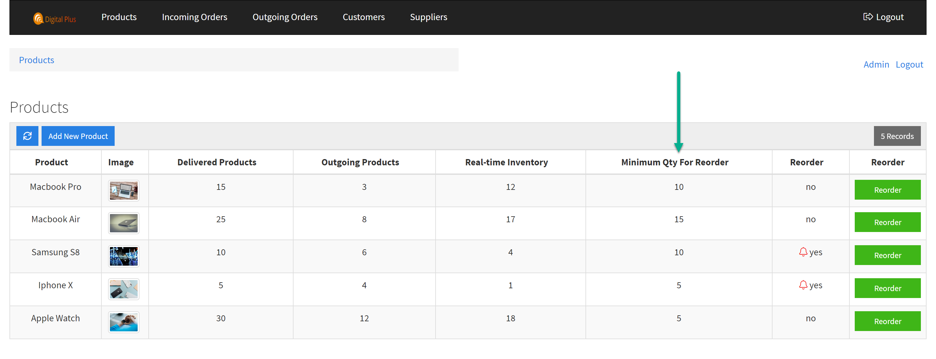
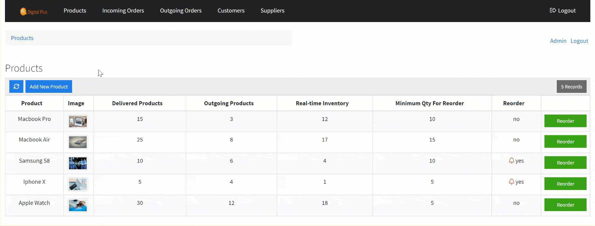
For instance, say you have an Inventory Tracking App with three data tables:
- Products data table- tracks the products with fields including Product Name, Product Image, and a basic formula field to calculate the Real-time Inventory of each product (incoming orders - outgoing orders).
- Incoming Orders data table- tracks incoming orders with fields including the incoming product, the incoming quantity of each product, and the delivery status of each incoming order. This data table is connected to the Products data table using the Product Name connection field.
- Outgoing Orders data table- tracks outgoing orders with fields including the outgoing product, the outgoing quantity of each product, and the customer receiving each outgoing product. This data table is connected to the Products data table using the Product Name connection field.
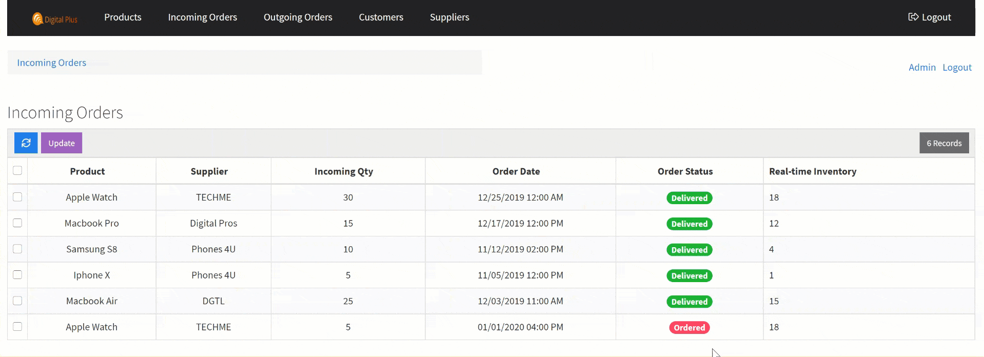
Now, say that you want to add the real-time inventory field from the Products data table to the Incoming Orders table component. You can do this because the Products data table and the Incoming Orders data table are connected. The real-time inventory field would be added as a connected field within the Incoming Orders table component and can be added from the Connected Fields tab within the Incoming Orders table component.

This real-time inventory connected field would be for viewing purposes only within the Incoming Orders table component, and while its values will be dynamically updated when other field values are updated, users will not be able to directly update this connected field value within this table.
For instance, as you can see in the gif below, when an incoming order's Order Status is updated to Delivered, the real-time inventory connected field value for that incoming order is dynamically updated and users can view that connected value within the table.
You can add connected field values to a table component by selecting them from the Connected Fields tab located on the left-side menu within the table component. When you click on a connected field from the connected field list, it will be added to the table as a new column.
Adding links
You can add links to a table component by selecting them from the Links tab located on the left-side menu within the table component. Clicking on a link within the Links tab will add that link as a new column within the table component.
As we discuss links extensively within its own article, please view the Links article to learn more about the six types of links you can add as columns within your components.
Customizing table columns
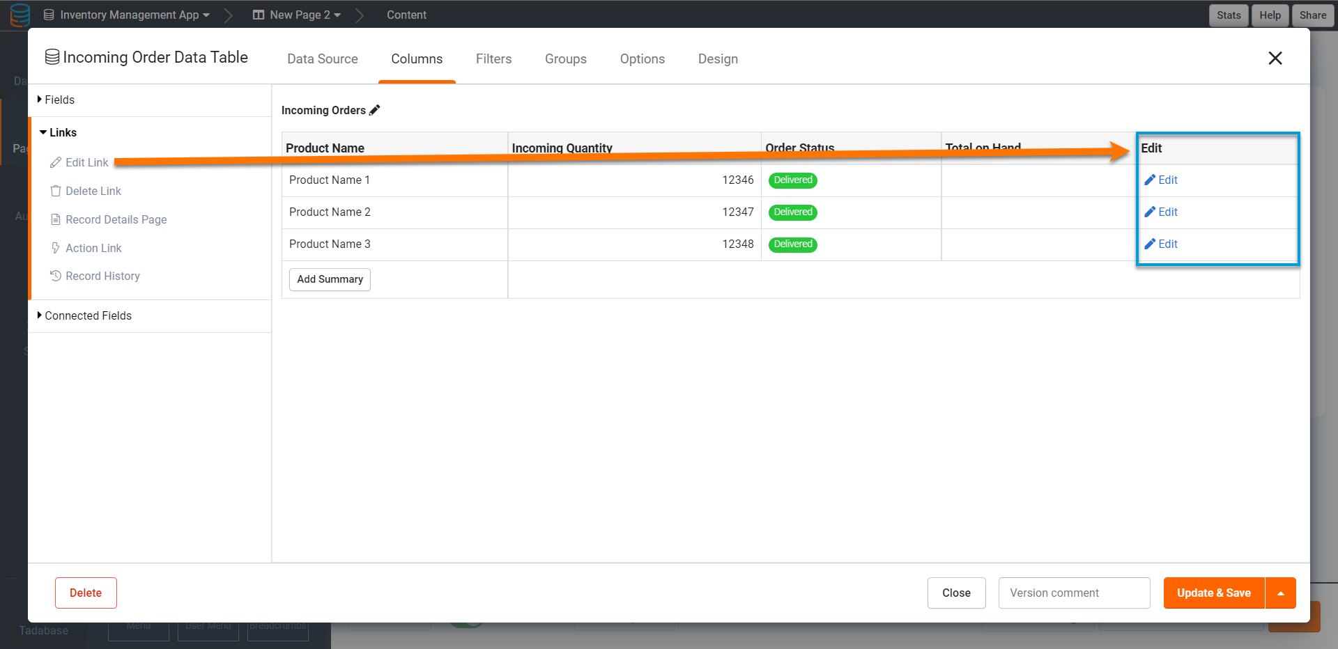
Whether you add a regular field, a connected field, or a link as a new column within your table component, you can customize each column within the table component by double-clicking on it.
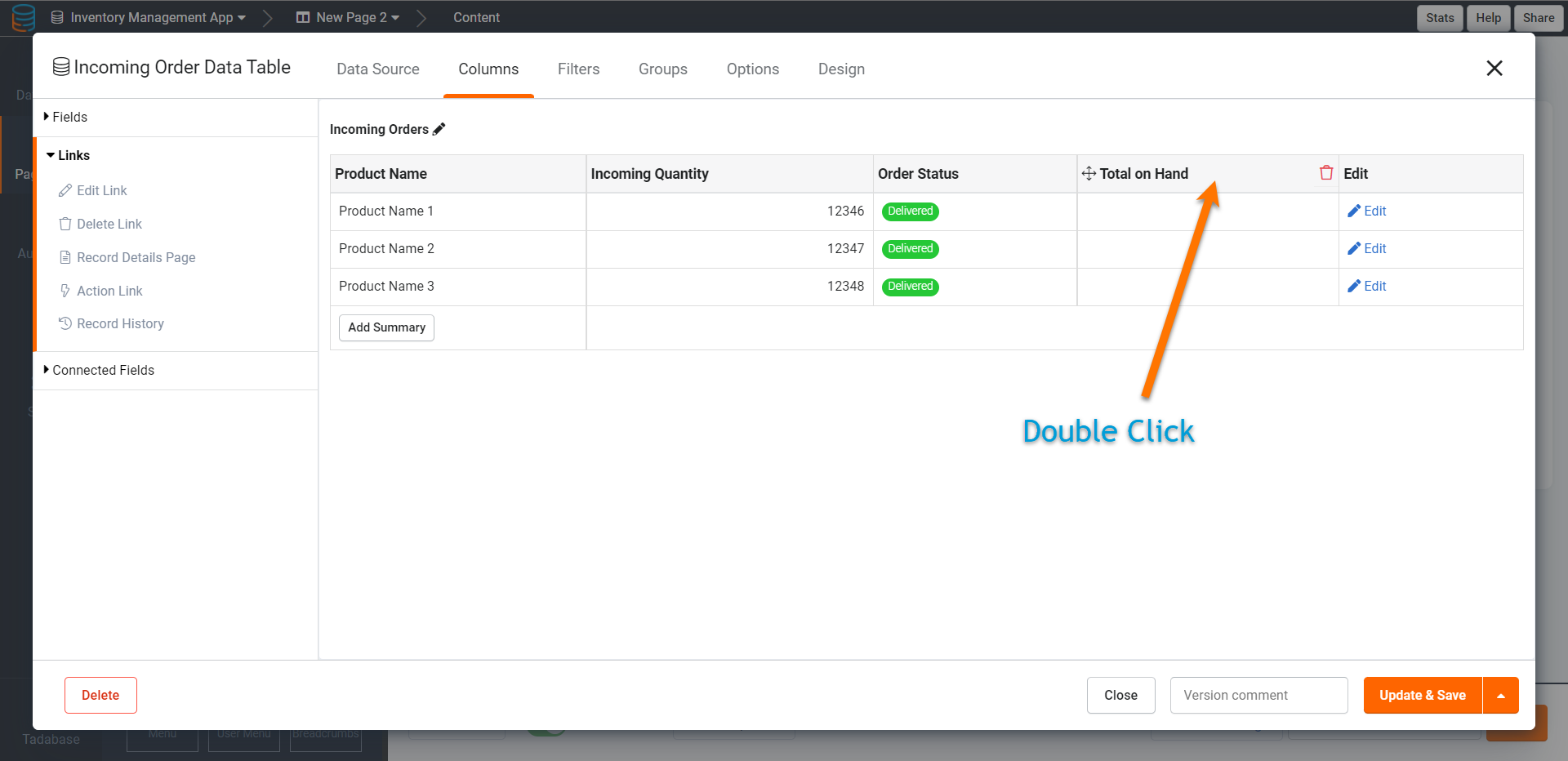
Double-clicking will direct you to that column's Edit Column page where you can customize all of that column's settings including its title, its formatting style, its display rules, etc. Each column's Edit Column page comes with three tabs- a General tab, a Format Tab, and a Display Rule tab- where you can customize each of the column's settings.
When adding Action Links to a table component, the action link columns come with a fourth tab- the Action Rule tab- where you can customize each action link column's action rule(s).

As we discuss Action Links extensively within the Links article, please click here to learn more about action links and adding them to components.
For the purpose of this article, we'll continue to discuss the column customization settings you can customize within the General tab, Format tab, and Display Rules tab of each column's Edit Column page.
General column settings
Within the General tab of each column's Edit Column page, you can customize several general settings which we will discuss below.

Let's first discuss the basic settings within the General tab, after which we will discuss the unique general customization settings that are dynamically available for specific field types.
Column title
Within the Edit Column page > General Tab > Title setting of any column, you can customize the column's header/title text.
By default, when you add a field or link to a table component, the column header/title will display with the same name as the field/link.
For instance, if you add the Minimum Required For Reorder field to the Products table component, this field column will display with a header titled "Minimum Required For Reorder" at default.

If you wish to change this field's column header title to "Minimum Quantity For Reorder", you can enter the new header title within the Title setting.

Once you save this change, the new column header title for the Minimum Qty For Reorder field will be changed to "Minimum Quantity For Reorder".

And on the live app, this customized column header title will apply for this column.
Hide title
Within the Edit Column page > General Tab > Hide Title setting of any column, you can choose to hide the column's header/title.
For instance, if you wish to hide the header for the Reorder link column within the Products table component, toggle the Hide Title setting from No (default) to Yes.
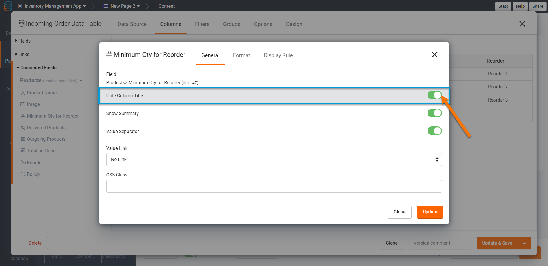
On the live app, the Reorder link's column header will be hidden.

Column inline editing
For Column inline editing first Inline editing must be enabled within the table component's Options tab > Enable Inline Editing setting in order to enable inline editing for individual columns within that table component.

Click here to learn more about first enabling inline editing for the table component as a whole.
Please view the Inline Editing article for an extensive overview of the inline editing feature.
Within the Edit Column page > General Tab > Allow Inline Editing setting of any column, you can choose to enable or disable the ability to edit a column's values inline.
When inline editing is enabled for a column, you can simply click on any value within that column on the live app and edit that value immediately, on the fly, without having to use an edit form or edit the value within the Builder.
For instance, if you have a Product field column within a Products table component, you can enable inline editing for this product field column by enabling the Allow Inline Editing setting.

Now, users can simply hover over any value within the Product field column and edit that value inline.
You can enable inline editing for certain columns within a table component and disable inline editing for other certain columns within the same table.
The above-mentioned general column customization settings located within the General tab of a column's Edit Column page are universal to all field and link columns added to a table component. There are, however, some general column customization settings that are unique to certain fields and links that will only appear as options within the Edit Column page > General tab of those specific field and link columns.
Let's explore these unique general column customization settings below.
Number field settings
Number field columns have a unique customization setting within the General tab of their Edit Column pages. Let's discuss this unique setting specific to number field columns.
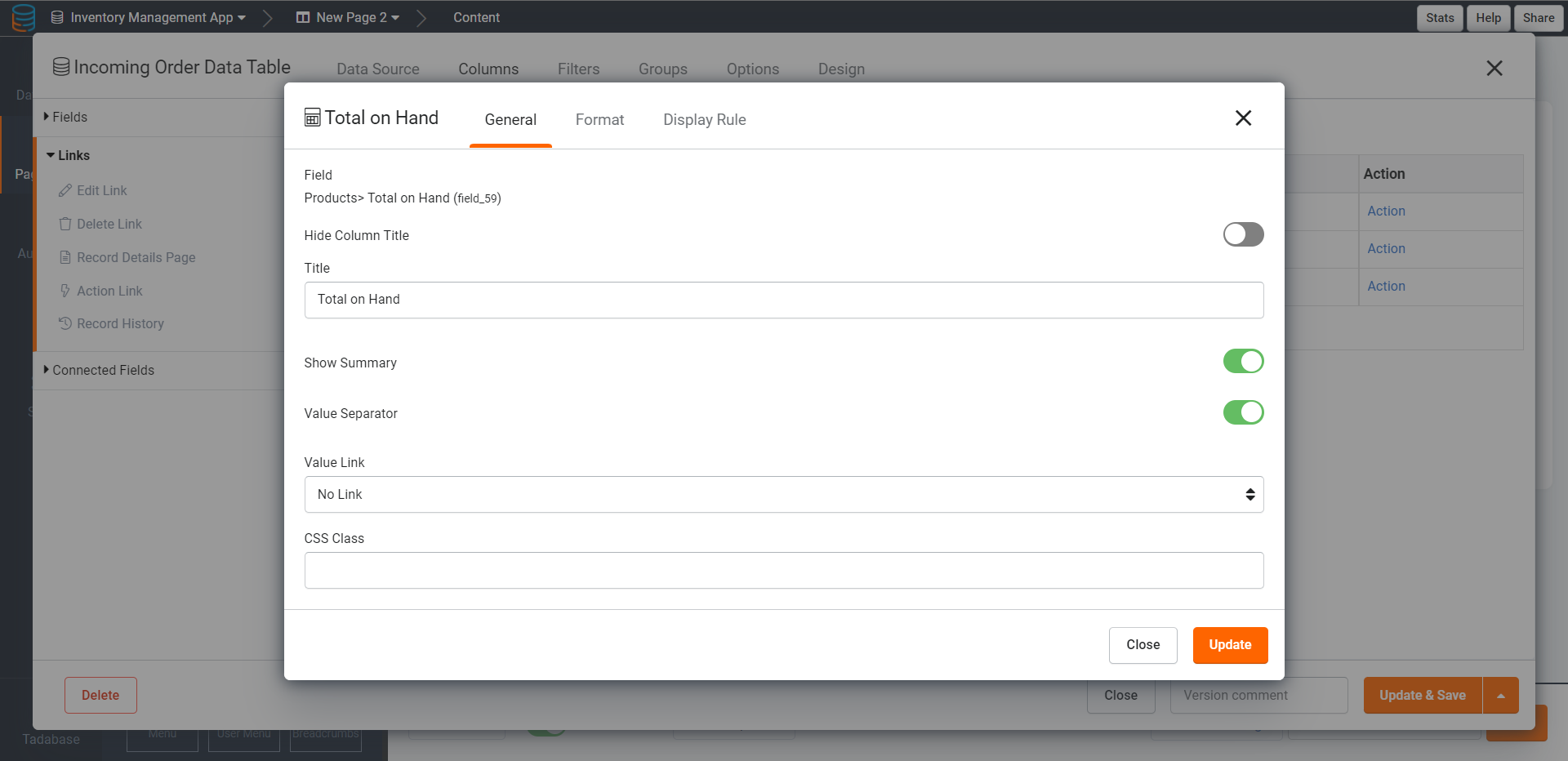
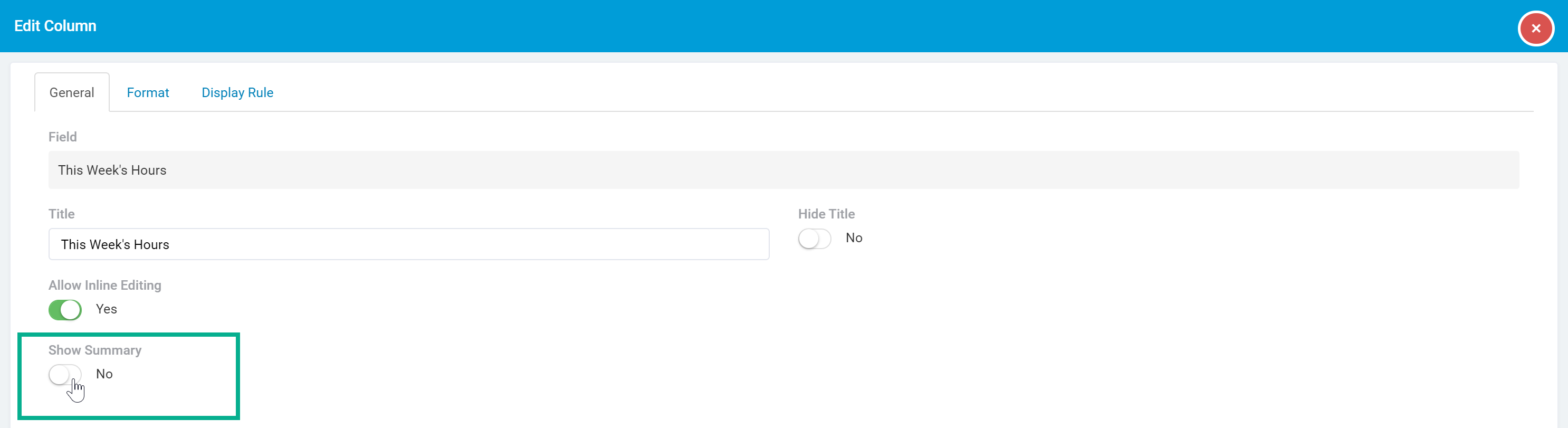
Show Summary
When Summaries are enabled within a table component
a summary row will display at the bottom of the table component to calculate the sum, average, minimum, or maximum of any number field type columns within the table.
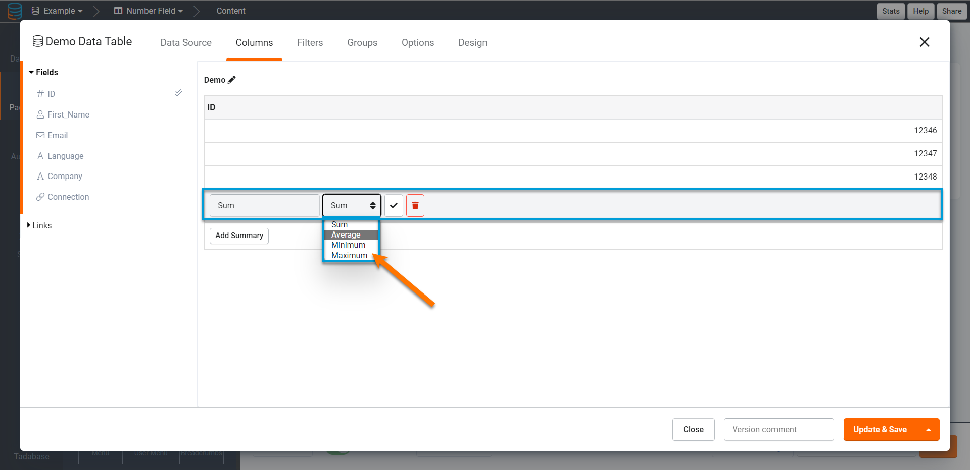
For instance, say summary row has been enabled to calculate the total sum of all number field type columns within this table component. On the live app, this summary row will be added to the Products table component and will display the total sum of all number field type columns within this table.

When Summaries are enabled for a table component, you can then enable or disable each number field type column's ability to be included within the summary row.
For instance, if you wish to disable the "Minimum Qty For Reorder" number field column from being calculated and included within the Products table component's summary row, go to the Column Tab > Number field > General Tab > Show Summary setting for the Minimum Qty For Reorder column and toggle the Show Summary setting to No.

Now, the Minimum Qty For Reorder column will not be calculated and displayed within the Products table component's summary row.

To calculate and display the Minimum Qty For Reorder column within the table's summary row, simple toggle the Show Summary setting to Yes.
Enabling the Show Summary setting for a column will have no impact if you have not first enabled a Summary Row within the Filters and Groupings tab of the table component. Click here to learn how to enable summaries within a table component's Filters and Groupings tab.
Rating field settings
Rating field columns have a unique customization setting within the General tab of their Edit Column pages. Let's discuss this unique setting specific to rating field columns.
Rating output
Choose if you would like to display the rating via its relative icon value or via a number value.

If you select an icon output, the rating will be displayed with the specific icon and icon color you selected when you originally created this rating field within the Data Builder.
If you select a number output, the rating will be displayed as a number value.

Click here to learn more about creating rating fields and defining their icon values within the Data Builder.
Slider field settings
Slider field columns have a unique customization setting within the General tab of their Edit Column pages. Let's discuss this unique setting specific to slider field columns.
Slider output
Choose if you would like to display the slider value as a number or as a progress bar.

If you select the number option, the values within the slider field column will display as a basic number value.

If you select the progress bar option, you will then be able to customize how the progress bar should display, including if the progress bar should display as a solid bar or as a striped bar, the default color of the progress bar, and optional color rules to display the progress bar with custom colors based on certain values.

On the live app, values within the slider field column will display with the above progress bar settings.

Click here to learn more about creating slider fields in the Data Builder.
Connection field settings
Connection field columns have unique customization settings within the General tab of their Edit Column pages. Let's discuss these unique settings specific to connection field columns.
Set value link
When using a connection field within a table component, you can choose whether to display the connection field values as links to, child pages connected to that connection field. You will do this within a table in a child page after creating a details link in the table of a parent page.
For instance, within a Tasks table component, you can add a Project connection field to the Tasks table to display the connected project that each task belongs to.
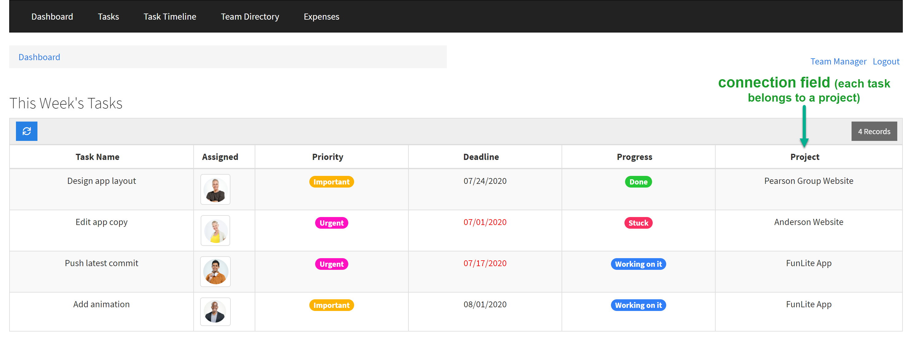
Within the table component of the child page select the Connected Field > General Tab > Value Link setting of the Project connection field column, you can choose to change the display of the project field values for each task from "No Link" (default) to a link to a connected child page, such as the Project Details Page.

Now, each task's connected project will be displayed as a link that, when clicked, will direct users to the details page of that task's project.
Value separator
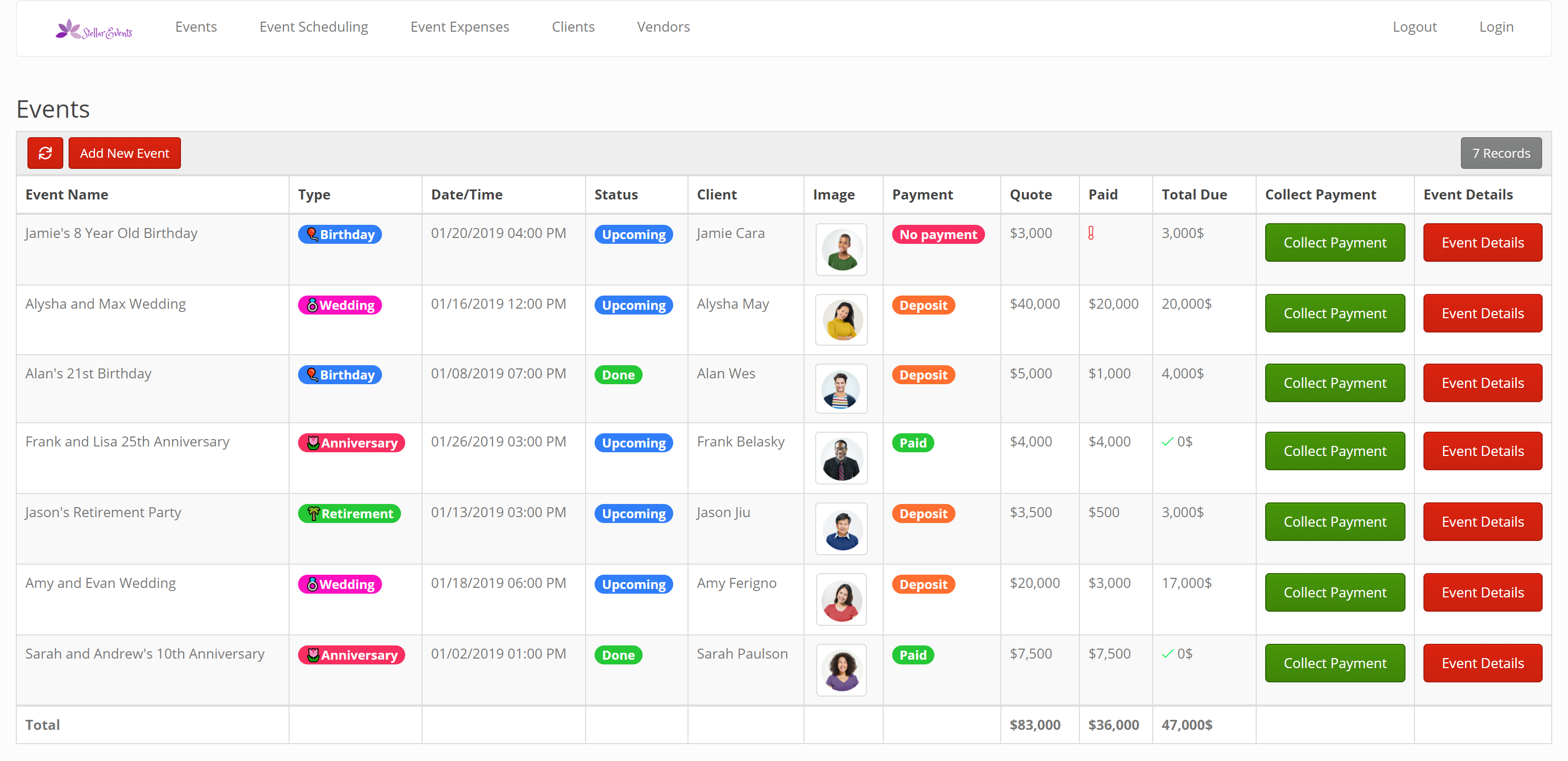
If the connection field that is added to the table component has a connection of one-to-many, you can choose if each connected value should be separated via commas or displayed each on a new line.

For instance, if you have an Events data table with a one-to-many connection to the Performers data table (each event has one or more performers), you can add the Performers connection field within the Events table component to display the performers booked for each event.
Within the Edit Column page > General Tab > Value Separator setting of the Performers connection field column, you can choose to separate the multiple performers selected for each event by displaying them each on a new line, as illustrated in the Events table component below.
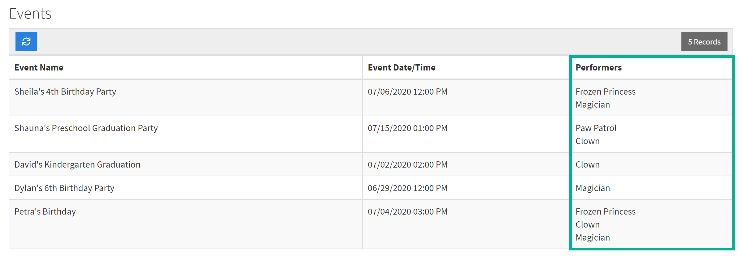
Choosing a comma value separator would separate each performer via a comma rather than separating each on a new line.
Format column settings
The second tab of each column's Edit Column page, the Format tab, is where you can customize each field or link column's format settings.
Let's first discuss the basic formatting settings within the Format tab, after which we will discuss the unique formatting settings that are dynamically available for specific field types.
Column width
By default, each column within a table component is set to an auto-defined width.

Within a column's Edit Column page > Format tab > Column Width setting, you can set a custom width for that specific column.
You can set a custom width of either pixels or percent.

Column alignment
Choose a left (default), center, or right alignment for each column.

For instance, if you center the alignment for each column within a table component, each column and its contents will be centered as such:

Now that we have discussed the format settings that are universal to all columns, let's discuss the unique format settings that are dynamically available only for specific field types within the Format tab.
Email field settings
Email field columns have a unique formatting setting within the Format tab of their Edit Column pages. Let's discuss this unique formatting setting specific to email field columns.
Email display format
Choose to display email values as a link or as plain text.

For instance, if you select Link, email values will display as a clickable link.

Address field settings
Address field columns have a unique formatting setting within the Format tab of their Edit Column pages. Let's discuss this unique formatting setting specific to address field columns.
Link to Google Maps
Choose if address values should display as a link that, when clicked, will direct users to Google Maps.

If "Yes" is selected, address values will display as a link that, when clicked, will open the address within Google Maps in a new browser window.

Date field settings
Date field columns have unique formatting settings within the Format tab of their Edit Column pages. Let's discuss these unique formatting settings specific to date field columns.
Date format
While you can set your app's overall date formatting settings within the Settings tab of your app's main navigation menu, you can choose to override the app-wide date format settings and set a custom date format for specific date or date/time field columns within a table component.
If you wish to set a custom date format for a specific date or date/time field column within a table component, select your desired date format within the Edit Column page > Format tab > Date Format setting.

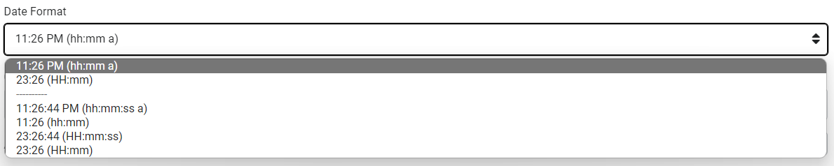
Time Format
While you can set your app's overall time formatting settings within the Settings tab of your app's main navigation menu, you can choose to override the app-wide time format settings and set a custom time format for a specific date/time field column by going to that column's Edit Column page > Format tab > Time Format setting.
Date Output Format
By default, date fields and date/time fields are displayed as basic dates and times. However, you can choose to display date and date/time field columns as age values or as stopwatch values rather than as basic dates and times.
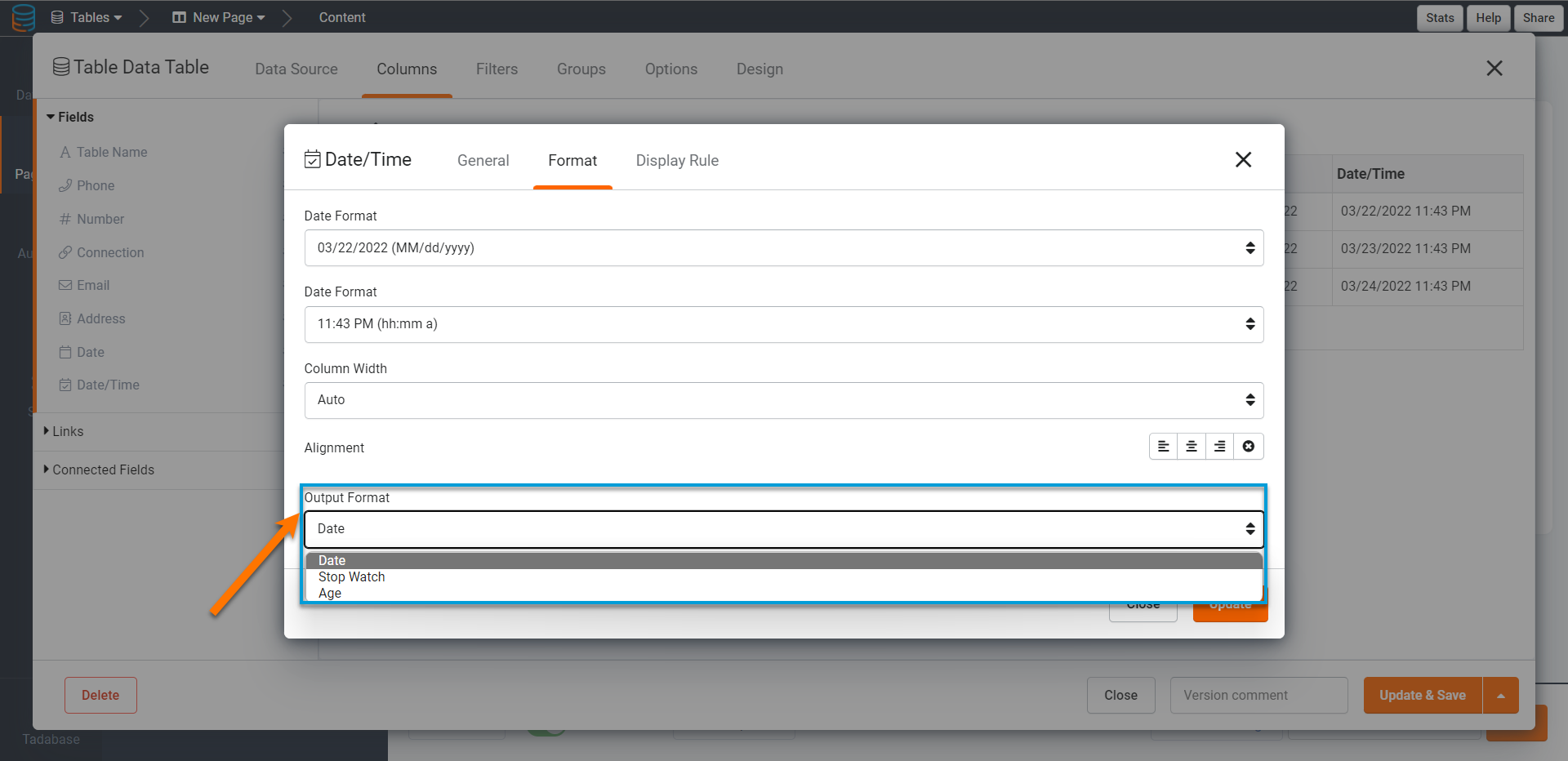
For instance, if you have a Listings table component with a Listing Expiration date/time field column, you can select an Output Format setting of Stopwatch to display the date/time values within this specific column as a stopwatch/countdown.

Or, within the On Market Since date/time field column, you can select an Output Format setting of Age to display the date/time values within this specific column as an age.

Alternatively, if you were to select an Output Format setting of Date for these two columns, both column values would be displayed as regular date/time values.

When selecting an Output Format of Age, you can also customize whether to include the month and/or days within the age output.

The image below displays the difference between a basic date value, its display as an age, its display as an age with included months, and its display as an age with included months and days.

Option field settings
Option field columns, such as Radio fields, have a unique formatting setting within the Format tab of their Edit Column pages. Let's discuss this unique formatting setting specific to option field columns.
Option format
If you have an option column that can have multiple options selected, you can choose to display each selected option by separating each option on a new line or by separating each option inline with commas.

For instance, if you choose to separate multiple Listing Type options via new lines, each selected listing type will appear on a new line.

Link format settings
As discussed extensively within the Links article, you can customize the formatting settings of link columns added to your table components within the Edit Column pages > Format tabs of link columns.

For instance, you can format links as buttons within their Format tabs.

Which will display the link column as such:
Please view the Links article for a comprehensive guide on how to add and customize links.
Display Rules
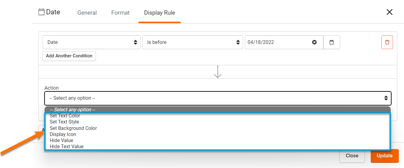
The third tab of each column's Edit Column page, the Display Rule tab, is where you can add each field or link column's display rules.
You can create Display Rules within a column to show/hide the field values within that column or display the field values with custom display options if custom-defined conditions are met.
For instance, if you have a Project Management App with a Tasks table component, you can create a display rule within the Deadline field column to display past deadlines in red text with a red alert icon.
Within the Tasks table component on the live app, any past deadlines will display with the above display rule.

As we discuss Display Rules extensively within its own article, please view the Display Rules article to learn how to create display rules within each column.
Please Note: When validating display rules against other fields, those fields must be present in the table component.
Customizing table components
While we have so far discussed how to customize the columns within a table component, let's now discuss how to customize table components as a whole, including table filters and groupings, data source filtering, and advanced table options.
Within a table component, you can customize these three table-wide settings within their respective tabs that can be found on the left-side menu of each table component.

Let's discuss each of these table-wide settings, beginning with the Data Source tab.
Data Source
The Data Source tab of each table component is where you can filter and sort which records should be displayed in this table component using "server-side" filtering.
Data source filtering
By default, all records from a table component's data table will be displayed within that table component. However, you can filter which records should be filtered through to be shown in the table by clicking the Add Filter Group button and adding a server-side filter.
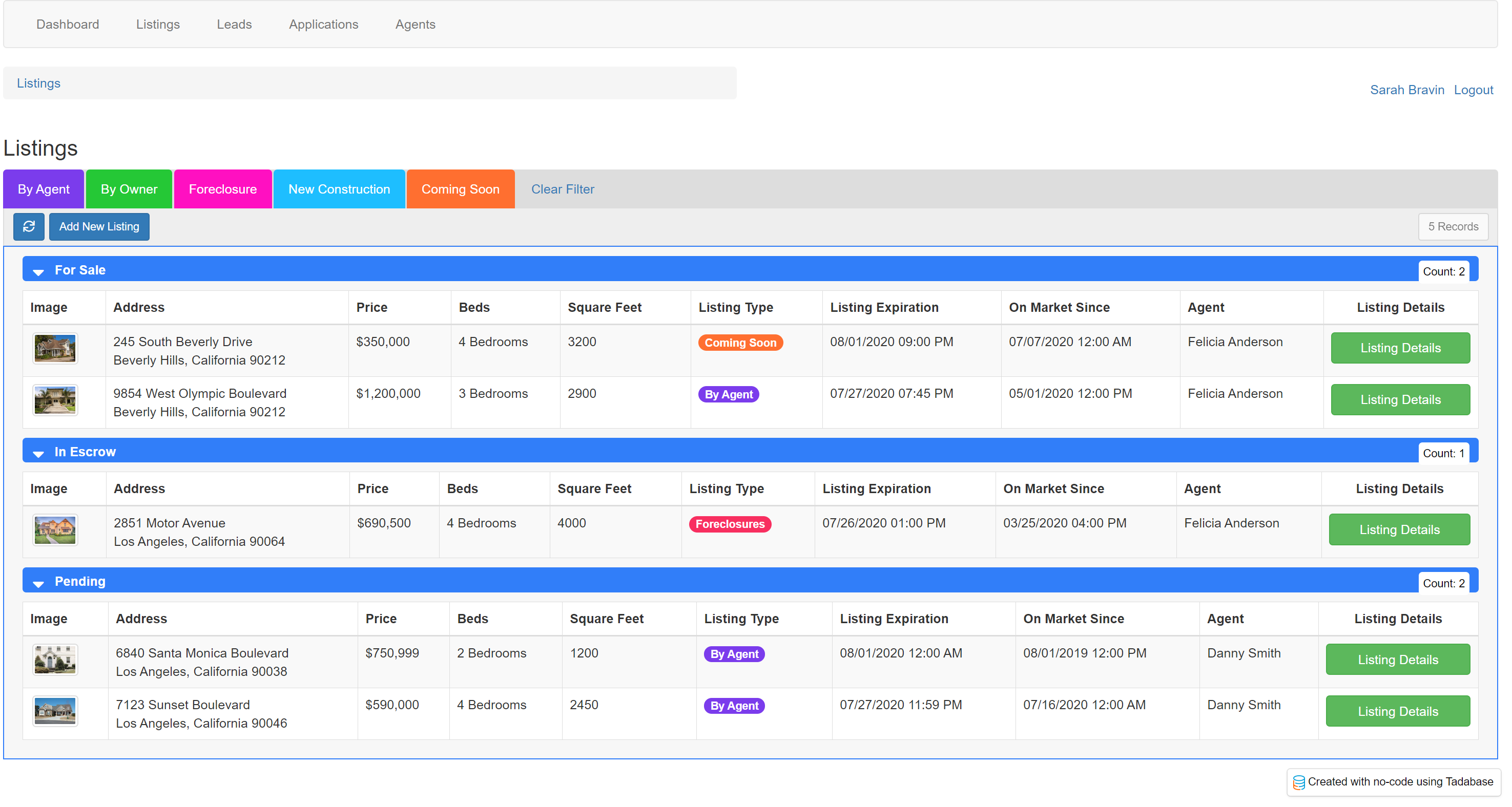
By default, all listing records within the Listings data table will be displayed within this Listings table component. However, if you wish to filter this table to exclude Sold listings, click on the Add Filter Group button and create a filter to only show listings with a status that is not sold.
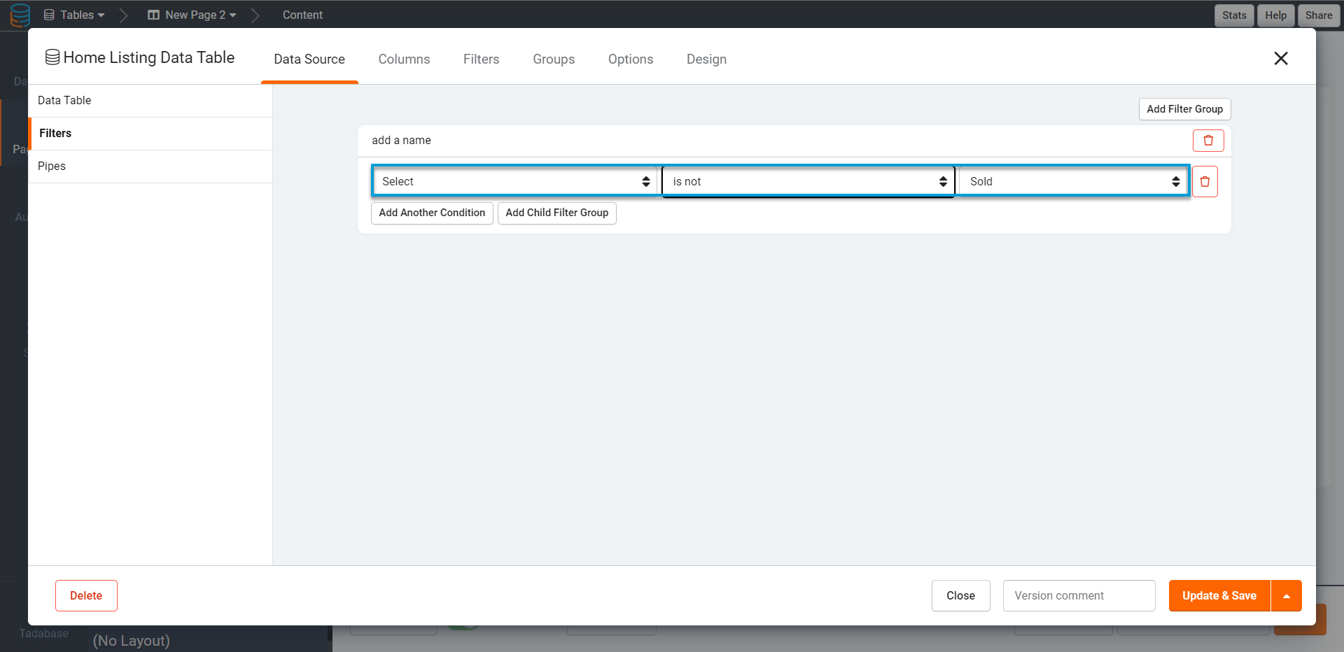
Now, Sold listings will be excluded from displaying within the Listings table component.
You can add multiple conditions within one filter group by clicking the +icon to the right of each existing condition. For instance, you can create a filter to only show listings with a status of For Sale and a listing price of under $2,000,000.

Now, only listings that are For Sale and asking under $2,000,000 will be filtered through and displayed in this Listings table.

You can create multiple filter groups by clicking on the Add Filter Group button beneath each existing filter group.
Data source sorting
Within the Data Source tab of each table component, you can also set a custom sorting method for the records that will be filtered through and displayed within the table.
For instance, within a Listings table component, you can create a custom sorting method to sort listing records by descending order of listing price.

Now, the listing records will be displayed in descending order of their listing price.

If you have groupings applied within your table component, the sorting method you specify will apply within each grouping category. For instance, if a Listing Status grouping is applied to the Listings table component, the listing records will be sorted in descending order of their listing prices within each group/status category.

Click here to learn more about table groupings.
For a more comprehensive discussion of data source filtering, please view the Data Source article.
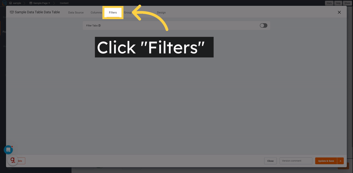
Filter Tabs
Creating Filter Tabs
To create front-end filters for a table component, toggle the Filters setting from Disable (default) to Enable and create your first filter tab.
Filter Tabs must have a title!
 |
You can select a color tag for each filter tab to color-code the filter tabs within the table component. You can add additional filter tabs by clicking on the Add New Tab button beneath each existing tab. When the page first loads, none of the filter tabs will be chosen by default. To set a specific filter tab to be applied by default when the page loads, click on the Set Default button for that specific filter tab.
 |
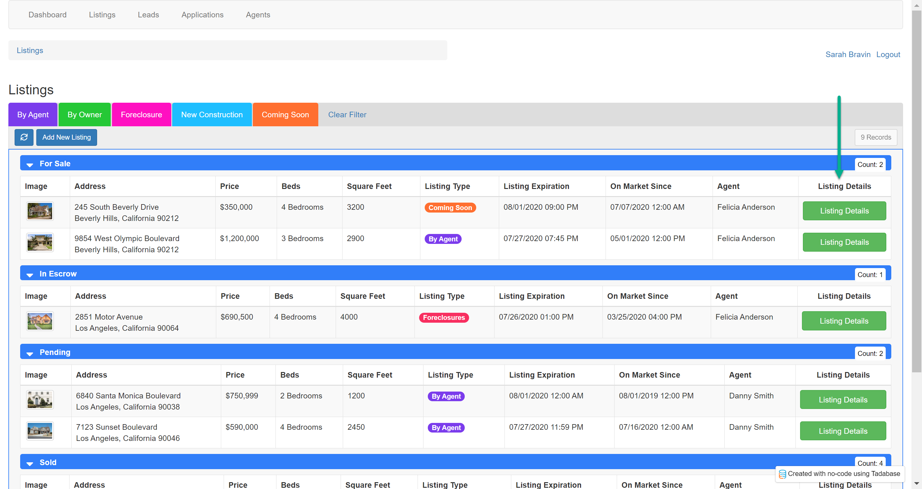
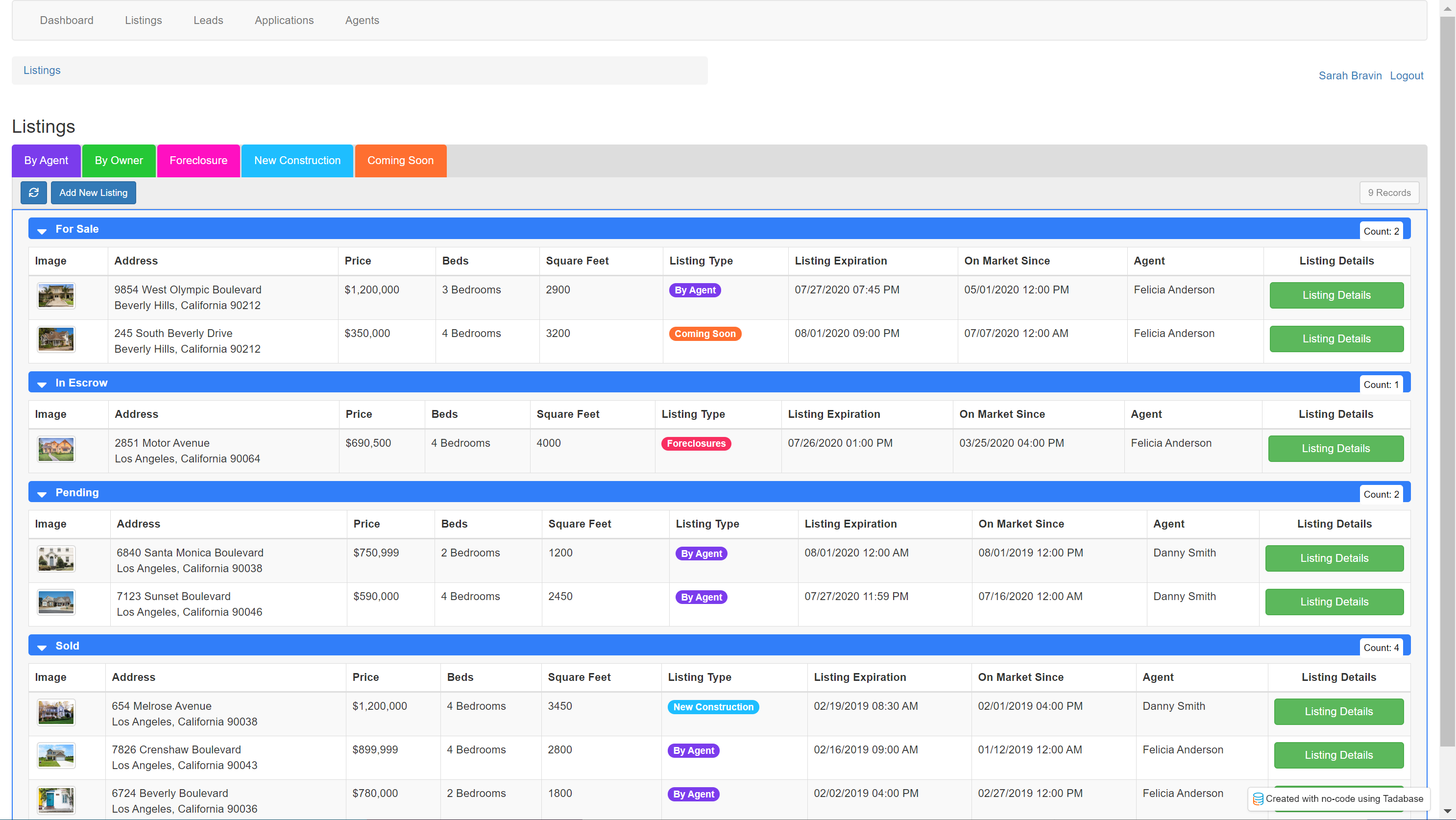
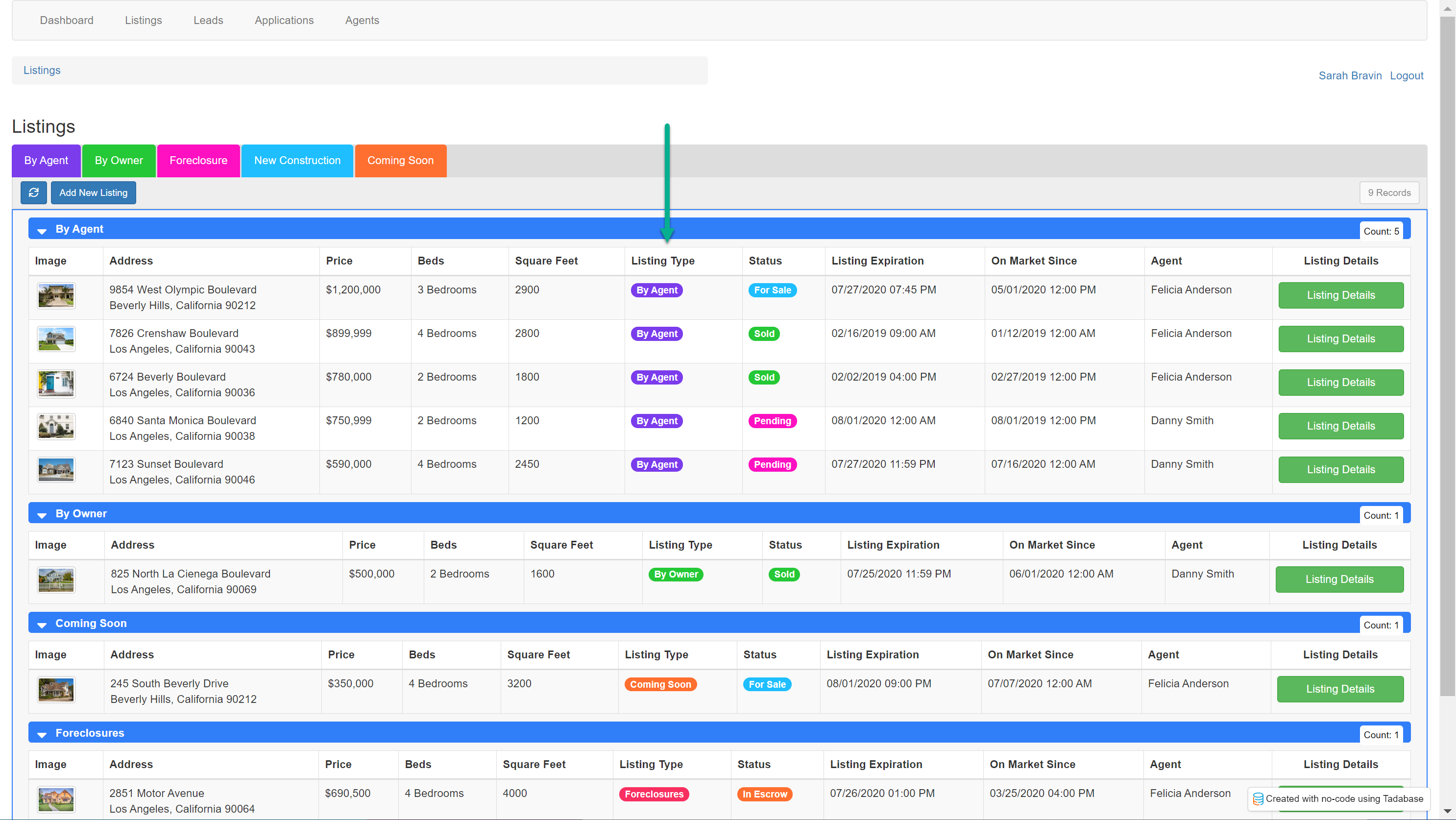
For instance, within a Listings table component you can create filter tabs for each Listing Type as demonstrated below. Each filter tab has a tab title name of By Agent, By Owner, Foreclosure, etc. and a condition to show only records of each listing type within each filter tab. Each filter tab is also assigned a color tag to color-code the filter tabs.

If you wish to hide specific columns from being displayed when a particular filter tab is selected, enter or select those columns within the Hide Columns setting. This can be useful for certain filter tabs where some columns do not need to be visible.

On the live app, the Listings table component will now display these front-end filter tabs for users to filter records by Listing Type when a filter tab is selected.

Filter Tab Settings
Hide Clear Filter Tab
You may hide the Clear Filter tab in the Filter Tab settings menu
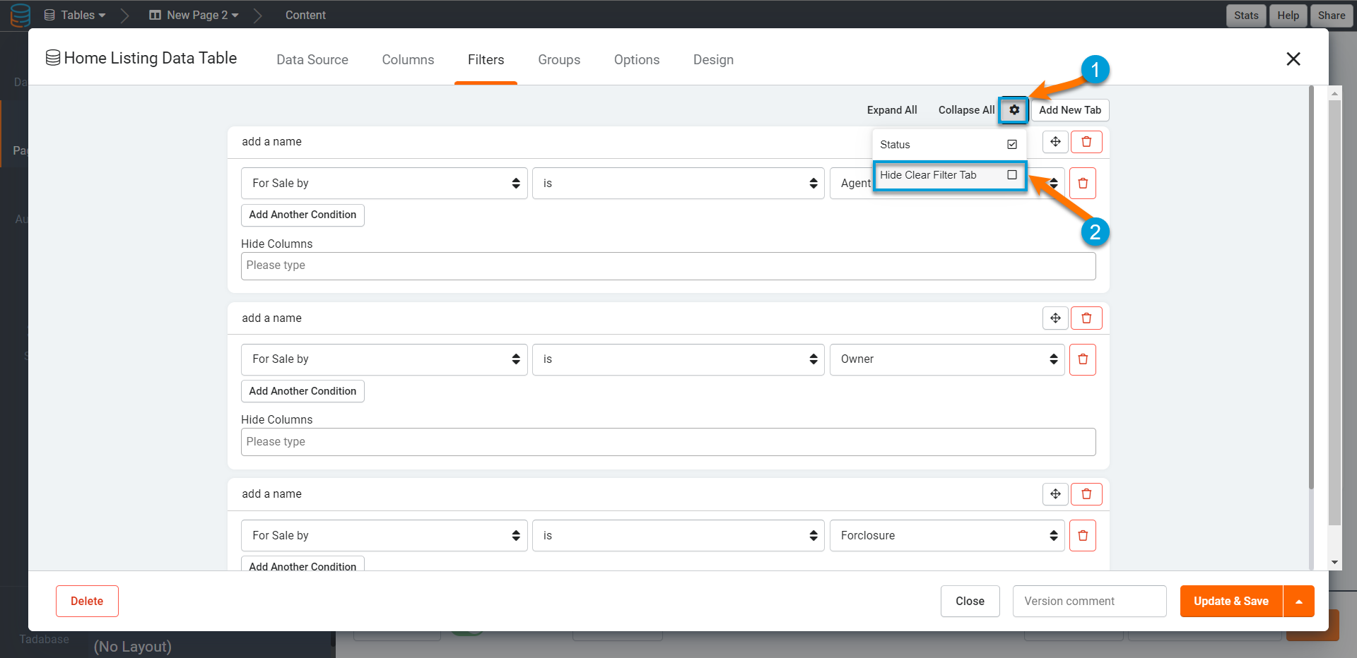
Show as Dropdown
You may convert the Filter Tabs to display as a dropdown menu in the Filter Tab settings menu.
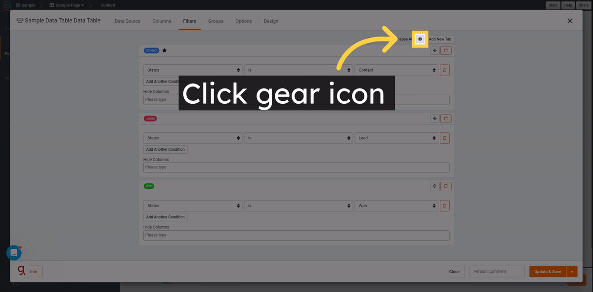 |
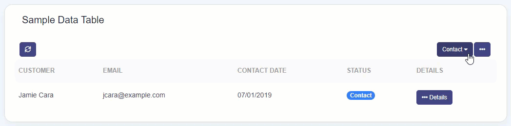
Table groupings
Within the Filters and Groupings tab of each table component, you can also create custom groupings to group and sub-group records within the table.
To create a group, click on the Add Group By Item button and select the group-by field by which to group records within the table component.

For instance, if you have a Listings table component, you can create a group to group records by Status. You can also enable a color for this group.

Now, the Listings table component will be grouped by listing status with the groupings color-coded in blue.
You can also create sub-groups to group records within an existing group. To create a sub-group, click on the Add Group By Item button beneath the existing group and add an additional group.
For instance, within the Listings table component above, you can add another group to sub-group the listing records by the number of bedrooms. You can color-code this sub-group in red.

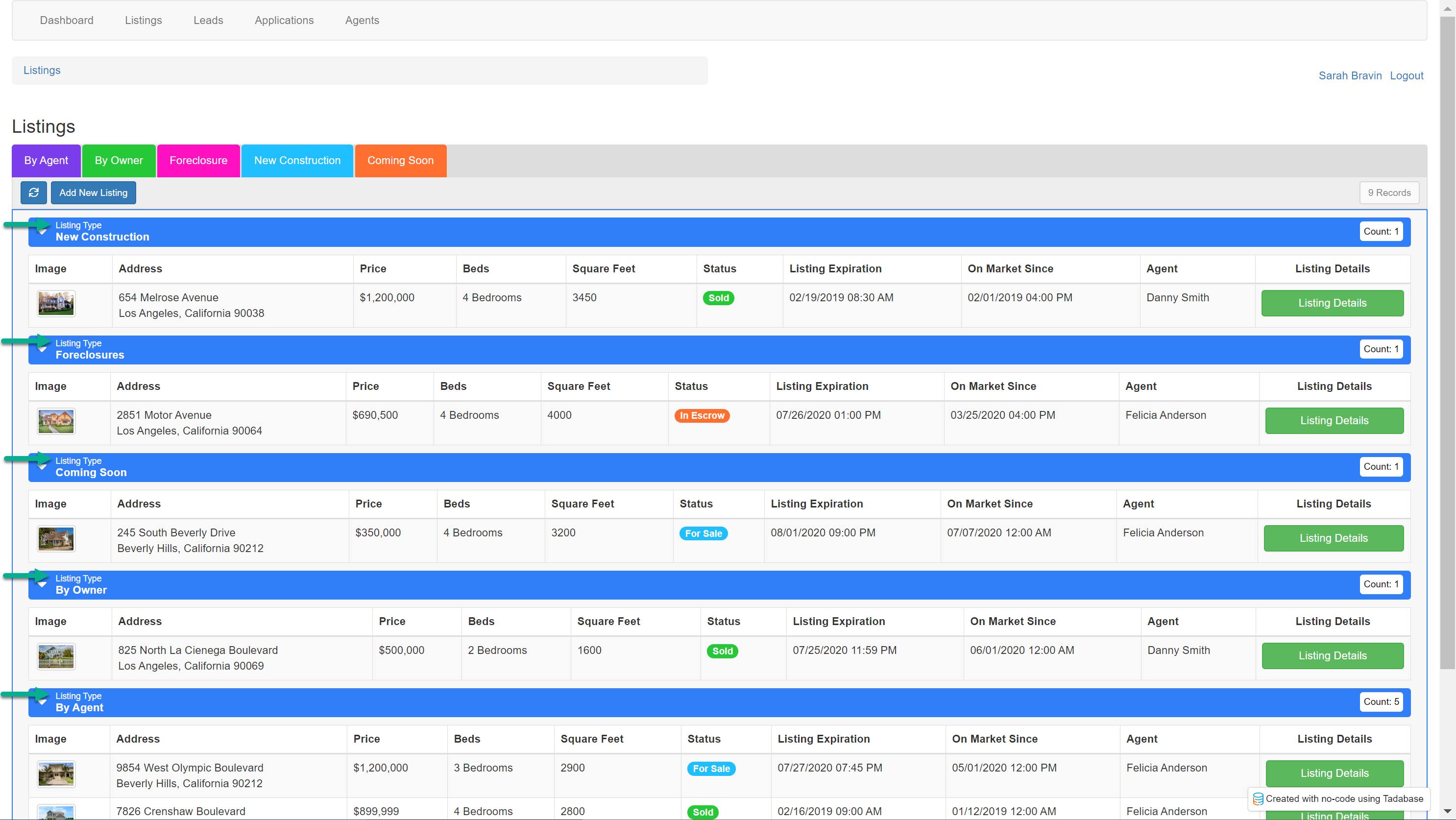
Now, the Listing table component will be grouped by listing status and sub-grouped by the number of bedrooms within each listing.

When creating a group or sub-group, there are several settings you can customize which we will discuss below.

Field- Select a field by which to group records from the drop-down list of fields.

Only fields added as columns to the table component will be available to select as group-by fields.
While you can select any field that has been added as a column within the table component to group records, it is best to select a field that would serve well as a group-by field, such as an options field.
Title- When you select a group-by field, the field name will automatically appear as the field title above the field value within each grouping bar. For instance, if you select the Listing Type field to group records within a Listings table component, the Title of "Listing Type" will automatically be inserted within the Title setting.

On the live app, the "Listing Type" title will appear above the listing type value within each grouping bar.
If you wish to remove the field title from each grouping bar, simply delete the field title from the Title setting.

As you can see in the Listings table component below, the field title has been removed from each grouping bar.

You can also edit the field title setting to display whichever title you choose above each grouping bar.
Order- Choose if this grouping should sort records by descending or ascending order.

Color- Select a color tag for each group.
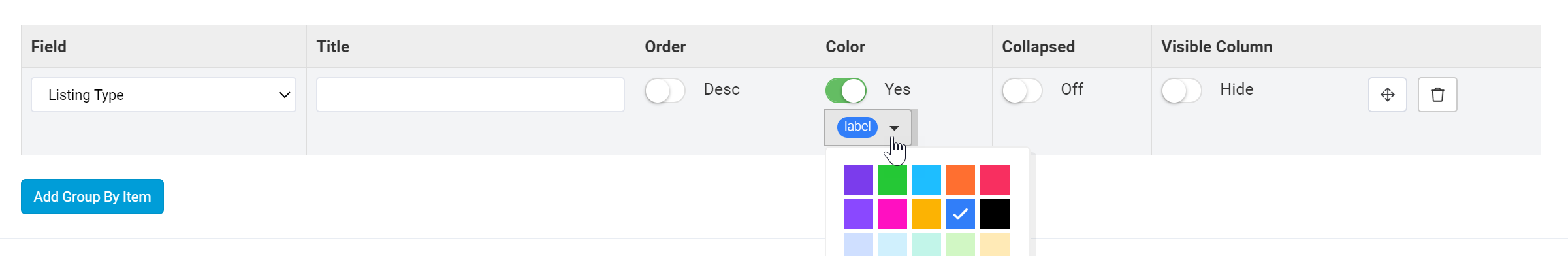
Collapsed- When set to "On", the page will load with each grouping bar within this group collapsed. To view the records within each grouping, users will have to click on the arrow on each grouping bar to expand that grouping.

Visible Column- By default, the group-by field used within each group will not be visible as a column within the table component since it is already being used to group records within the table.
For instance, as you can see in the Listings table component below, the Listing Type field used to group records is not visible as a column within the table.

However, if you choose to display the group-by field column within the table component, you can toggle the Visible Column setting from Hide (default) to Show.

Now, the Listing Type group-by field will display as a column within the Listings table component.
Filters and sorting defined in the Data Source tab will override any filters and groupings defined within a table component. Therefore, ensure that there are no conflicting filters or sorting set in the Data Source tab that will override your filter and grouping settings within the Filters and Groupings tab.
Table summaries
Within the Filters and Groupings tab of each table component, you can also create custom summary rows that will appear at the bottom of the table component to calculate the sum, average, minimum, or maximum of any number field type columns within the table.
To create a summary row, click on the Add Summary button and select the title and calculation by which you wish to summarize the number field types within the table component.

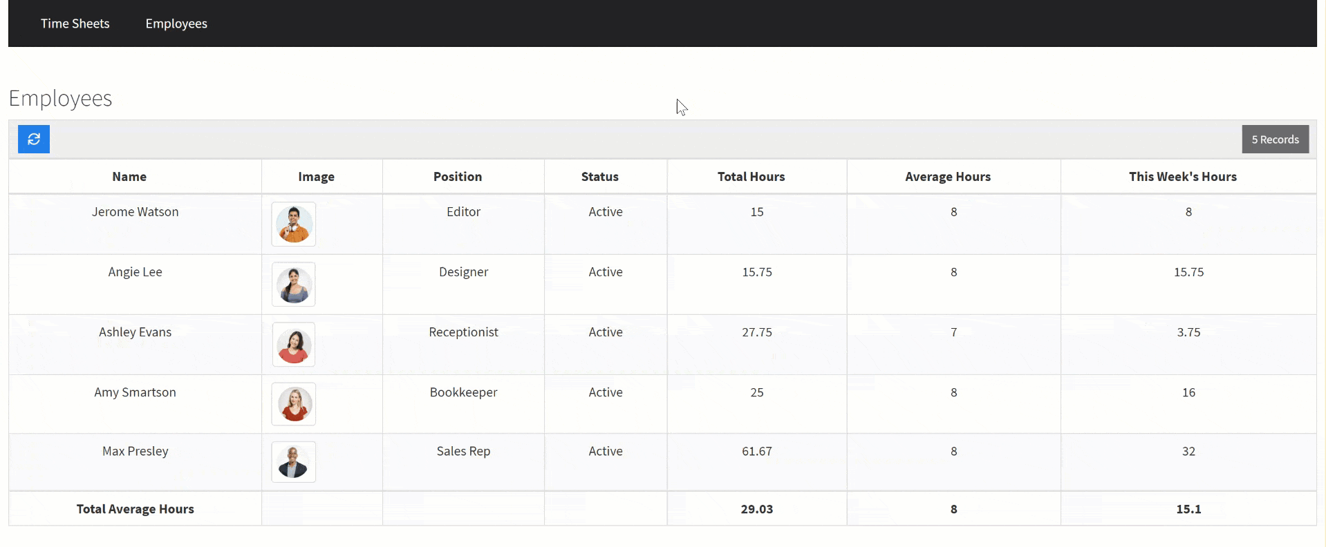
For instance, if you have an Employee Time Tracker app with an Employees table component, you can add a summary row to summarize the Total Average Hours of all employee hours.

As you can see in the image below, a summary row summarizing the Total Average Hours of all employees has been added to the bottom of the Employees table component.

For best results, ensure that the first column within the table component is not a number field type that needs to be summarized as this is where the summary row title will appear.
If you enable a summary row for a table component but wish to exclude a certain number field type column from being calculated and displayed within the summary row, you can disable that particular column's ability to be summarized within that column's Edit Column page > General Tab > Show Summary Setting > No. For instance, setting the Show Summary setting to No for the "This Week's Hours" field column will exclude this particular column from being calculated and displayed within the table component's summary row.
Advanced table options
Within the Options tab of each table component you can customize advanced table options which we will discuss below.

Allow new record popup
Within the Options tab of a table component, you can enable the Allow New Record Popup Page setting. When enabled, this setting will allow users to add new records inline, directly from within the table component.
When set to Yes, this setting will insert a button within the table component that, when clicked, will popup with an Add New Record Form for users to add new records to this table component's data table.
For instance, if you have an Employee Time Tracker app with an Employees table component, you can enable the Allow New Record Popup Page setting within the Options tab of the Employees table component.

This will insert an Add New Button within the Employees table component.

When users click on the Add New button, an Add New Record form will popup for users to add a new employee record on the fly.

When enabling the Allow New Record Popup Page setting, you will also be able to customize the Button Label from the default "Add New" button label to the button label of your choice as well as customize the Popup Form Title from the default "Add New Record" title to the popup form title of your choice.
For instance, for the same Employees table component, you can customize the Button Label to "Add New Employee" and the Popup Form Title to "Add New Employee".

Now, the Add New button will display as an "Add New Employee" button and the popup form title will display as "Add New Employee".
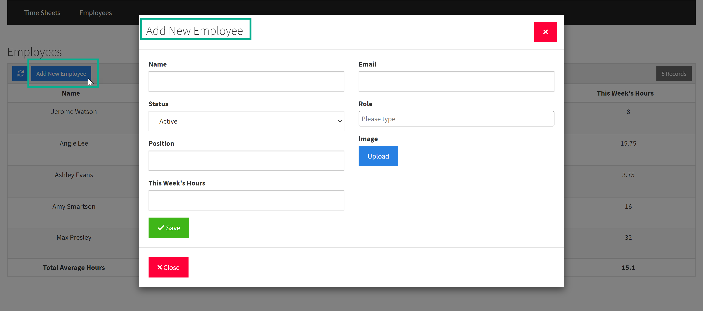
When users add a new employee record using this inline option, the new employee record will be inserted within the Employees data table.
When enabling this setting, a new Add New Form is populated, meaning that a new child page is also populated to contain this Add New Form.
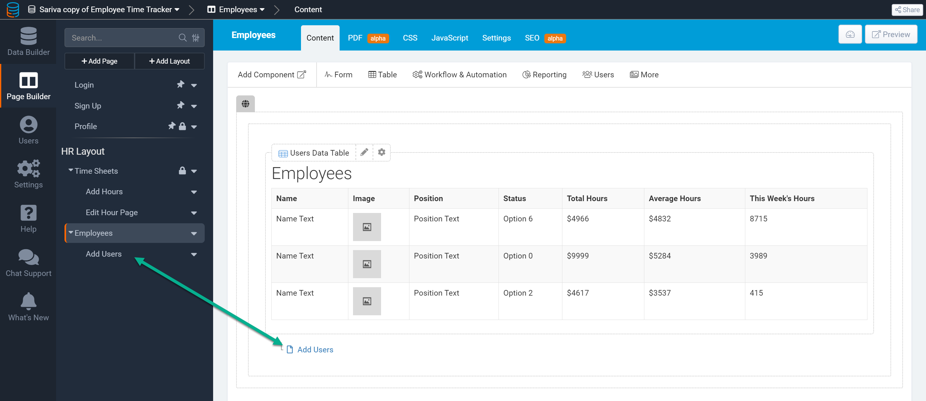
You can click on the new Add Users child page to customize the Add New Employee form that users will see when they click on the Add New Employee button within the Employees table component. Based on your use case, you can select which employee-related fields and connected fields to include within this Add New Employee popup form.

If you do not wish to allow users to add new employees, simply disable the Add New Record Popup Page setting which will remove the Add New Employee button and the Add New Employee popup form from the Employees table component.
Please Note: If you had used the Quick Add option to configure this Employees (Users) table component and had quick-added the ability to include a form to add new users to this table, then an Add New button and Add New popup form would have already been included within this Employees table component upon its configuration.

The above process of enabling the Allow New Record Popup Page setting would not have been necessary as this setting would have already been enabled once the table was quick-added.
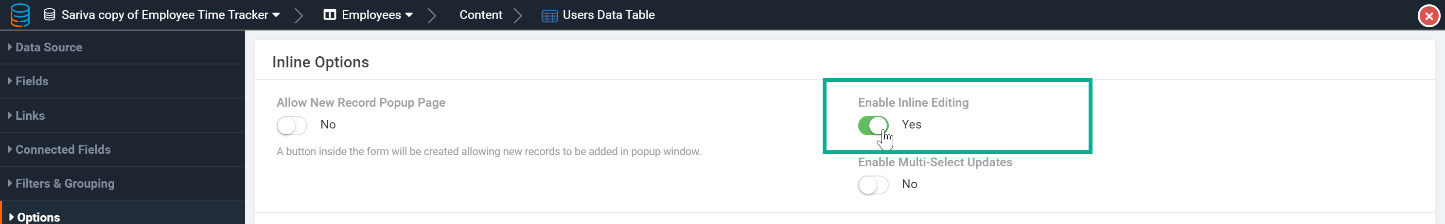
Enable inline editing
Within the Options tab of a table component, you can enable the Enable Inline Editing setting. When set to Yes, this setting will allow users to simply click on any value within the table component on the live app to edit that value inline.
For instance, within an Employees table component, you can enable inline editing to allow users to edit any value within the table component on the fly without having to use an Edit Form or edit the value from within the Data Builder.
If you enable inline editing for a table component but wish to restrict specific columns from being edited inline, you can disable the inline editing setting within those specific columns to restrict only those columns from being edited inline. Instructions on how to accomplish this were discussed previously within this article within the Customizing Table Columns section. Please click here to reference back to instructions on how to disable inline editing for specific table columns.
For a more comprehensive discussion of Inline Editing, please view the Inline Editing article.
Multi-select updates
Within the Options tab of a table component, you can enable the Enable Multi-Select Updates setting. When set to Yes, users will be able to select multiple records within the table component and update those records at the same time.

For instance, if you have an Applicant Tracking app and enable this setting with the Jobs table component, a new column with checkboxes will appear at the far-right of the Jobs table components for users to select multiple job records and update those records by the same value at the same time. For instance, HR users can multi-select specific jobs within the Jobs table component and update the status of those jobs to "Filled".

Multi-select updates is similar to Batch Updates, another table-wide Options tab setting which we will discuss further on within this article, except that multi-select updates allows users to update multiple records by directly selecting those records via checkboxes whereas batch updates allows users to update multiple records based on custom-defined conditions.
Enable search
Within the Options tab of a table component, you can enable the Enable Search setting which will allow users to search through records in the table via a search bar.

When you set the Enable Search setting to Yes, you will also be able to select the fields that are allowed to be searched. By default, this setting is set to "All Searchable Fields", meaning all fields within a table component can be searched at default. You can, however, select specific fields from the fields drop-down list to allow for only the specific fields you select to be searchable.

By default, connection fields are not searchable. However, you can make connection fields searchable by selecting them from the fields drop-down list and adding them to the list of searchable fields.
Only two connection fields can be searched at the same time.
Please Note: Search works on top of any existing data conditions added in the Data Source tab.
Enable filter
Within the Options tab of a table component, you can enable the Enable Filter setting which will add an Add Filters button to the table component that, when clicked, will enable users to add their very own front-end filters.
For instance, if you have an Applicant Tracking app, you can enable filters within the Jobs table component to allow users to click on the Add Filters button and create their own filters, such as a filter to only show records with a job type of "Full-time".

As demonstrated in the above gif, users can click on the x-icon to the right of their new filter to remove that filter and once again show all records.
Users can create multiple front-end filters by clicking on the Add Filter Group button to add additional filters.
When you set the Enable Filter setting to Yes, you will also be able to select the fields that you allow to be used as filter-by fields. By default, this setting is set to "All Fields", meaning all fields within a table component can be used as filter-by fields when users create their own filters. You can, however, select specific fields from the fields drop-down list to allow for only the specific fields you select to be used as filter-by fields.

No data text
Within the Options tab of a table component, you can enter the text you wish to display when a table component's data table contains no data.

By default, when a data table contains no data, the table component will display with the text, "No record found".
You can choose to change this text within this setting.
Record Limit
Within the Options tab of a table component, you can customize the Record Limit per page for each table component. By default, ten records are shown per page within a table component.

Show pagination
Within the Options tab of a table component, you can enable the Show Pagination setting.

When set to Yes, the table's pagination will display at the top of the table component.

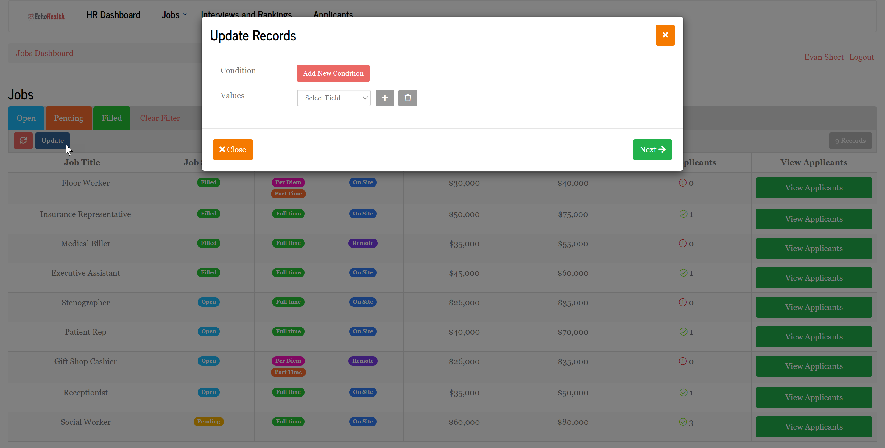
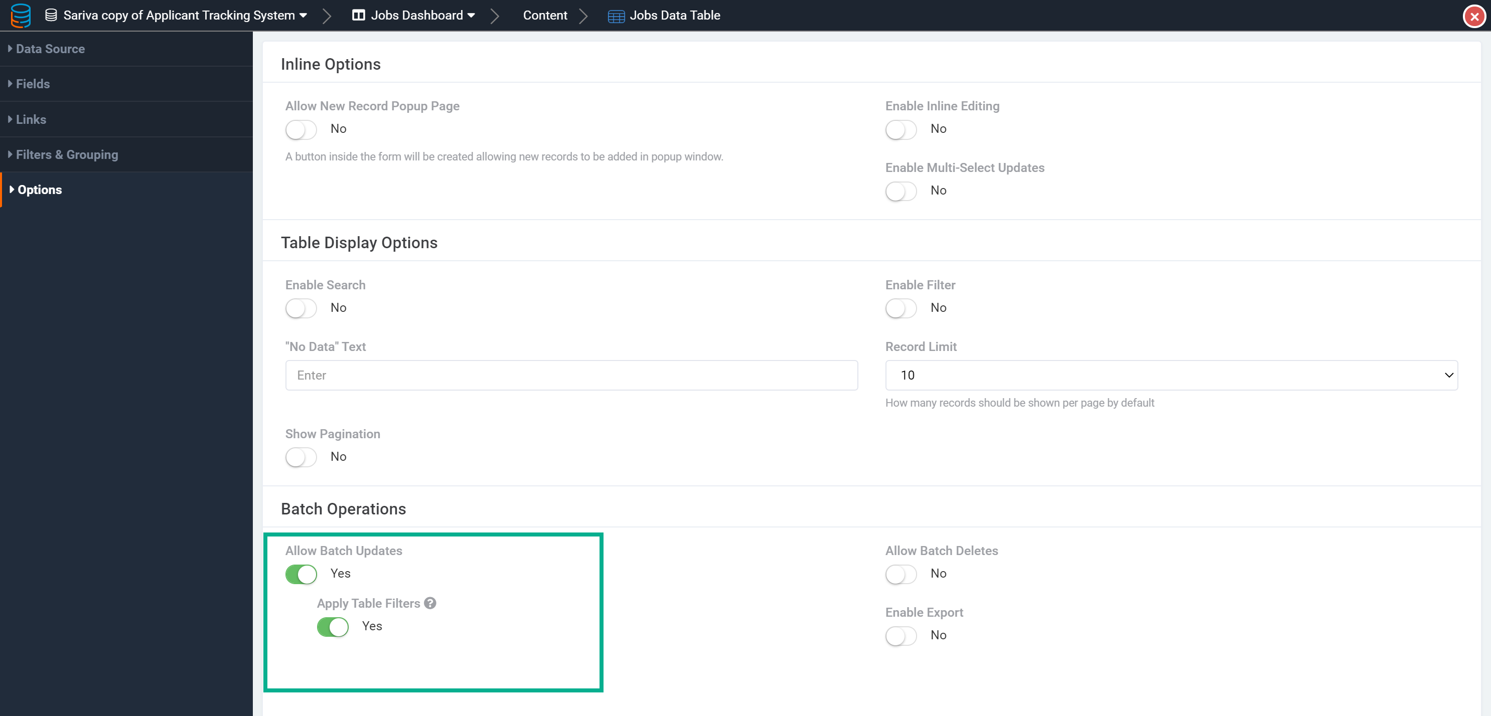
Batch updates
Within the Options tab of a table component, you can enable the Allow Batch Updates setting which will allow users to update multiple records at once based on custom-defined conditions.
When Batch Updates are enabled, an Update button will be added to the table component.

When users click on the Update button, a page to update records will popup where users can create conditions and values upon which to update specific records. To create a condition, users can click on the Add New Condition button.
Users can then specify the condition(s) and values upon which to update specific records. For instance, if you have an Applicant Tracking app, you can enable Batch Updates within the Jobs table component to allow users to update multiple records at once based on custom-defined conditions, such as when the job type is "Flexible", update all records with that job type to an updated job type of "Per-Diem".
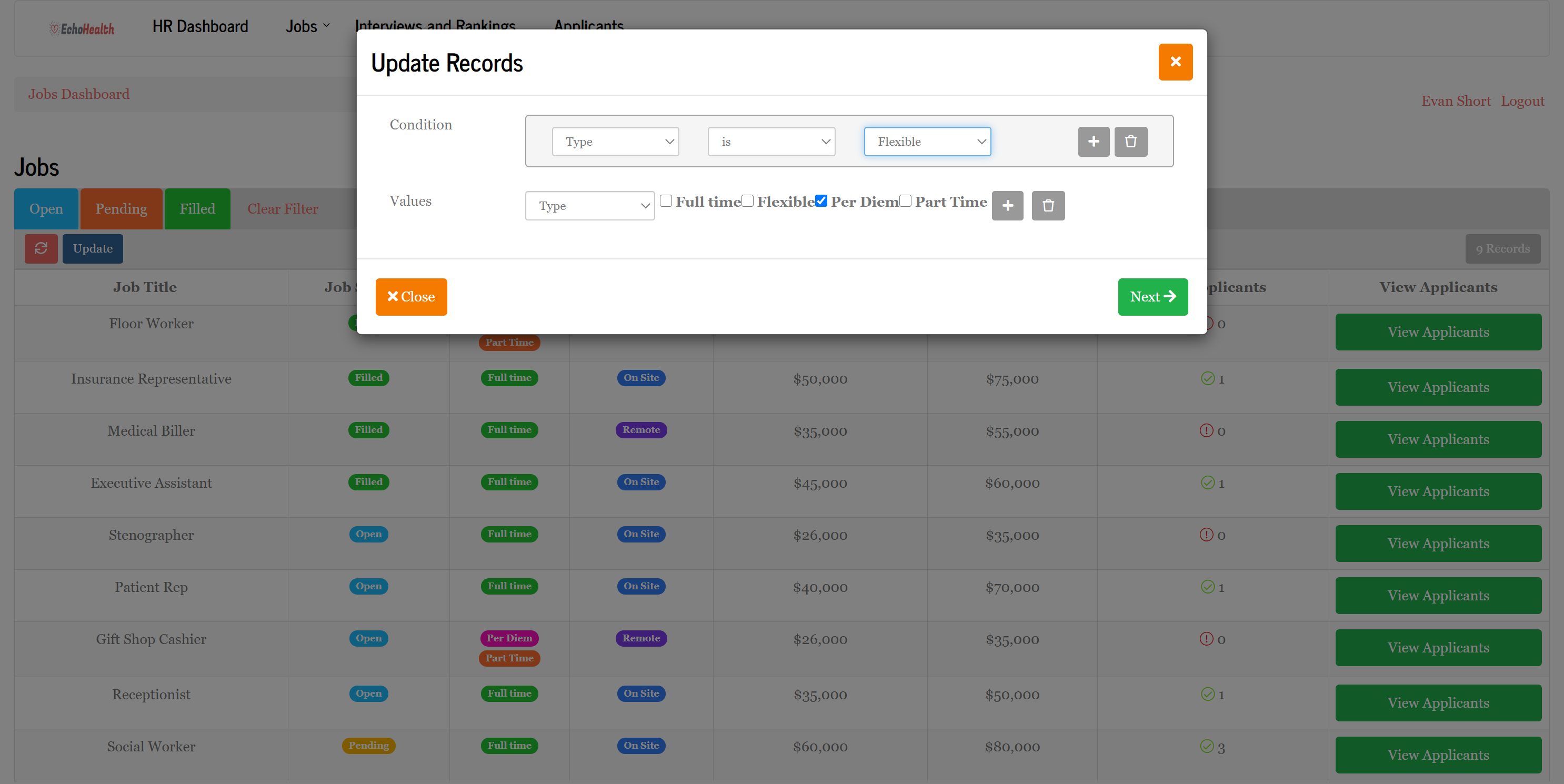
Upon this batch update, all job records that had a type of "Flexible" have been updated to "Per-Diem".
When Batch Updates are enabled, you can choose to allow users to batch update all records within the table component's data table (even records they can not see in the table component due to existing table filters) or to allow users to only batch update records that are allowed via the table component's existing filters (only batch update records they can see in the table component via existing table filters).
To choose to restrict users from being able to batch update records that they can not see in the table component due to existing table filters, set the Apply Table Filters setting to Yes. This will restrict records that are not filtered through to the table component from being included in batch updates.
Batch Updates is similar to Multi-Select Updates, another table-wide setting within the Options tab that was previously discussed, except that Batch Updates allows users to update multiple records at once based on custom-defined conditions whereas Multi-Select Updates allows users to update multiple records by directly selecting the records via checkboxes.
Batch deletes
Within the Options tab of a table component, you can enable the Allow Batch Deletes setting which will allow users to delete multiple records at once based on custom-defined conditions.
When Batch Deletes are enabled, a Delete button will be added to the table component.

When users click on the Delete button, a page to delete records will popup where users can create a condition upon which to delete specific records. To create a condition, users can click on the Add New Condition button.
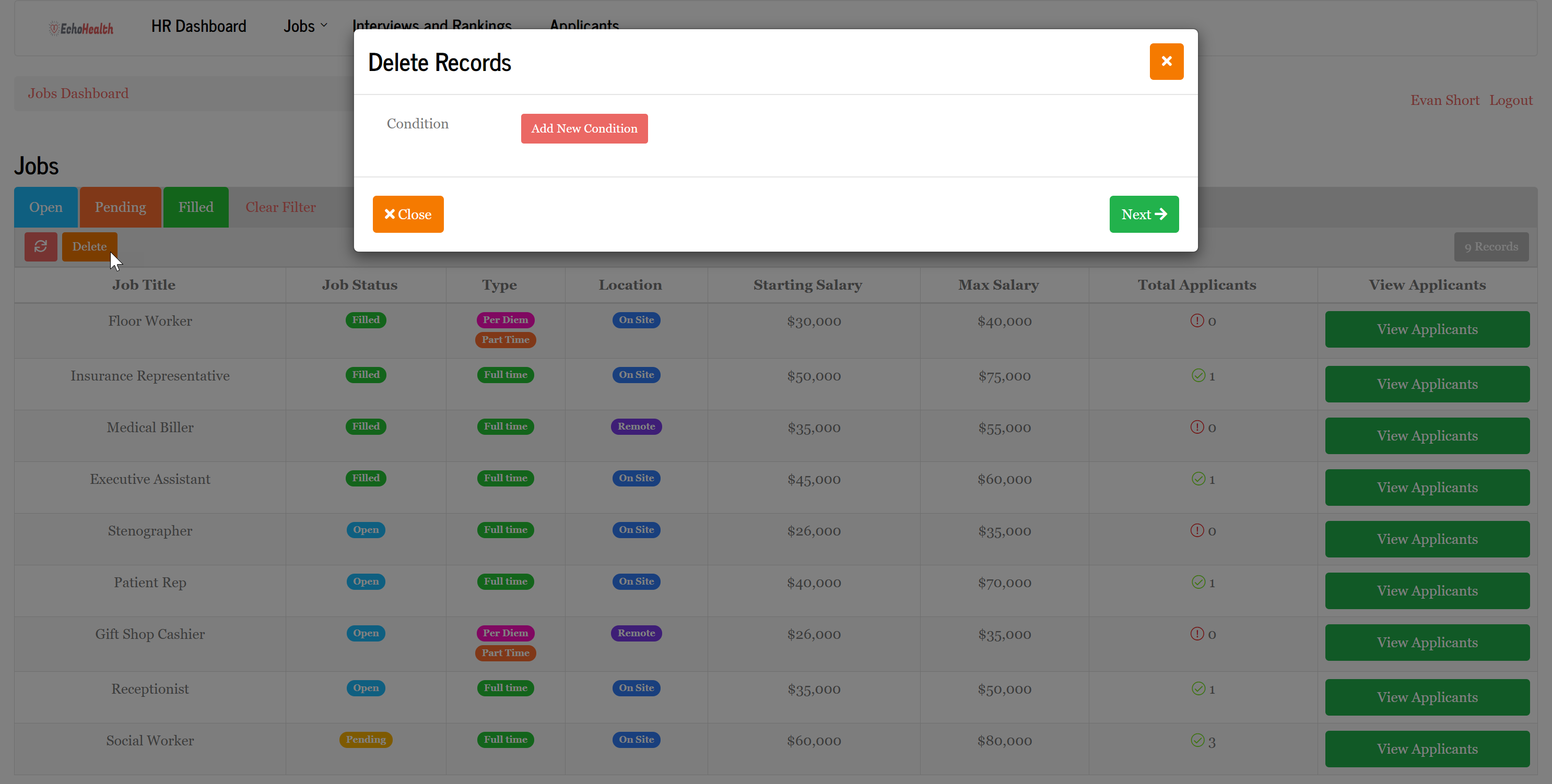
Users can then specify the condition upon which to delete specific records. For instance, if you have an Applicant Tracking app, you can enable Batch Deletes within the Jobs table component to allow users to delete multiple records at once based on custom-defined conditions, such as when a job was added over 90 days ago and is still Open.

Upon this batch delete, all job records that were added over 90 days ago and were still "Open" have been deleted.
Enable exports
Within the Options tab of a table component, you can enable the Enable Exports setting to allow the records within the table component to be exported.

When exports are enabled, an Export button will be added to the table component.

When users click on the Export button, all records and columns within the table component will be downloaded as a CSV file.

You can also export pre-defined records and columns even if they are not currently in this table component by using Export Templates. To use a pre-defined Export Template, you must first add an export template within the Data Builder. Click here to learn how to add and utilize Export Templates.
When export templates are available to utilize within a table component, you will see the export template options available within the table's Export button drop-down list.

We'd love to hear your feedback.