Text Fields
📚 Updated Documentation Available
This article has been split into individual field articles for better organization.
Please visit the following updated articles in the Fields category for the most current information:
The Text type category includes the four field types pictured below. These field types are primarily text-based fields.

This article will define each of the four text field types.
Text
Text fields are basic field types that stores basic text. Text fields can be used to add any basic text, such as "Job Name" or "Product Name", or any common, basic text.
Non-common or non-basic text fields, such as a person's name, email, or address, would not be added as text fields but rather as other basic field types defined later on in this article, including the person name field, email field, and address field.
Sample Text Field:

The GIF below illustrates how text fields are displayed in a form as well as in a table component once the form is saved.

The default text field
Every new data table comes with a default text field if no other fields are defined prior to creating your data table. For instance, a new Orders data table with no added fields will be created with a default text field titled "Order Name". A new Jobs data table with no added fields will be created with a default text field titled "Job Name", etc. You can delete the default text field once you add at least one new field to your data table, or you can keep the default text field within your data table.
Creating a new text field
To add a new text field to your data table, click on the text type category on the Add Field menu and select the text field type from the drop-down list.

When adding a new text field, there are several settings you can customize such as those highlighted in the image below.

- Name- this is where you can title your text field. For instance, "Project Name" or "Task".
- Description- this is where you can provide an optional description of this field for your own reference.
- Max Length Type- choose between Small or Medium length type. Regardless of this setting, the default maximum text length is 255 characters.
- Unique- this is where you can enable whether each text value must be unique from other records' text values.
- Placeholder-this is where you can enter placeholder text to automatically populate within the text field's box when a form loads. Placeholders will appear as a grey text and can be useful for providing instructions, such as "Please enter text here." When a user begins to type within the field box, the placeholder text will disappear and be overwritten.
- Default Form Value- this is where you can enter a default text value that will automatically populate within the text field's box when a form loads. If the user does not edit or remove the text, the default form value text will be saved.
Long Text
Long Text fields are basic field types designed to hold larger amounts of text. Long text fields are often used for adding descriptions or instructions.
Sample Long Text Field:

The GIF below illustrates how long text fields are displayed in a form as well as in a table component once the form is saved.
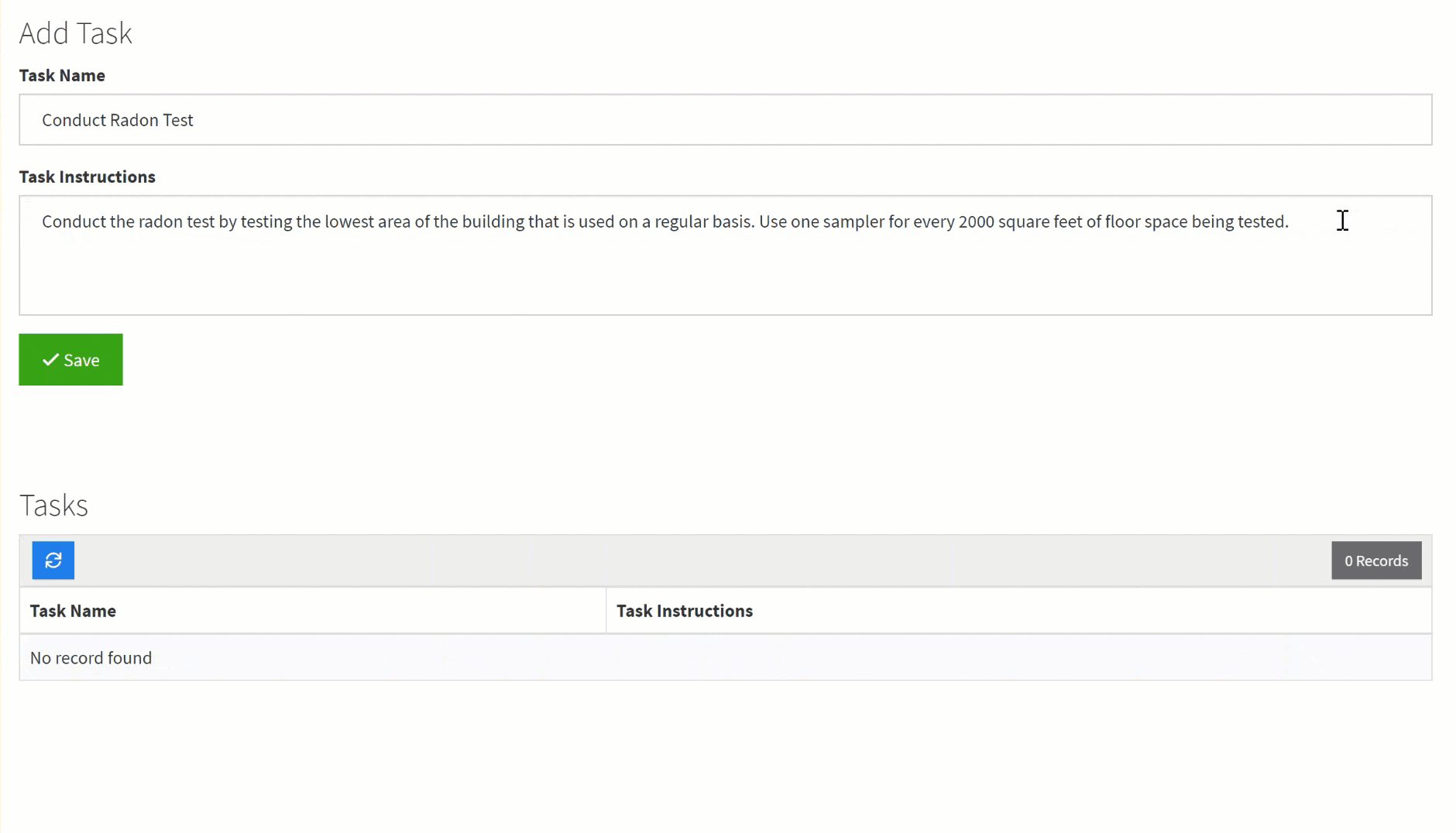
As you can see in the image below, the table component displays the long text field titled Task Instructions.

Creating a long text field
To add a new long text field to your data table, click on the text type category on the Add Field menu and select the long text field type from the drop-down list.

When creating a new long text field, there are several settings you can customize such as those highlighted in the image below.

- Name- this is where you can name your long text field. For instance, "Job Description" or "Task Instructions".
- Description- this is where you can optionally provide a brief description of this field for your own reference.
- Placeholder-this is where you can enter placeholder text to automatically populate within this field's box when a form loads. Placeholders can be useful for providing instructions, such as "Please enter a description here". When a user begins to type within the field box, the placeholder text will disappear and be overwritten.
- Default Form Value- this is where you can enter a default text value that will automatically populate within the long text field's box when a form loads.
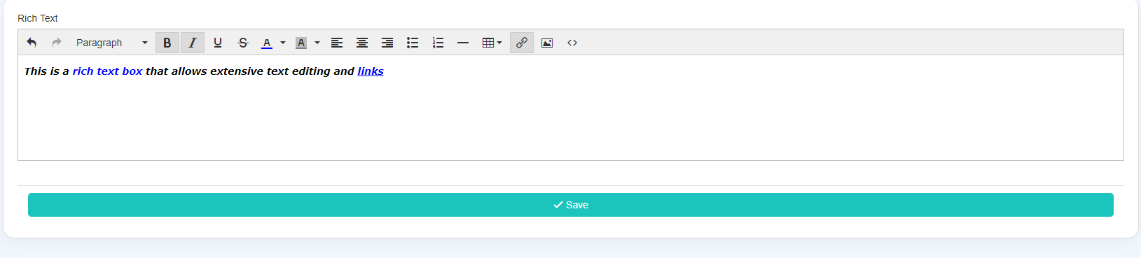
Rich Text
Rich Text fields are basic field types that contain HTML or other custom text that can be formatted using a WYSIWYG editor.
Sample Rich Text Field:

Creating a rich text field
To add a new rich text field to your data table, click on the text category on the Add Field menu and select the rich text field type from the drop-down list.

When adding a new rich text field, there are several settings you can customize such as those highlighted in the image below.

- Name- this is where you can name your rich text field.
- Description- this is where you can optionally provide a brief description of this field for your own reference.
- Placeholder- this is where you can enter placeholder text to automatically populate within this field's box when a form loads. Placeholders can be useful for providing instructions, such as "Please enter text here." When a user begins to type within the field box, the placeholder text will disappear and be overwritten.
- Default Form Value- this is where you can enter a default text value that will automatically populate within the rich text field's box when a form loads.
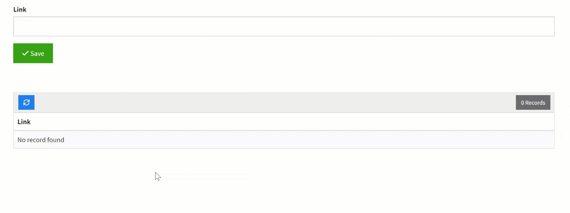
Link
Link fields can be used to store links. For instance, you can use link fields to store website links, LinkedIn Profile links, article links, or any other type of link.

To add a new link field, click on the text category on the Add Field menu and select the Link field type.

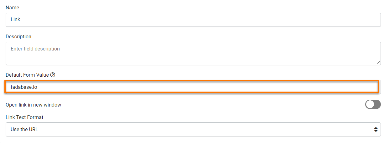
When creating a new link field, there are several settings you can customize such as those highlighted in the image below.

- Name- this is where you can name your link field. For instance, "Link" or "Website".
- Description- this is where you can optionally provide a brief description of this field for your own reference.
- Default Form Value- this is where you can enter a default text or link value to automatically populate within the link field box within a form.
For instance, if you enter "tadabase.io" as the Default Form Value, forms will automatically load with the tadabase.io link pre-entered within the link field box.
At default, the Default Form Value for link fields is blank, meaning no default text or link value will automatically populate within the link field box when the form loads.


- Open Link In New Window- choose whether you would like the link to open in a new window when clicked. By default the Open Link In New Window setting is set to No, meaning links will open within the same window when clicked unless this setting is changed to Yes.
- Link Text Format- this is where you can define the text that displays your link within components once it is submitted via a form. At default, the Link Text Format is set to Use the URL, meaning the link URL is the text that will display your link with components after it is saved via a form.
There are 3 other text formatting options you can choose to display your links within components- Use the same texts for all links, Use the unique text for each link, or Format Link as an Image.
For instance, if you change the Link Text Format to the "Use the same texts for all links" option, a box will appear titled "Link Text" where you can enter the text value you wish to display for all links within your components after they are saved via a form. This text format setting can be useful if you would like to have the same text displayed for all your links, such as "Please Click Here".
Below the Link Text Format is changed to the Use the same text for all links option and "Please Click Here" is entered within the link text box.
In the GIF below, when the link "tadabase.io" is entered within the forms and saved, the link now displays as "Please Click Here" within the table component.

Alternatively, if you change the Link Text Format to the "Use the unique text for each link" option, you will have the opportunity on each form to enter a unique text value to display each link.


We'd love to hear your feedback.