Resource Component
What is Resource Component?
The Resource component enables you to view the data you wish to add in in a calendar in conjunction with a resource.
Why use Resource?
When you need to track a resource and the times assigned to the resource visually you can do so with this component. Unlike calendars, which shows a label placed on a time. With resources you can be with a 3rd source of data, we call this the resource.
For example, this data below is a calendar with our all our jobs for a given day. As you can see, its cluttered and only one dimensional. We can't organize it by more than one detail :

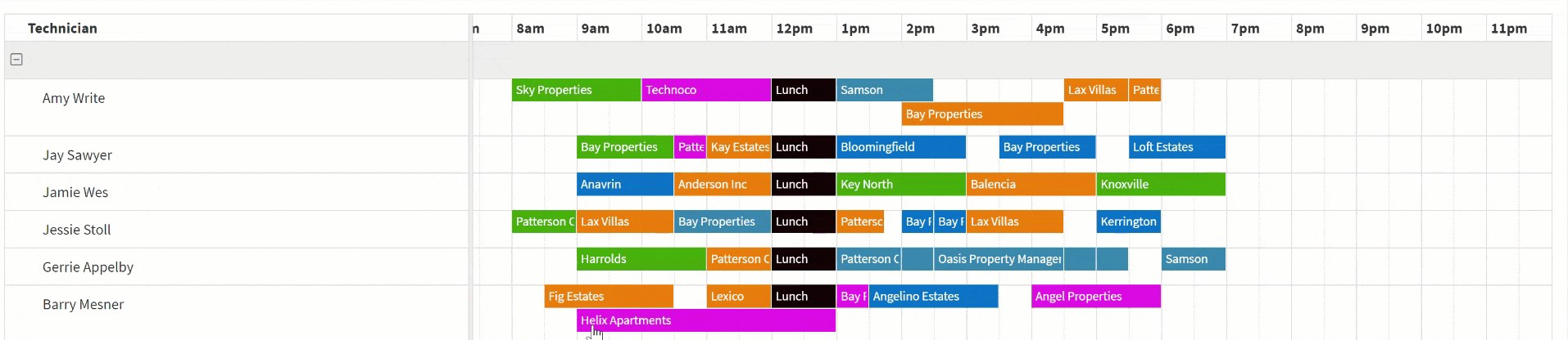
Now let's put it into a Resource component and we can see this same data but with another piece of data, in this case the actual resource which is the Technician that's assigned to this job.

There are 2 versions of this component, one which displays the resources on the left-hand side going down, while the other on the top.
The image above is Vertical Resource, while this one below is Horizontal.

When should you use Resource Component?
Resource component is very useful when you need to manage date and times together with other data. Some examples:
- Technicians and their jobs
- Doctors, Patients and the assigned rooms
- Waiter and assigned tables
- Rentals and cars
- etc...
Adding Resource
To add a Resource component choose the Resource component and then choose the data table to be used for this Resource.
Only tables which contain a date field will be available as an option for Resources.
Once you've chosen the table, you can choose Quick Add which will add the Resource component with some default settings. Alternatively, you can choose Customize to configure all the settings manually.
Choosing QuickAdd is simply a shortcut, you can always go right back into the component to make any changes necessary.
Inside the Resource component you'll see have some standard options available in other components, as well as unique settings only available in the Resource component.
- Data Source
- Resource Options
- Detail View
- Form View
Data Source
Resource Option
Under General options you'll have 5 or 6 basic options depending on the Vertical vs Horizontal components:

Resource Type
Here you can choose if you want the resources at the top or left side of the page.

Nearly all settings are the same for both versions except for groupings. Groupings is only available in the vertical resource component.
Label Field
The label fie determines which value will appear on the actual label on the calendar.
Label Text
This is a custom text that can be added at the top of the resource list.
Date Field
The date field to be used for placing your events on the calendar. There are 3 types of date fields each one will look differently on the calendar.
- Date - This will display all events as a full day event
- Date/Time - This will display all events at the given time with a default time of 30 minutes
- Date Range - This will display events with start and end date/time given in the field.
Resource Field
This is the field that will be used on the top when using Horizontal Resources or the left when using Vertical resources.

Resource Group Field
Only available in the Vertical Resource
To group all the resources and be able to collapse them based on this grouping select the field for it to be grouped as.

Please keep in mind, that each resource will not be added to more than one group. Each resource will be assigned to the first group that he matches with and all his records will be put into that group - even if they belong in another group.
Under the Interactive Options there are 3 options to enable this calendar to be more interactive.
- Enable Drag/Drop
- Enable Detail View in Pop up
- Enable Form to Add additional Records

Enable Drag and Drop
Enabling this will allow users to drag and drop events to move them to new dates, new resources and expand the end times of a record.
Enable Detail View in Popup
Enabling this option will make each value in the calendar clickable. When clicked the record details will appear in a pop up window. You can customize which fields are displayed in the Detail View Section.

Enable Form to Add Additional Records
Enabling this will open a new form any time a blank space in the calendar is pressed. You can customize which fields are displayed here in the Form View.
The time will be automatically set to 30 minutes and resource to whatever resource line this was added to.

Under the Default Options you can choose some default options to be used when the calendar initially loads.

Default Display Range
This will determine the date range to be used when the calendar first loads.

Default Event Color
This will be the default color used on the label in the calendars. If you'd like to create custom record colors you can do so with Label Color Rules.
Aspect Ratio
With Aspect Ratio you can determine how zoomed in the table should be.
Label Color Rules
Add rules to change the colors for each record based on pre-defined criteria.

We'd love to hear your feedback.