Option Fields
📚 Updated Documentation Available
This article has been split into individual field articles for better organization.
Please visit the following updated articles in the Fields category for the most current information:
Option Fields enable you to pre-define values for selection. The Option field type category includes the five option field types pictured in the image below.

We'll explore each of these five option field types within this article as well as compare/contrast their various features and functionality.
The following table illustrates an overview feature matrix of each of the five option field types.
|
|
Select multiple values | Assign color badges | Assign icons | Assign score values |
|
Checkbox |
✔ |
✔ |
✔ |
✔* |
| Radio | ❌ |
✔ |
✔ |
✔ |
| Select | ❌ |
✔ |
❌ |
✔ |
| Multi-Select |
✔ |
✔ |
❌ |
✔* |
| Decision Box | ❌ | ❌ | ❌ | ❌ |
Color badges and icons, are Option Field features that enable you to assign custom status indicators to your values.
For instance, if you would like to track the status of your jobs, you can create a Radio Field and assign each status value with a unique color badge and icon.

As you can see in the GIF below, assigned icons will display within forms and assigned color tags will display within tables and other components.
Checkbox
Checkbox fields enable you to pre-define values for selection and option values will display with checkboxes.

Similar to Radio Fields, Checkbox Fields enable you to assign color badges and icons as custom status indicators.
Unlike Radio Fields, Checkbox Fields enable you to select multiple values as options. This makes Checkbox Fields useful for circumstances when you wish to allow users to select all values that apply or select more than value.
For instance, if you would like to prompt users to select all home improvement services needed, you can choose a Checkbox Field to pre-define your values of repairs, paint, design, cleaning, etc. so that users can select as many, if not all, services needed.

As you can see in the GIF below, using a Checkbox Field enables users to select multiple values.

Creating a Checkbox Field
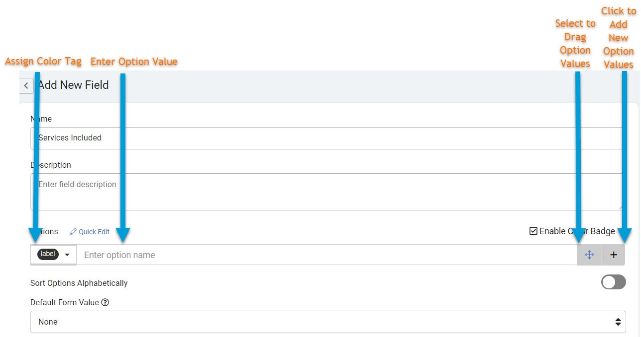
When creating a new Checkbox Field, there are several settings you can customize such as those highlighted in the image below.

- Name- this is where you can name your Checkbox Field. For instance, "Equipment used to complete this job" or "Services Needed".
- Description- this is where you can optionally provide a brief description for this field for your own reference.
- Quick Edit- For your convenience, you click on the Quick Edit button to copy and paste many option values along with their assigned color badges, icons, and score values from one options field into another in order to add many options at once.
Click here to learn more about using Quick Edit to copy and paste your option values. - Enable Color Badge- This is where you can uncheck the Enable Color Badge checkbox to disable the color badge feature. At default, this checkbox is pre-checked, meaning each new Checkbox Field comes with enabled color badge functionality at default.
Click here to learn more about color badge functionality. - Enter Option Values- this is where you can enter your option values as well as each value's assigned icon (optional), color badge (unless disabled), and/or score value (if enabled). Option values will display and be stored in the order in which they are listed here in this field, and you can rearrange the order of option values by dragging them to your desired order with the cross-arrow move icon.

The GIF below demonstrates the process of clicking on the + icon to enter new option values, assigning color badges and icons to each option value, and rearranging the order of option values by dragging them with the cross-arrow move icon. - Sort Options Alphabetically- this is where you can choose to sort your option values in alphabetical order when displayed in a form.
Note: Choosing to sort option values alphabetically will only affect how option values are displayed, not how they are stored. Option values will still be stored in the order in which they are entered in the options field regardless of this setting.
- Default Form Value- this is where you can define a specific option value to automatically populate within a form. For instance, if you would like to automatically populate each form with a specific option value already pre-checked, you can click on the Default Form Value drop-down arrow and select your desired option value.

As you can see in the image below, forms will automatically populate with the selected option value pre-checked.
At default, the Default Form Value is set to None, meaning no option values will automatically populate within a form as illustrated in the image below.
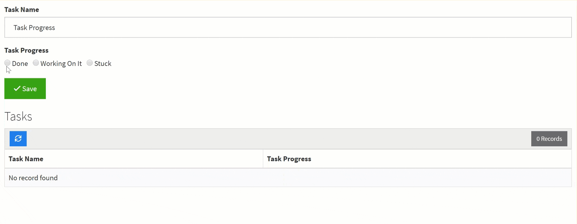
Radio
Radio Fields enable you to pre-define values for selection and option values will display with radio option buttons.

Similar to Checkbox Fields, Radio Fields enable you to assign color badges and icons as custom status indicators.
Unlike Checkbox Fields, Radio Fields do not allow for multiple option selection. Common use cases for Radio fields are circumstances when you would like to prompt users to select only one option, such as selecting the status for a job or selecting an assigned sales rep.
For instance, if you have a Project Management application and would like to create an option field to select the current progress for each task, you could use a Radio field to accomplish this.

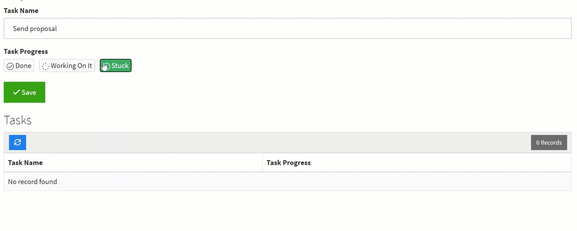
As you can see in the GIF below, radio fields display option values with radio buttons and only allow for a single selection.
Note: If icons are assigned to option values within a Radio field, the icons will replace the radio buttons in a form.
For instance, if you were to add icons to the above Task Progress Radio field, the icons would replace the radio buttons when displayed in a form as illustrated below.
As you can see in the GIF below, the assigned icons replace the radio buttons within a form.
Even if you have added icons to an options field, you can always enable/disable displaying the icons within forms down the road when customizing form settings.
Within form settings you can also customize the display of option values to display vertically down a page.
Creating a Radio Field
When creating a new Radio field, there are several settings you can customize such as those highlighted in the image below.

- Name- this is where you can name your Radio field. For instance, "Job Status" or Service Type".
- Description- this is where you can optionally provide a brief description for this field for your own reference.
- Quick Edit- For your convenience, you click on the Quick Edit button to copy and paste many option values along with their assigned color badges, icons, and score values from one options field into another in order to add many options at once.
Click here to learn more about using Quick Edit to copy and paste your option values. - Enable Color Badge- This is where you can uncheck the Enable Color Badge checkbox to disable the color badge feature. At default, this checkbox is pre-checked, meaning each new radio field comes with enabled color badge functionality at default.
Click here to learn more about color badge functionality. - Enter Option Values- this is where you can enter your option values as well as each value's assigned icon (optional), color badge (unless disabled), and/or score value (if enabled). Option values will display and be stored in the order in which they are listed here in this field, and you can rearrange the order of option values by dragging them to your desired order with the cross-arrow move icon.
The GIF below demonstrates the process of clicking on the + icon to enter new option values, assigning color badges and icons to each option value, and rearranging the order of option values by dragging them with the cross-arrow move icon.
- Sort Options Alphabetically- this is where you can choose to sort your option values in alphabetical order when displayed in a form.
Note: Choosing to sort option values alphabetically will only affect how option values are displayed, not how they are stored. Option values will still be stored in the order in which they are entered in the options field regardless of this setting.
- Default Form Value- this is where you can define a specific option value to automatically populate within a form. For instance, if you would like to automatically populate each form with a specific option value already pre-selected, you can click on the Default Form Value drop-down arrow and select your desired option value.
As you can see in the image below, forms will automatically populate with the selected option value pre-selected.

At default, the Default Form Value is set to None, meaning no option values will automatically populate within a form as illustrated in the image below.


Select
Select fields enable you to pre-define values for selection and option values will display within a drop-down list.

Select fields are functionally identical to Radio fields except for two key differences:
- Select fields display option values within a drop-down list whereas Radio fields display options horizontally across a page or vertically down a page with radio buttons. With its drop-down display of options, Select Fields can take up far less space on a page than radio fields.
- Select fields do not allow for assigning icons to option values whereas Radio fields do allow for assigning icons to option values.
While you cannot use icons within a Select field, you can use color badges and score values within a Select field.
Similar to Radio fields, select fields do not allow for multiple option selections.
You may wish to use a Select field to display your option values when you want to prompt users to select only one option and when you wish to preserve space on your page with a drop-down list.
For instance, if you have a Real Estate Listings application and you would like to create an option field to select the Listing Type for each listing, you can use a Select field to accomplish this which would also take up less space on your app's page than using a Radio field.
As you can see in the GIF below, Select fields display option values within a drop-down list and only allow for a single selection.

Creating a select field
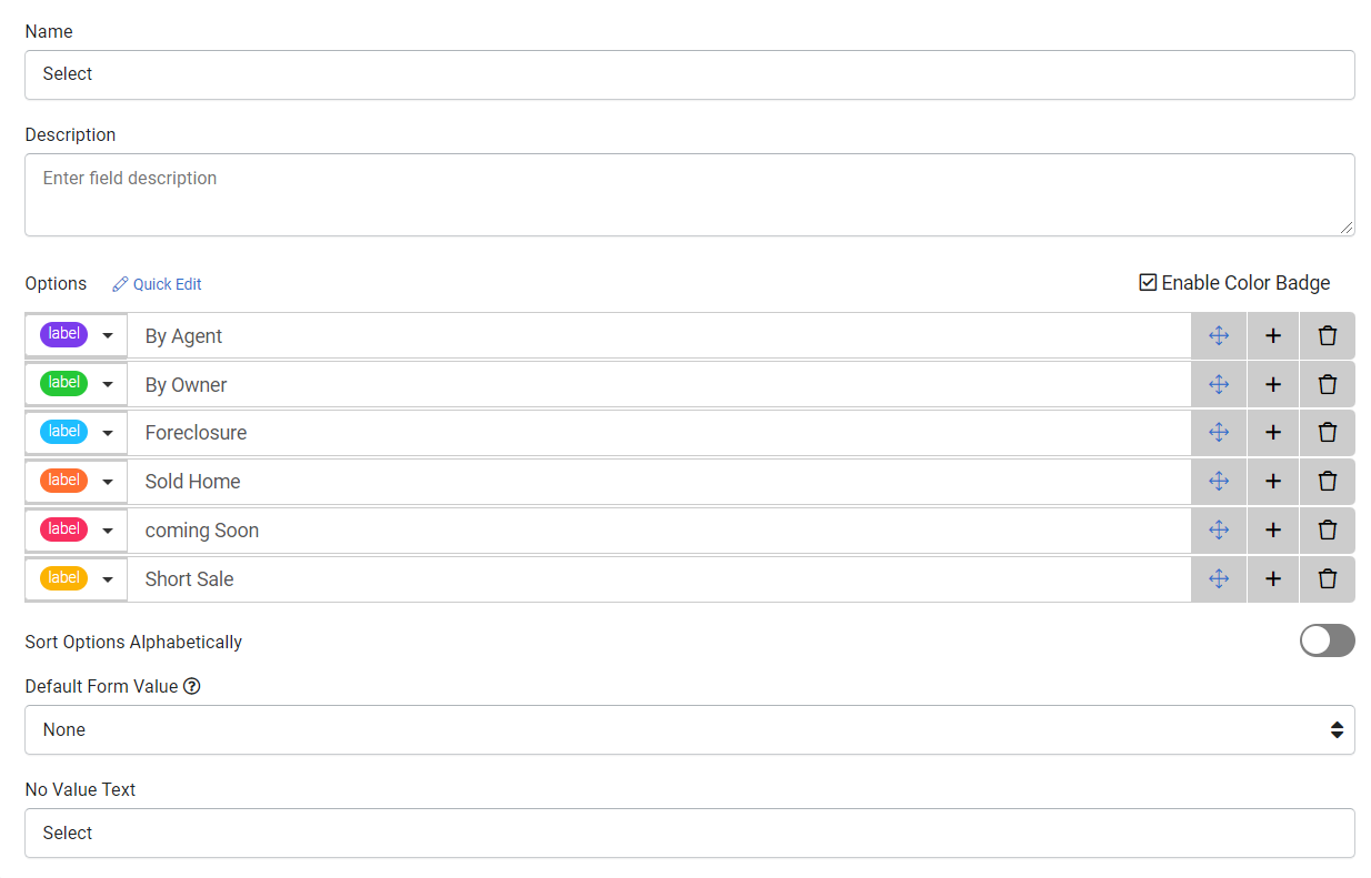
When creating a new Select option field, there are several settings you can customize such as those highlighted in the image below.
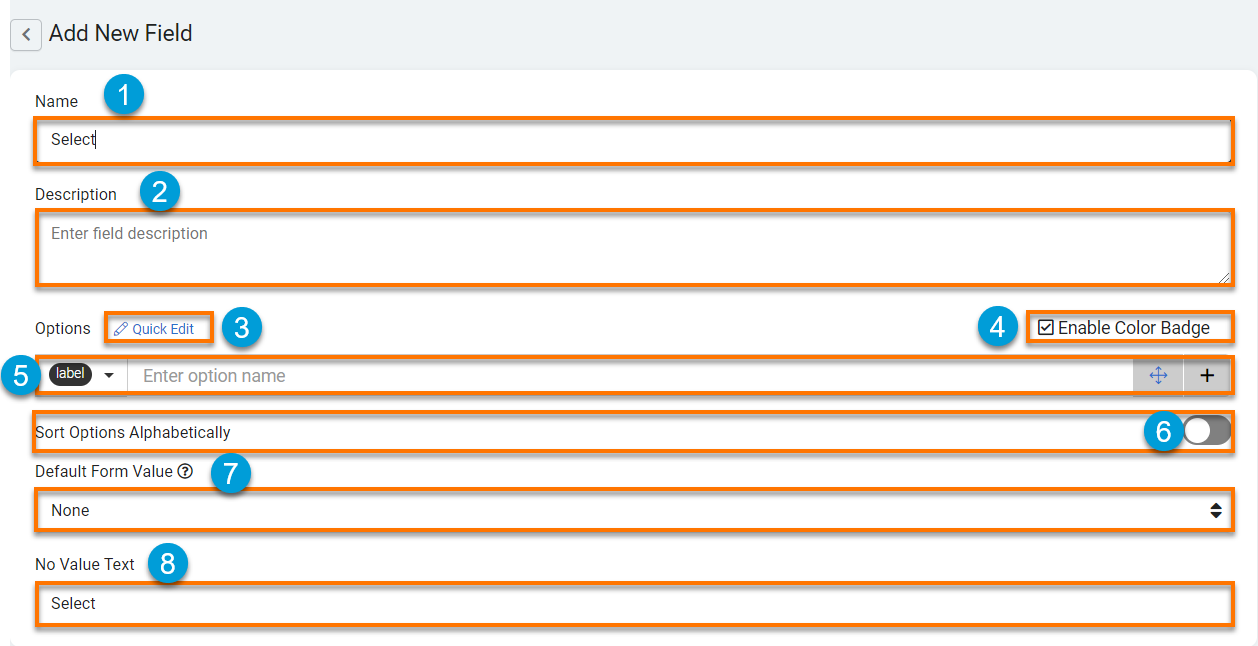
- Name- this is where you can name your Select field. For instance, "Listing Type" or "Job Status".
- Description- this is where you can optionally provide a brief description of this field for your own reference.
- Quick Edit- For your convenience, you click on the Quick Edit button to copy and paste many option values along with their assigned color badges, icons, and score values from one options field into another in order to add many options at once.
Click here to learn more about using Quick Edit to copy and paste your option values. - Enable Color Badge- This is where you can uncheck the Enable Color Badge checkbox to disable the color badge feature. At default, this checkbox is pre-checked, meaning each new select field comes with enabled color badge functionality at default.
Click here to learn more about color badge functionality. - Enter Option Values- this is where you can enter your option values as well as each value's assigned color badge (unless disabled) and/or score value (if enabled). Option values will display and be stored in the order in which they are listed here in this field, and you can rearrange the order of option values by dragging them to your desired order with the cross-arrow move icon.

The GIF below demonstrates the process of clicking on the + icon to enter new option values, assigning a color badge to each option value, and rearranging the order of option values by dragging them with the cross-arrow move icon. - Sort Options Alphabetically- this is where you can choose to sort your option values in alphabetical order when displayed in a form.
Note: Choosing to sort option values alphabetically will only affect how option values are displayed, not how they are stored. Option values will still be stored in the order in which they are entered in the options field regardless of this setting.
- Default Form Value- this is where you can define a specific option value to automatically populate within a form. For instance, if you would like to automatically populate each form with a specific option value already pre-selected, you can click on the Default Form Value drop-down arrow and select your desired option value.

As you can see in the image below, forms will automatically populate with the selected option value pre-selected.
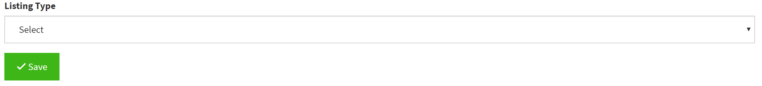
At default, the Default Form Value is set to None, meaning no option values will automatically populate within a form as illustrated in the image below.
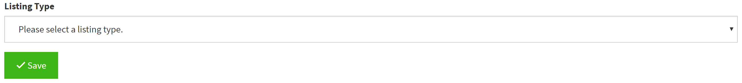
- No Value Text- this is where you can change the text that displays when no option value is selected. For instance, you can change this text to "Please select a listing type" to have this text displayed as the No Value Text when no option is selected.

At default, the No Value Text is set to "Select" as illustrated in the image below.


Multi-Select
Multi-Select fields enable you to pre-define values for selection and option values will display vertically listed within a a selection box with the ability to select multiple options.

You can use Multi-Select fields to assign color badges and score values to your options, however you can not use multi-select fields to assign icons to your options.
To select multiple options in a Multi-Select field, you can use either the Ctrl Key (Command on a Mac) or Shift Key.
Use the Ctrl key (Command on a Mac) to multi-select options with an "and" operation.

Use the Shift key to multi-select options with an "and everything in between" operation.

Creating a multi-select field
When creating a new Multi-Select option field, there are several settings you can customize such as those highlighted in the image below.

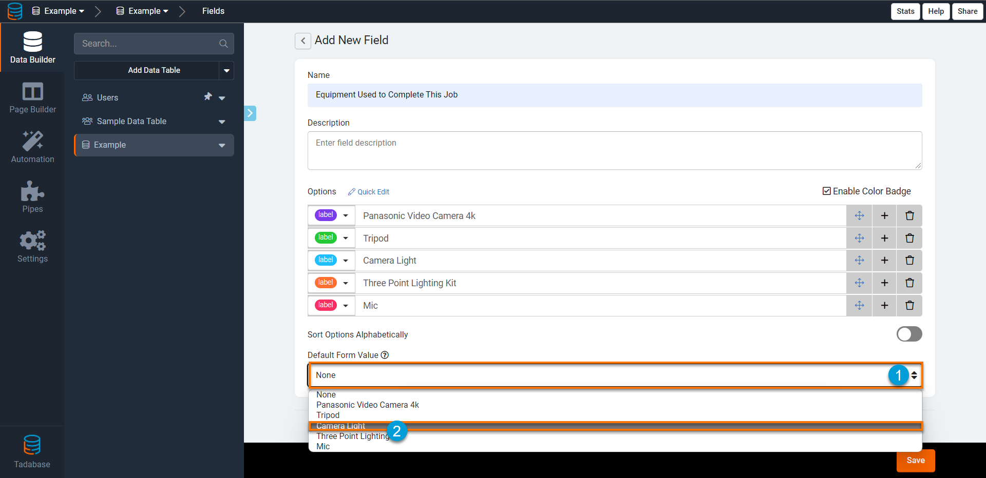
- Name- this is where you can name your Multi-Select field. For instance, "Services Included" or "Equipment Used".
- Description- this is where you can optionally provide a brief description of this field for your own reference.
- Quick Edit- For your convenience, you click on the Quick Edit button to copy and paste many option values along with their assigned color badges, icons, and score values from one options field into another in order to add many options at once.
Click here to learn more about using Quick Edit to copy and paste your option values. - Enable Color Badge- This is where you can uncheck the Enable Color Badge checkbox to disable the color badge feature. At default, this checkbox is pre-checked, meaning each new multi-select field comes with enabled color badge functionality at default.
Click here to learn more about color badge functionality. - Enter Option Values- this is where you can enter your option values as well as each value's assigned color badge (unless disabled) and/or score value (if enabled). Option values will display and be stored in the order in which they are listed here in this field, and you can rearrange the order of option values by dragging them to your desired order with the cross-arrow move icon.

The GIF below demonstrates the process of clicking on the + icon to enter new option values, assigning a color badge to each option value, and rearranging the order of option values by dragging them with the cross-arrow move icon.
- Sort Options Alphabetically- this is where you can choose to sort your option values in alphabetical order when displayed in a form.
Note: Choosing to sort option values alphabetically will only affect how option values are displayed, not how they are stored. Option values will still be stored in the order in which they are entered in the options field regardless of this setting.
- Default Form Value- this is where you can define a specific option value to automatically populate within a form. For instance, if you would like to automatically populate each form with a specific option value already pre-selected, you can click on the Default Form Value drop-down arrow and select your desired option value.

As you can see in the image below, forms will automatically populate with the selected option value pre-selected.
At default, the Default Form Value is set to None, meaning no option values will automatically populate within a form as illustrated in the image below.


Decision Box
Decision Box fields enable you to prompt users to make binary decision selections.

For instance, you can use Decision Box fields to prompt users to select whether or not they would like to "Accept Terms of Service", "Opt In To Receive Email Updates", or "Subscribe".
Creating a decision box field
When creating a new decision box field, there are several settings you can customize such as those highlighted in the image below.
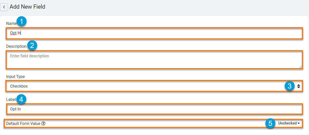
- Name- this is where you can name your decision box field. For instance, "Accept Terms of Service" or "Opt In To Receive Text Messages".
- Description- this is where you can optionally provide a brief description of this field for your own reference.
- Input Type- this is where you can select the input method for which you would like users to make their binary decision selections. You can prompt users to make a binary decision selection with three input types: Checkbox (default), Radio Buttons, and Drop-Down.
The default Input Type is set to Checkbox. Checkboxes will prompt users to make a binary decision selection by checking or unchecking a checkbox..png)
If you change the Input Type to Radio Buttons, this will prompt users to make a binary decision of either yes/no, on/off, or true/false by selecting a radio button..png)
If you change the Input Type to Drop-Down, this will prompt users to make a binary decision of either yes/no, on/off, or true/false by selecting from a drop-down list..png)
- Label- this is where you can define the text you wish to display to prompt users to make their binary decision selections.
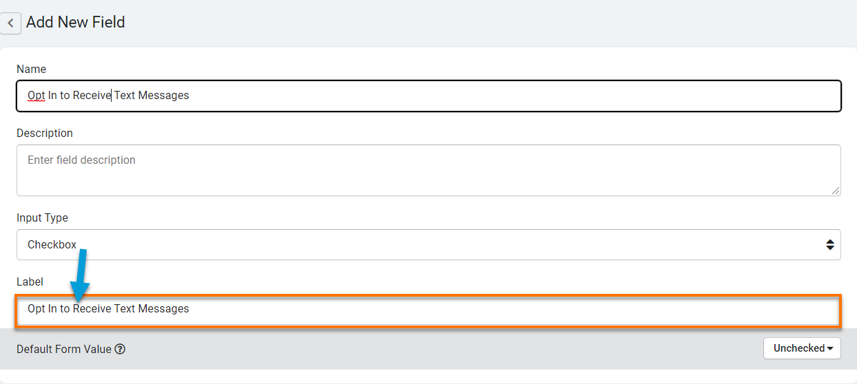
If you are using the default checkbox input type, this is where you can enter the text you wish to display to prompt users to check/uncheck the decision box. For instance, if you are prompting users to "Opt In To Receive Text Messages" with a checkbox input type, this is where you can enter the text "Opt In To Receive Text Messages" to display this text as the checkbox label.
As you can see in the image below, the label text prompting users to check or uncheck the checkbox is "Opt In To Receive Text Messages".
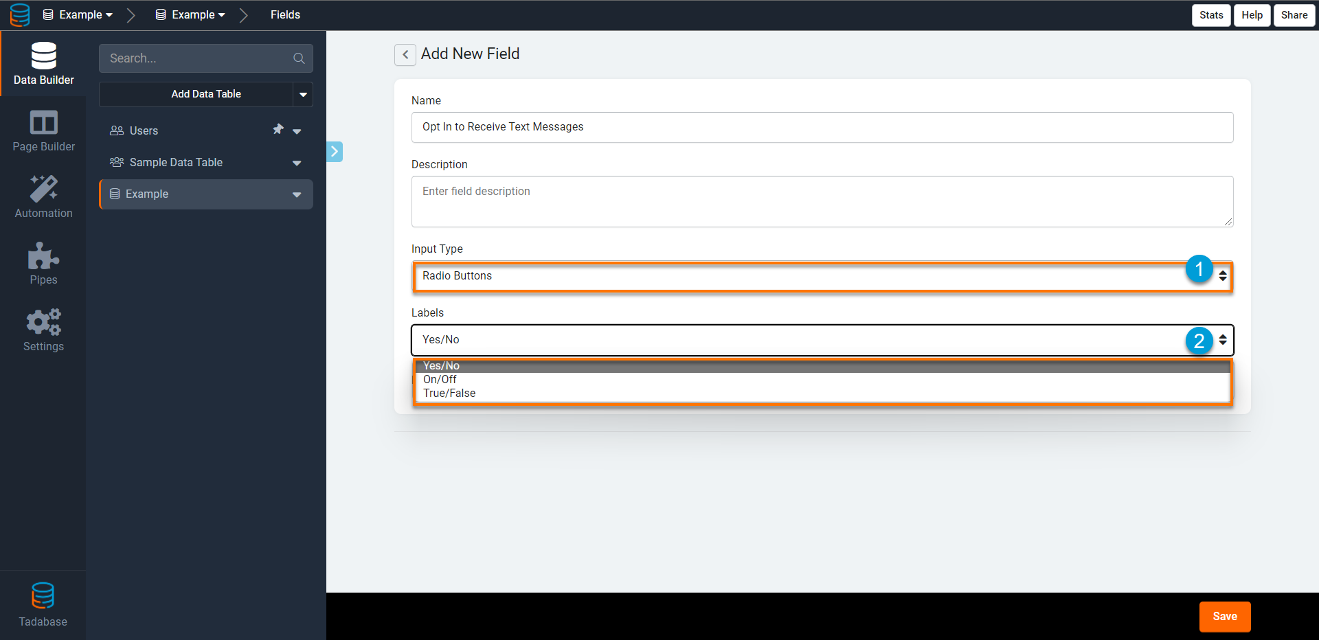
If you change the Input Type to either Radio Buttons or Drop-Down, the Labels setting will change from a text field to a drop-down list with three types of binary labels to choose from: Yes/No, On/Off, and True/False.
As you can see in the image below, users are prompted to opt in to Receive Text Messages with the selected radio button input type and yes/no labels. - Default Form Value- this is where you can define whether you would like the positive binary value (yes/on/true/checked) to be automatically selected when a form loads.
For instance, if you would like your form to automatically populate with the checkbox for "Accept Terms of Service" already pre-checked, you can change the Default Form Value to "Checked".
As you can see in the image below, changing the Default Form Value to "Checked" will result in forms automatically populating with the "Accept Terms of Service" box already pre-checked.
At default, the Default Form Value is set to "Unchecked", meaning forms will automatically load with decision checkboxes unchecked at default as illustrated in the image below.
When the Input Type is set to Radio Buttons or Drop-Down, changing the Default Form Value to "Checked" will result in forms automatically populating with the positive binary value (yes/on/true) pre-selected. For instance, within the same field you can change the Input Type to Radio Buttons with a Label of yes/no and set the Default Form Value to "checked".
As you can see in the image below, the form populated with the binary value of "yes" automatically selected..png)
.png)
.png)
.png)


.png)
Customizing Color Badges
The image below illustrates the default color badges available to use within Tadabase.
.png)
If you would like to further customize a color badge, you can do so using custom CSS. For your reference, here is a sample of the current CSS being used for the first color badge (badge-wh-1). You can customize this CSS code to customize this color badge as well as any other color badge to your desired color badge display.
 .badge-wh-1 {
    display: inline-block;
    min-width: 10px;
    padding: 3px 7px;
    font-size: 13px;
    font-weight: bold;
    color: #fff;
    background-color: #7B3CEC;
    line-height: 1;
    vertical-align: middle;
    white-space: nowrap;
    text-align: center;
    border-radius: 10px;
}
Using Quick Edit
For your convenience, you can use the Quick Edit option to copy and paste many option values along with their assigned color badges, icons, and score values from one options field into another in order to add many options at once.
Within Quick Edit, values are listed with one value per line.
As you can see in the GIF below, you can click on the Quick Edit button to copy all the values for each option in order to paste them into a new options field rather than manually re-enter each option with all its values from scratch.
The image below illustrates how option values, including the option text, score value, icon, and color badge, are displayed within each line of Quick Edit.

We'd love to hear your feedback.