Logo
For example "scheduled tasks"
Search
Info
Content
Category Navigation
  • 📖  Manual

  • 👋Welcome

    Welcome to Tadabase

    What Is No-Code?

    Tadabase Support

    Getting Started With Tadabase

    Platform Overview

    🧰The Data Builder

    Data Tables

    Fields

    Text Fields

    Personal Fields

    Number Fields

    Date Fields

    Option Fields

    File and Image Fields

    Equation Fields (Category)

    Equation Fields

    Connection Fields

    Date Equation Examples

    Records

    Record Logs

    Import Templates

    Export Templates

    Automating Tasks

    Number Equation Examples

    Text Equation Examples

    Multi-Function Equation Examples

    ✏️Page Builder

    Page Builder Overview

    Layouts

    Pages

    Components Overview

    PDF Pages

    📗System Components

    System Components Overview

    Menu

    User Menu

    Breadcrumbs

    PDF Print (Alpha)

    Link Button

    Login

    Signup

    Profile

    HTML

    Image

    Subscriptions (Alpha)

    📘Data Components

    Data Components Overview

    Form Component

    Table Component

    List Component

    Kanban Component

    Calendar Component

    Resource Component

    Map Component

    Timeline Component

    Accordion Component

    Card Component

    Chart Component

    Search Component

    Import Component

    Data Source

    Data Source Filtering

    Links

    Display Rules

    Inline Editing

    Data Component Visual Directory

    Custom Component

    Custom Component Helpers

    Writing Your Own Component Helpers

    🙋Users

    Users

    Roles

    Single Sign On (SSO)

    Adding Stripe Subscriptions

    🔒Security and Reliability

    Tadabase Builder Security

    App Security

    User Security

    🔗Integrations

    Zapier Integration

    Using Webhooks

    Saving files to Dropbox

    Adding PayPal payment buttons to your app

    Exporting records to Google Sheets

    Viewing data in Microsoft BI

    Chat Widgets

    REST API

    Using SendGrid for emails

    Saving files to AWS S3 Bucket (IAM Method)

    Incoming Webhooks

    Embeddable Components

    Saving Files to Custom S3 Bucket (Account Method, Recommended)

    PDF Forms

    Stripe Checkout

    JavaScript Callbacks and Actions

    Twilio Integration

    ⚙App Settings

    General Settings

    Layout & Format Settings

    Custom Domain

    Customizing CSS

    Changing app themes

    Support Settings

    404 Error Page

    💳Account

    Plans

    Managing Your Account

    Sharing your app builder

    Managing your Apps

    🧩Pipes

    Introduction to Pipes

    Adding Pipes

    Using Pipes

    PDF Gen V2

Categories
📖 Manual
📘 Data Components
Map Component

Map Component

What are maps?

Maps enable you to see records in your database that contain Address Fields on a Google Map. 

Map-Image-min.jpg


Adding Maps

To add a Map component, choose the Map component and then choose the data table to be used for this Resource. 

Only tables which contain an address field will be available as an option for Maps. 

Once you've chosen the table, you can choose Quick Add which will add the Resource component with some default settings. Alternatively, you can choose Customize to configure all the settings manually. 

Choosing QuickAdd is simply a shortcut, you can always go right back into the component to make any changes necessary. 

Inside the Resource component you'll see have some standard options available in other components, as well as unique settings only available in the Resource component. 

  1. Data Source
  2. Map Options
  3. List View
  4. Popup View

Data Source

The Data Source tab is where you can filter which records will be displayed in this component with some 'server-side' filtering. Since this is universal to all components you can view it as its own article here. Learn more about Data Source. 

Map Options

Inside the Map Options is where you can set most of the map settings relating to this component. 

Under General Options you'll have 3 basic options. 

  • Title
  • Description
  • Address Field

Title

This will be the title displayed on top of your map. 

Description

This is a description for your own reference. 

Address Field

This is the address field from your data table to be used for placing markers on the map. For example if each record has 2 addresses  such as Home and Work addresses, you can only use one of those as the source for address fields. 


Under Map Settings you'll have another 3 settings: 

  • Map Size
  • Zoom Level
  • Map Type


Map Size

This is the size of map height. By default, the map will always be the full width of its parent container. Only the height can be adjusted. 


Zoom Level 

The zoom level is the default zoom when the map first loads. This can be anything from 1 (Zoomed Out) to 20. 

Zoom-Levels.jpg

In general you can think of the zoom levels as: 

  • 1: World
  • 5: Landmass/continent
  • 10: City
  • 15: Streets
  • 20: Buildings


Map Type

The map type will determine if it should show Roadmap, Satellite, Hybrid or Terrain. 

kScmap-types.jpg


Under Interactive Options you can enable any interactive options available for this component. 

  • Show List Panel
  • Enable Popup
  • Enable Scroll to Zoom

Show List Panel

By enabling this option you'll be able to choose which values to show on the side panel next to the map. 

Map-List-Panel.jpg

Once this is enabled, you can customize what shows in each record by going to the List View inside the map component. When you have a List View enabled, clicking on one of the records will move the map to the chosen record and open the details in the Popup. 
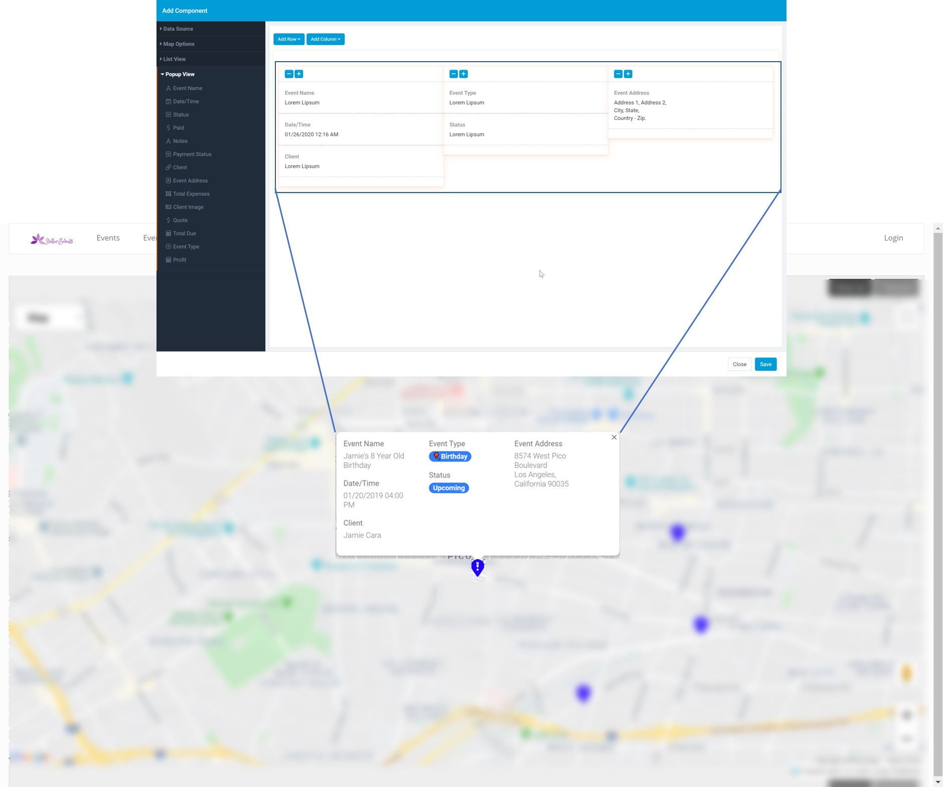
Enable Popup

Popup enables you to view more details when a Map Marker is selected. you can customize what shows in each popup by modifying the fields inside the Popup view. 


Enable Scroll to Zoom

With this setting you can disable the scroll wheel on the mouse from zooming the map in and out. 


Under General Options you can set the following options: 

  • Default Pin
  • No Data Text
  • Record Limit


Default Pin

The default pin is the icon that will be displayed on the map. You can customize the pin based on predefined conditions and when no conditions are met this pin will be used. Learn more about Pin Color Rules here. 

No Data Text

This is what will show when there are no records to show. 

Record Limit

Set a limit or allow all records to show up on a map. 


Pin Color Rules

Here you can set color rules to determine which icon as well as its color to be used for each record. 

maps-pin-color-rules.jpg


List View

The list view is the section on the side of the page that will allow any details about each record you chose to add. 

map-list-view.jpg


Popup View

Inside the popup view you can choose which fields will show up when a marker on the map is clicked. This only is an option when the Enable Popup option is enabled. 

map-popup-view.jpg


Maps and custom domains

If you're using maps with a custom domain, please let us know so we can white list your domain to ensure it works correctly.


How did we do ?

Previous Article
Resource Component
Next Article
Timeline Component
Article Navigation
  • What are maps?
  • Adding Maps
  • Data Source
  • Map Options
  • Title
  • Description
  • Address Field
  • Map Size
  • Zoom Level
  • Map Type
  • Show List Panel
  • Enable Popup
  • Enable Scroll to Zoom
  • Default Pin
  • No Data Text
  • Record Limit
  • Pin Color Rules
  • List View
  • Popup View
  • Maps and custom domains
  • Back to top
    Developer portal Tadabase Community
    API
    100% Operational
    Apps
    100% Operational
    Builder
    100% Operational
    Overall Status
    100% Operational