Kanban Component
What is Kanban?
The Kanban component enables you to view the data you wish to add in 'swim lanes'.
Why use Kanban?
Kanban helps you gradually improve the delivery of your products and services. It does so by helping you eliminate bottlenecks in your system, improve flow and reduce cycle time. It helps you deliver more continuously and get faster feedback to make any changes that may be needed by your customer.
When should you use Kanban?
Kanban can only be used when there is a radio field which will be utilized for tracking each of the lanes. For example, if you have a radio field called "Status" with several options like: "Open" "Pending" "Completed" each of these can be a lane on the kanban board.
Adding Kanban
To add a Kanban choose the Kanban component and then choose the data table to be used for this Kanban.
Only tables which contain at least one radio field will be displayed in the list of tables.
Once you've chosen the table, you can choose Quick Add which will add the Kanban with some default settings. Alternatively, you can choose Customize to configure all the settings manually.
Choosing QuickAdd is simply a shortcut, you can always go right back into the component to make any changes necessary.
Inside the Kanban component you'll see have some standard options available in other components, as well as unique settings only available in the Kanban component.
- Data Source
- Fields
- Links
- Options
Data Source
The Data Source tab is where you can filter which records will be displayed in this component with some 'server-side' filtering. Since this is universal to all components you can view it as its own article here. Learn more about Data Source.
Fields
In the fields tab you can choose how to format each Kanban item and which fields to display. All the settings here will be applied to a each and every record in the kanban. For example, in the illustration below you can see the settings vs how it will appear in your app:
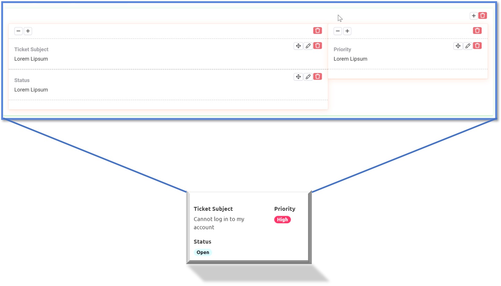
As part of the customization for each record you can add:
- Rows
- Columns
- Fields
- Custom HTML
This works similarly to how rows and columns work in the page builder where Rows are the top level, columns are inside of rows and the fields are placed into a column. Using custom HTML you can further create very dynamic display of your data using raw values in the HTML component.
To add fields, simply select the field you wish to add from the left-hand side:

Links
In the links tab you can create links to details, edit and other connected records.
Since this is universal to all components you can view it as its own article here. Learn more about Links here.
Options
Options are where you can configure the options specific to Kanban boards.
- Title
- Kanban Field
- Kanban Cover Field
- Kanban Columns
- Kanban Height
- Show Column Count
- Column Width
- No Data Text
- Inline Editing
Title
Add a custom title to appear at the top of the Kanban board.
Kanban Field
This will be the field that will be used to organize the records into the proper column. The settings you specify here will apply to a single record and be duplicated across all your records.
Kanban Cover Field
If you have an Image field in your table, you can choose to use this image as the cover field. The cover field allows adds some special formatting and puts the image at the top of the Kanban without and padding or margins.
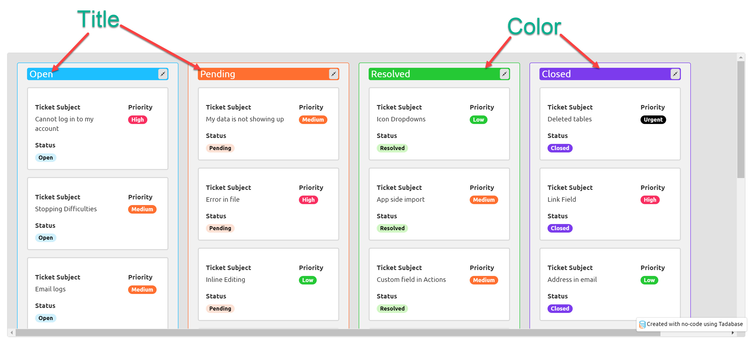
Kanban Columns
Each option from the "Kanban Field" you chose above will be displayed here plus an additional "Uncatalogued" option. Each line here represents a single column/swim-lane and can be customized with several options.
- Title
- Color
- Visibility

You can rearrange the order by clicking on the 4 pointed arrow and dragging each column to the order you prefer.
Title
By default the title will be the value from the option of the Kanban Field, but you can override that here.
Color
Set a background and border color for this entire column
Visibility
Choose to show or hide this column.
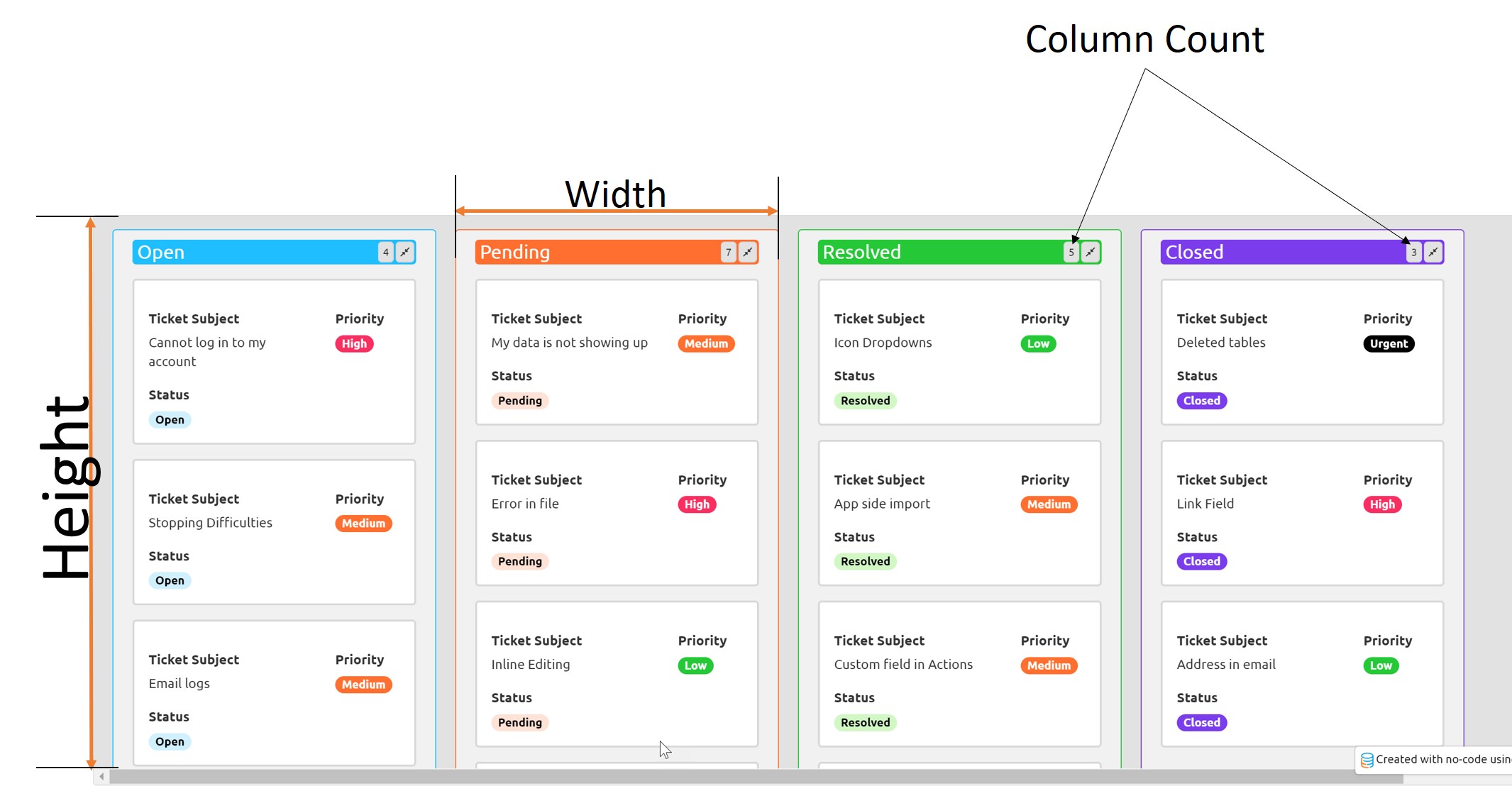
Kanban Height
This will set the height of the entire Kanban board in Pixels.
Show Column Count
If you'd like to show on top of each swim-lane the total items inside that column enable this option here.
Column Width
Set the column width for each lane. This can be in Pixels or percent. Keep in mind you'll need to factor in some additional percentage points for the padding and margins. For example, if you have 4 colummns and set each one to 25% it will likely go into a new line since this also includes the padding between each column/swim-lane.
No Data Text
Where there are no records, the text added here will be displayed.

The above settings will result in this output:
Inline Editing
Similar to inline editing in all other components. This will allow users to select a value and change it in a pop up. Click here to learn more about inline editing.
We'd love to hear your feedback.