Components Overview
What are components?
Components are interactive viewpoints you can add to your pages or layouts that empower users to add and interact with your data on the live app.
There are two types of components you can add to your pages and layouts: Data Components and System Components.

Data Components, including forms, calendars, charts, etc., are dynamic viewpoints that can be added to your pages for users to add, track, report, and automate your data on the live app.
System Components, including, menus, logins, profiles, etc. can be added to your pages and layouts to enable users to navigate your live app and manage their user-related information.
Each data and system component has its own unique features and settings, so we will explore each component within its own article within the following Data Components and System Components sections.
For now, let's explore how to add, edit, move, copy, and delete components, all of which are universally applicable across all data and system components.
Adding components
Data and System Components can be added within columns on a page or layout.
There are two ways to add a data or system component to a column on a page/layout:
You can add data and system components to a page or layout by adding them within existing columns on the page/layout. You can add a component to the top or bottom of an existing column by clicking on the +Add Component icon at the top or bottom of the column you would like to add the component to.

Once you click on a data or system component, and it will open the components tab where you can select your column.
As a reminder, components are color-coded blue within the content tab of a page/layout, whereas columns are color-coded orange and rows are green.
Editing components
Once a data or system component is added to your page/layout, you can edit the component by double clicking it.
You will then be directed within the component where you can format and customize the component by adding fields, links, filters, and other customization options.

As each data and system component is unique with different editing options and features, we will discuss the editing settings for each component within its own article. Please see each data and system component's article to learn how to edit and customize each specific component.
For the purpose of this article, we will continue to discuss the universal features of navigating all data and system components within your page/layout content, including how to move, copy, design, and delete components on a page/layout.
Moving components
Components can be moved from one column to another on a page/layout. To move a component, hover over the component's name and a cross arrow move icon will appear. Use the move icon to drag and drop the component to a new column of your choice.

Designing components
Generally, you can simultaneously design all components within a row by customizing the design of the row that contains the components. If you customize a row's design, that design will apply to all components within that row.
To customize a row's design including the design of all components within that row, click on the row's green pencil icon.

A new window will pop up for you to customize several design options for this row and contained components, including font styles, background styles, borders, spacing, and CSS.

To read in-depth instructions on how to customize all design settings for rows and their contained components, please view the Page Builder Overview Article.
You also have the option to customize the design of a specific component, which will override the design of the row that contains that component.
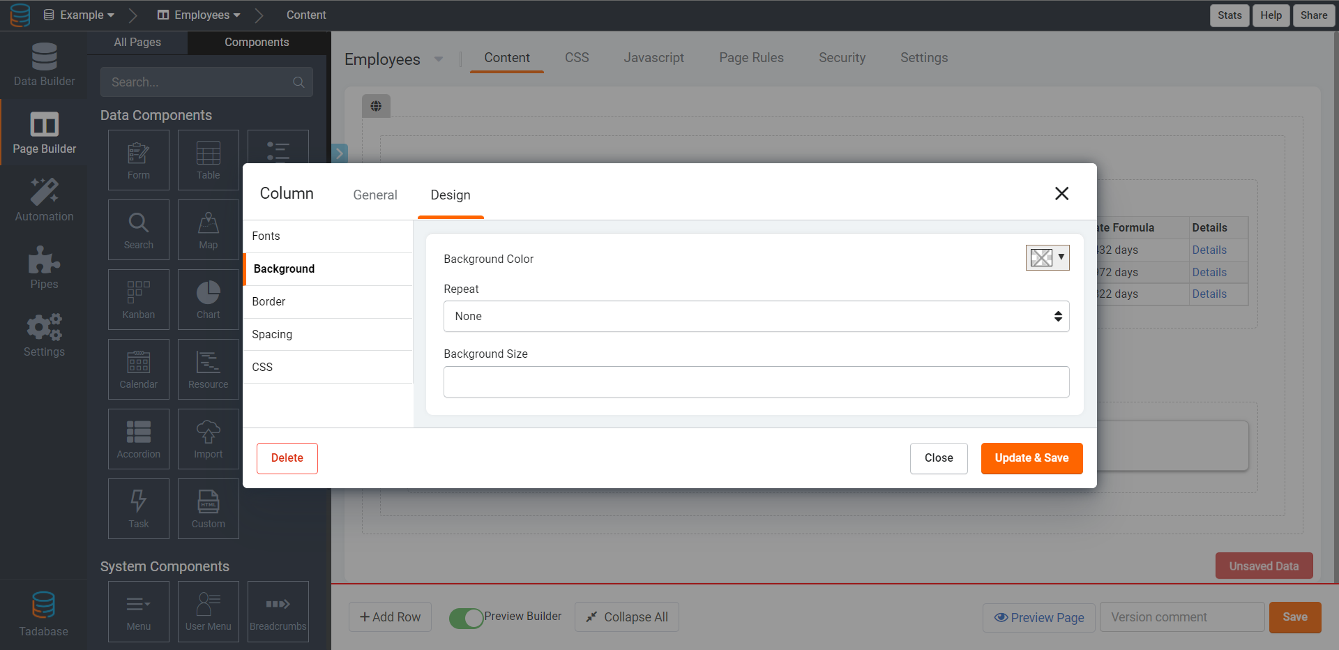
A new window will pop including five tabs you can utilize to customize this component's design.
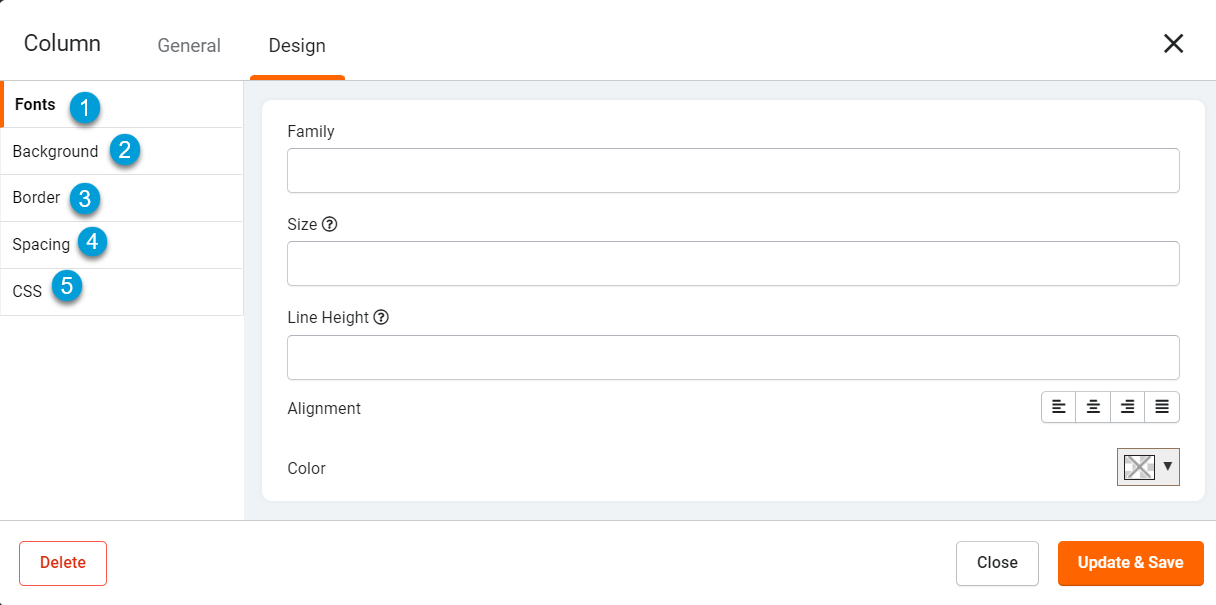
Let's explore each of these five design tabs.
Fonts
Within the Fonts tab of a component's design window, you can customize the font styling as well as enter the font family that you wish to apply to this component. If you have imported external font families and saved them within your layout or page CSS tab (or within your app settings), you can enter the name of the imported font family here within the Font Family setting to apply that font to this component. To learn more about importing external fonts, click here.
Background
Within the Background tab, you can customize the background of this component.
Border
Within the Border tab, you can customize the border of this component.

Spacing
Within the Spacing tab, you can define custom spacing and padding to be used for this component.
Proper CSS Units are required when adding values to Margin or Padding. For example, 18px or 20%

CSS
Within the CSS tab, you can enter custom CSS to further customize this component.

Copying components
You can copy and paste a component onto a different page within your app by hovering over the component, clicking its gear icon, and selecting the Copy option. Once you click Copy you will have the option to select the page onto which you would like to paste this component.

Deleting components
You can delete components from a page/layout by hovering over the component, clicking its gear icon, and selecting the Delete option.
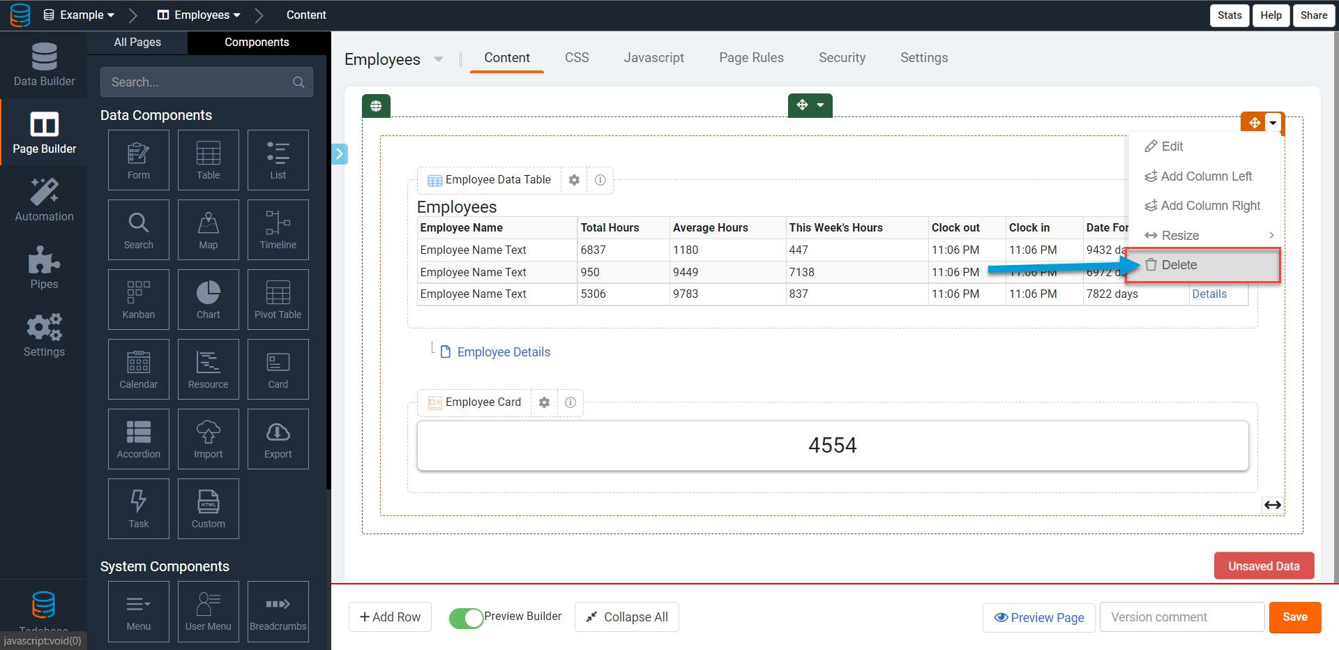
Please be cautious when deleting components from your pages and layouts as deleted components can not be recovered.
When deleting components that were used to add child pages via details links, edit links, or add new forms, please note that deleting these components will orphan those child pages. Meaning, deleting the component that linked and created the child page will not delete the child page, but it will delete the link/component that created the page.
We'd love to hear your feedback.