Logo
For example "scheduled tasks"
Search
Info
Content
Category Navigation
  • 📖  Manual

  • 👋Welcome

    Welcome to Tadabase

    What Is No-Code?

    Tadabase Support

    Getting Started With Tadabase

    Platform Overview

    🧰The Data Builder

    Data Tables

    Fields

    Text Fields

    Personal Fields

    Number Fields

    Date Fields

    Option Fields

    File and Image Fields

    Equation Fields (Category)

    Equation Fields

    Connection Fields

    Date Equation Examples

    Records

    Record Logs

    Import Templates

    Export Templates

    Automating Tasks

    Number Equation Examples

    Text Equation Examples

    Multi-Function Equation Examples

    ✏️Page Builder

    Page Builder Overview

    Layouts

    Pages

    Components Overview

    PDF Pages (Alpha)

    PDF Pages 2.0

    📗System Components

    System Components Overview

    Menu

    User Menu

    Breadcrumbs

    PDF Print (Alpha)

    Link Button

    Login

    Signup

    Profile

    HTML

    Image

    Subscriptions (Alpha)

    📘Data Components

    Data Components Overview

    Form Component

    Table Component

    List Component

    Kanban Component

    Calendar Component

    Resource Component

    Map Component

    Timeline Component

    Accordion Component

    Card Component

    Chart Component

    Search Component

    Import Component

    Data Source

    Data Source Filtering

    Links

    Display Rules

    Inline Editing

    Data Component Visual Directory

    Custom Component

    Custom Component Helpers

    Writing Your Own Component Helpers

    🙋Users

    Users

    Roles

    Single Sign On (SSO)

    Adding Stripe Subscriptions

    🔒Security and Reliability

    Tadabase Builder Security

    App Security

    User Security

    🔗Integrations

    Zapier Integration

    Using Webhooks

    Saving files to Dropbox

    Adding PayPal payment buttons to your app

    Exporting records to Google Sheets

    Viewing data in Microsoft BI

    Chat Widgets

    REST API

    Using SendGrid for emails

    Saving files to AWS S3 Bucket (IAM Method)

    Incoming Webhooks

    Embeddable Components

    Saving Files to Custom S3 Bucket (Account Method, Recommended)

    PDF Forms

    Stripe Checkout

    JavaScript Callbacks and Actions

    Twilio Integration

    ⚙App Settings

    General Settings

    Layout & Format Settings

    Custom Domain

    Customizing CSS

    Changing app themes

    Support Settings

    404 Error Page

    💳Account

    Plans

    Managing Your Account

    Sharing your app builder

    Managing your Apps

    🧩Pipes

    Introduction to Pipes

    Adding Pipes

    Using Pipes

    PDF Gen V2

Categories
📖 Manual
📘 Data Components
Card Component

Card Component

What are cards?

Cards enable you to add static or dynamic single points of data on a component that looks a bit like a card. 

When should I use cards?

Cards are mostly used on dashboard or any page where you want to add a summary in  a clean design with custom title, icons and footers. 

Adding Cards

To add a card choose the card component and then choose the data table to be used for this card


Inside the calendar component you'll see have some standard options available in other components, as well as unique settings only available in the calendar component. 

  1. Data Source
  2. Calculations
  3. Design


Data Source

For this component the data source is unlike the other components and only shows the table being used for display of component. 


Calculations

Here you can choose what to display as the primary content on the card. You can choose from the following options: 

  • Static or Formula

Static

Static will simply display a static (non dynamic) value that you enter here. 

static-card.jpg


Formula

With formula you can choose to summarize values from the table you chose when adding this component. 

You can choose from 5 formulas: 

  • Count
  • Minimum
  • Maximum 
  • Average
  • Sum

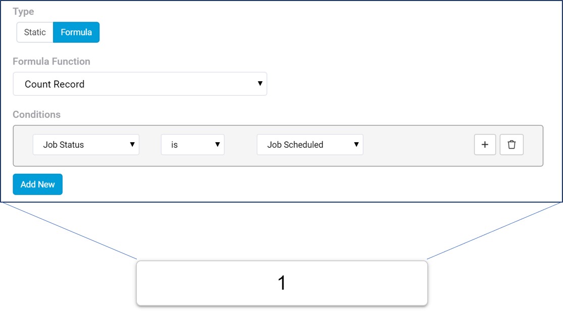
You can also add conditions to determine which records should be used int he calculation.

For example, Count all the Jobs where Job Status is Job Scheduled

card-count.jpg


When working with other formulas that require another parameter, like SUM which we must also decide which field to sum, you'll have another option to choose that number field. 

card-sum.jpg

You can also enable Auto Refresh which will refresh this component every 30 seconds. This is useful when displaying statistics on a TV monitor so you don't need to constantly refresh. 

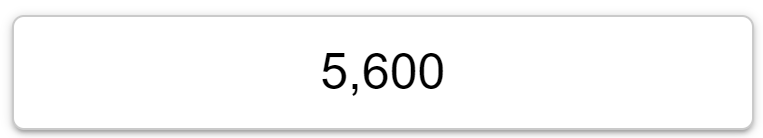
Finally, you can choose to add a thousands delimiter to the output: 


Design

In the design tab you can customize much of how the card is displayed including: 

  • Header
  • Footer
  • Content
  • Border
  • Icon 
  • Shadow

Here are all the sections

card-parts.jpg

Header

Header can be customized with custom text, size, alignment and color. 

Footer

Footer can be customized with custom text, size, alignment and color. 

Content

Content can be customized with size, color, alignment as well as a prefix or suffix to be added next to the value outputted. For example, you can add a currency symbol as a prefix or a % sign as the suffix. This can be anything you wish. 

Border

Border can be customized with which sides should have a border, the width, color and radius. 

Icon

Choose a default icon and its position and color,  

card-icon-positions.jpg

Icon can be customized with display rules that will modify the icon based on the values. For example, 

  • If revenue is above $25,000 show a green smiley face. 
  • If revenue is lower than $20,000 show a red frown
  • Otherwise, show a blue 'meh'

card-icon-rules.jpg

How did we do ?

Previous Article
Accordion Component
Next Article
Chart Component
Article Navigation
  • What are cards?
  • When should I use cards?
  • Adding Cards
  • Data Source
  • Calculations
  • Static
  • Formula
  • Design
  • Header
  • Footer
  • Content
  • Border
  • Icon
  • Back to top
    API
    100% Operational
    Apps
    100% Operational
    Builder
    100% Operational
    Overall Status
    100% Operational